Continuous Input In Mobile Devices: Pain Or Gain?

Email Newsletter
Weekly tips on front-end & UX.
Trusted by 200,000+ folks.
 Flexible CMS. Headless & API 1st
 Register!


Working with text has long been the domain of desktops and notebooks. Yet the screen size, resolution and software of mobile devices have improved in recent years, which has made typing a fairly large amount of text quite achievable. A number of apps and techniques are intended to make this task easier, thus increasing productivity and increasing the amount of text that can be comfortably created or edited on a mobile device.
One such technique is continuous input, whereby the user keeps sliding their finger across the keyboard until they’ve finished entering the word. However, the very nature of the technique presents the average mobile user with a usability challenge.
This article invites UX designers and usability experts to look at the user experience of continuous input. We will detail the process of continuous input and weigh its gains against its pain points. We will then apply usability heuristics and basic empathy considerations in an attempt to remove pain points and tweak the design, helping developers improve usability of continuous input apps.
Setting Up A Lab
To proceed with our review, we must consider the specifics of the variety of hardware and software on the market today. However, rather than researching the huge range of handsets, building a database and fiddling with the statistics, thereby driving this article into oblivion, we’ve chosen to use Motorola’s Moto X handset (4.7 inches, with a 720 × 1280-pixel display) running Android 4.4.4. It’s an average piece of hardware, good enough both to present the problem and to work on a design solution. We’ll set the default font size and use the Evernote app as a representative piece of software.
Typing On A Touchscreen
Typing on a touchscreen device is very different from typing on a desktop or notebook. Due to the size of mobile devices, typing with more than two fingers is usually impractical or even impossible.
Most mobile users type at fewer than 25 words per minute. Some have practice or training and can type without looking at the keyboard or by occasionally glancing at it, most of the time focusing on the text field above the keyboard.
The majority of mobile users don’t have much practice and will look for each key before tapping it.
On desktop devices, the former method is known as “touch typing” (although it has no relation to touchscreen devices) and the latter is “hunt and peck” or “search and peck” typing. Because we are concerned only with touchscreen devices here, we will leave the desktop terminology alone to avoid confusion.
Twenty-five words per minute is not a great rate, and there are several ways to improve it. One is a technique called continuous input, also referred to as “continuous typing” or “gesture typing” and popularized by such apps as SwiftKey (with its Flow feature) and Swype.
Continuous Input
Continuous input (CI) is a touchscreen technique that goes one step further than tapping, letting users leave their finger on the keyboard while moving from one key to another until the whole word is put together. The finger leaves the touchscreen only to mark the end of a word. Even then, rather than lifting the finger off the screen, the user could also slide it across to the space key. The rationale is simple: Lifting one’s finger off a touchscreen between keystrokes adds time. The amount of time is tiny but adds up with each keystroke. Saving this time improves one’s overall text-input rate.
With normal tapping, key taps are differentiated by signals produced from the finger touching the screen. With CI, key taps are differentiated by a complicated algorithm that analyzes several factors, including the path of the finger around the keyboard and the time spent at each key. Based on this, the software dynamically searches its dictionary and builds the required word. Combined with predictive text input, this noticeably increases the typing rate. From our personal experience, the technology works very well.
The Problem
It works very well, indeed — apart from one little snag.
When a user is entering text by tapping, lifting their finger to move to another key gives them a chance to glance over the keyboard. This glance serves two purposes. First, it allows them to evaluate and adjust their position over the keyboard. Secondly and more importantly, it helps them pinpoint the next key to tap. The importance of this action ranges from very low — for those who have a good mental representation of the keyboard’s layout — to very high — for those who have to visually locate every key before tapping it.
Users who have to visually locate every key are our main concern here.
Entering text by tapping can be represented by a very simple task flow:
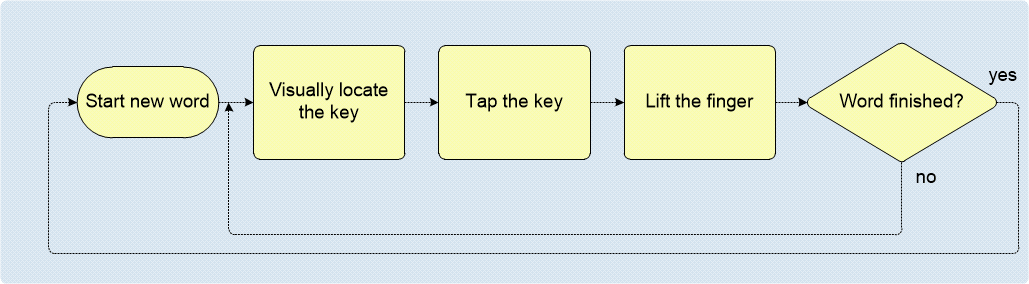
Let’s consider entering text with CI.
The CI task flow seems to start similarly to the above — that is, with the first letter in a word. By definition, lifting one’s finger from the screen signifies the end of the word being entered. So, after tapping the first letter, the finger must stay on the keyboard, sliding across to the next key, until the whole word is built. The CI task flow can be represented by the following diagram:
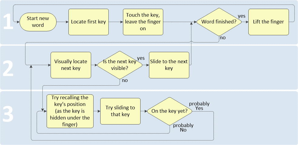
We can explain the flow as consisting of three segments.
- Segment 1 represents the start and the end of a word. The finger must touch the screen at the first character, stay on the touchscreen and then leave the touchscreen at the last character of the word. This segment is straightforward and resembles the tapping flow shown earlier.
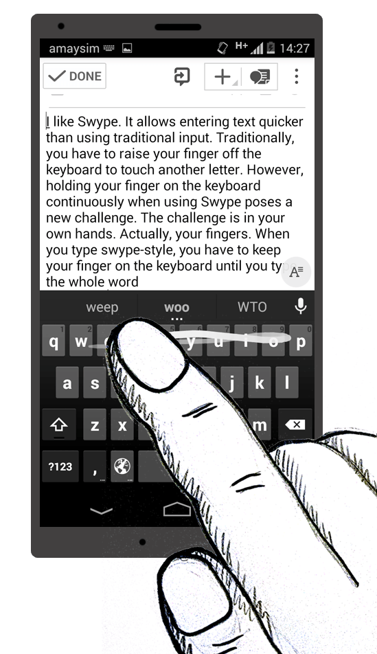
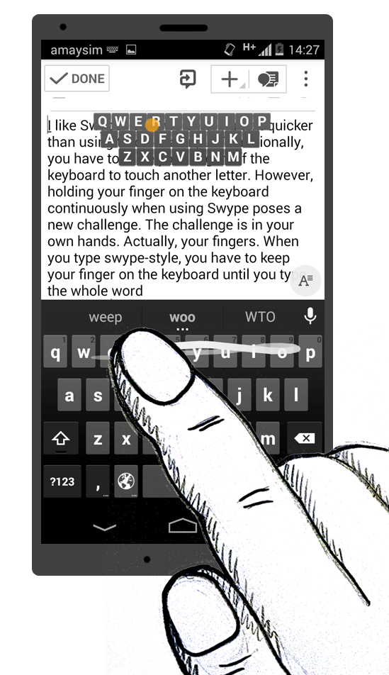
- Segment 2 is when the frustration begins, with the user attempting to locate the next and subsequent characters. In touching the keyboard, the user’s finger will often overlap a significant portion of the keyboard (as shown in the image below). A simple visual estimation tells us that, depending on the current key, the screen size and the user’s hand size, up to half of the keyboard area could be obscured, blocked out by the user’s hand.
- Segment 3 is the most frustrating. If the target key is hidden from sight, the user is left to recall its location from memory. When they work out the approximate location, the finger starts in that direction. Along the way, more of the keys around the target area might become visible, enabling the user to work out the location with greater accuracy, and so on until the target key is reached. Even then, the user is still not certain that the finger is on the target key, because the target key is still hidden under their finger (hence the “Probably yes” and “Probably no” in the diagram above). This entire segment thus represents a micro-process of progressive approximation, all within a single keystroke. This process occurs several times for each word.
Needless to say, what was supposed to be an easy task becomes an annoying process. This significantly reduces both the rate and accuracy of typing on a mobile device, diminishing the benefits of CI. The problem is most pronounced for the “hunt and peck” group, who might try the CI method on a whim, get frustrated and decide that the solution doesn’t work for them, and then revert to tap typing. This category of users would benefit most from a solution to this problem.
It is no surprise that, aside from the perceived frustration, this implementation of CI also violates at least two heuristics of interaction design: “recognition rather than recall” and “user control and freedom.”
The Solution
We will tackle those two heuristics here.
It seems the only way to address the “recognition rather than recall” heuristic is to make all of the keys fully visible. One solution would be to make the user’s hand transparent. Sadly, however beautiful a solution that would be, no HTML or CSS trick today makes that possible.
A less technically challenging approach would be to move the keyboard out from below the user’s hand. This would definitely solve the visibility problem — except that it would also prevent the user from reaching the keys altogether. So much for that.
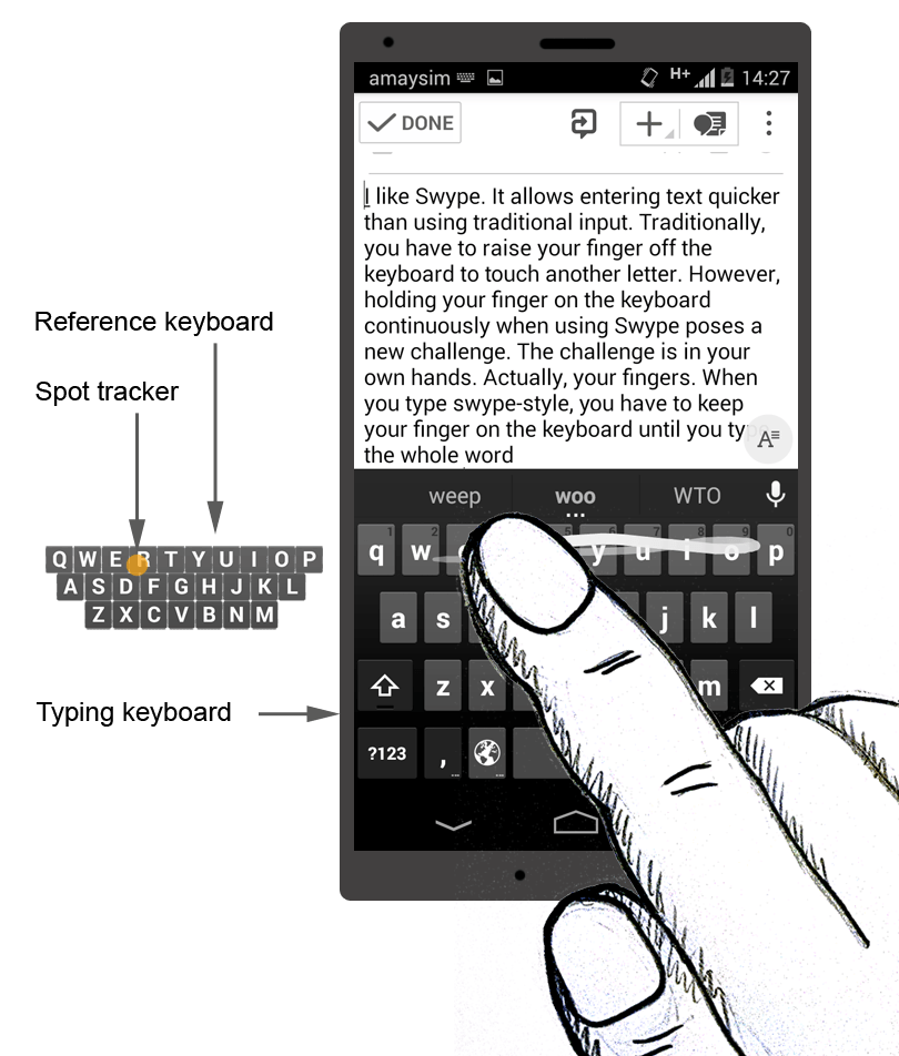
Let’s try for a more practical (and serious) solution. Perhaps we could put some kind of reference on the screen, one that would trace the current key and show all other keys as well. And what would be better for such a reference than another keyboard? However inelegant that sounds, perhaps we need to show two keyboards on the screen. One would be the action keyboard (AK), which is the existing one and on which the user would do all of the typing. The other would be for reference only (RK); it would be a smaller replica of the AK and would have only the alphanumeric keys. It would serve as a visual reference for the position of the user’s finger on the AK. As they move around the AK, a spot tracker representing their finger would move around the RK. Displaying a trace of their movement path on the RK might also help.
Usability Concerns
Because the proposed solution aims to improve the usability of CI, we should be careful not to create more pain points for the user. One potential pain point created in the process is that we’re jamming the screen with extra components — namely, the RK. A mobile device’s screen has very little room to accommodate even the tiniest of elements. Yet we need to put something relatively big onto it, a full second keyboard. This is the biggest challenge with the proposed solution.
Keeping in mind the heuristic of “user control and freedom”, we should give the user full control over the visibility and location of the RK. In particular, the RK should be easily accessible and hideable. In other words, no more than a flick (or comparable gesture) would be required to bring the RK on screen and then to remove it. It should also be easily moveable to any area of the screen.
Figuring out a default location for the RK would spare the user from having to make one more decision and spare them the effort of positioning the keyboard in the desired spot.
About half of the screen of our lab testing hardware is occupied by the user’s entered text. The remaining screen space is occupied by the AK and the elements for controlling the app, such as menus and buttons.
After careful consideration, we find that the only way to place the RK on a touchscreen is by sacrificing the text-input area of the screen.
About eleven lines of text fit on the screen when using the Evernote app, with the font at default size. The RK would occupy about three lines, leaving eight lines of unobscured text available for reference. If the most important part of the entered text is what the user has typed most recently, then the RK should be placed over the top three lines. Given that the start and end are probably the most important areas of a line, the middle of the top three lines are the most suitable area to place the RK.
Usage
Given all of this, the solution could work as follows.
The user is about to start entering text via CI. Swiping upward over the keyboard area brings up the RK, which appears in its default location over the text area. The user begins typing by sliding their finger over the AK, and they can clearly see both their current position and all of the keys on the RK. Locating each subsequent key to slide to now takes no effort.
If they need to see any text overlapped by the RK, the user simply slides the RK to another spot or flicks it off the screen. Either action requires just one gesture. They can bring the RK back on screen at any time with an upward swipe from the AK.
Further Considerations
Relative Size
To minimize the space occupied by the RK, the space between keys may be reduced. While the size of the characters would remain the same, the overall size of the RK would become less than that of the AK. Therefore, the spot tracker trail would be scaled relative to the finger movement. Without prototyping and testing for usability, it is unclear how much effort such a solution would require from the user and whether it would create new pain points. At this time, we’re basing our assessment on assumptions and empathy, rather than proper usability tests.
Discoverability
Revealing the RK through an upward flick from the AK also suffers from a discoverability problem. Possible solutions to this range from fairly standard, such as displaying a toggle button, to the more visually engaging, such as displaying a semi-transparent image of the RK in the default position at the beginning of a typing session, with options to show or hide the RK.
Variations
This basic idea could be implemented in a variety of ways, with variations in opacity, color, size, default placement of the RK and AK, and so on. The advantage of one variation over another would become clear only after usability testing.
Conclusion
Mobile devices present a whole new class of design challenges due to their size, and any new solution or technique must carefully preserve any positive UX. We’ve argued here that usability, an important aspect of UX, is problematic with continuous input typing, a technique intended to increase typing speed on mobile devices. We’ve seen that the advantages of CI are offset by the very nature of the technique for a sizeable user segment. The human anatomy and the altered mechanics of CI compared to traditional tapping make CI less practical for users who must visually guide themselves with every typed character.
Because CI relies on a different physiology of interaction than tapping, it might need more careful designing in order to succeed with users of varying levels of typing skill and to win the hearts (and fingers) of many users.
Visually guided text input is only one instance of the more general “identify, then use” approach to interaction between user and environment. As technology keeps changing in shape, size and functionality, new and unusual methods of interaction could supplant traditional ones. Thus, UX designers must stay at the forefront, helping both hardware manufacturers and software developers seamlessly implement their technology and continue changing this world for the better.
Resources
- “10 Usability Heuristics for User Interface Design,” Jakob Nielsen
- “Philosophy of Interaction and the Interactive User Experience,” Dag Svanaes, Interaction Design Foundation
- “Requiring Less Taps in Mobile UI,” Luke Wroblewski
Further Reading
- Animated Microinteractions In Mobile Apps
- Removing Stumbling Blocks In Mobile Forms
- Browser Input Events: Can We Do Better Than The Click?
- The (Not So) Secret Powers Of The Mobile Browser


