Coding An HTML 5 Layout From Scratch

Email Newsletter
Weekly tips on front-end & UX.
Trusted by 200,000+ folks.

 Flexible CMS. Headless & API 1st


HTML5 and CSS3 have just arrived (kinda), and with them a whole new battle for the ‘best markup’ trophy has begun. Truth to be told, all these technologies are mere tools waiting for a skilled developer to work on the right project. As developers we shouldn’t get into pointless discussions of which markup is the best. They all lead to nowhere. Rather, we must get a brand new ideology and modify our coding habits to keep the web accessible.
While it is true HTML5 and CSS3 are both a work in progress and is going to stay that way for some time, there’s no reason not to start using it right now. After all, time’s proven that implementation of unfinished specifications does work and can be easily mistaken by a complete W3C recommendation. That’s were Progressive Enhancement and Graceful Degradation come into play.
Further Reading on SmashingMag:
So today we're going to experiment a little with these new technologies. At the end of this article you'll learn how to:
- Use Graceful Degradation techniques and technologies to keep things in place for legacy browsers.
- Use Progressive Enhancement techniques and technologies to be up to date with the latest trends.
- Use HTML5 alongside a rising technology: Microformats.
- Have a clear vision of some of the most exciting new features HTML5 and CSS3 will bring.
It’d be a good idea to have a read at some of these articles first:
- HTML5 and The Future of the Web which teaches the very basics of HTML5, introduces new elements and explains some of the advantages of the new markup language.
- HTML5 enabling script which shows a method that enables HTML5 tags on IE6 to be styled.
- Understanding aside where the usually misunderstood new tag is explained.
I’ll also assume you know the basics of HTML and CSS. Including all the “old school” tags and the basic selectors and properties.
The HTML 5 Layout - Before we begin…
There’s a couple of things you have to bear in mind before adventuring on the new markup boat. HTML5 is not for everyone. Therefore, you must be wise and select how and where to use it. Think of all the markup flavours you’ve got available as tools: use the right one for the right job. Therefore, if your website is coded in standards compliant XHTML strict there’s no real need to change to HTML5.
There’s also the fact that by using HTML5 code right now your website gets stuck in some kind of “limbo” since even though your browser will render HTML5, it does not understand it as of yet. This may also apply to other software such as screenreaders and search engines.
Lastly you must consider that HTML5 is still under heavy development, and it’s probably the “most open” project the W3C has ever done. With the immense amount of feedback and all the hype around it, the current draft is bound to change and it’s impossible to predict how much.
So if you’re ready to do the switch, are not afraid of using technology that in the near future will be way more meaningful and can easily change whatever piece of code that might get broken, then keep reading.
A word on Progressive Enhancement and Graceful Degradation
So what are these two terms all about? Graceful Degradation is a widely used term which ideology is basically using the latest technologies first, and then fix anything that needs fixing for older browsers. We do this on a daily basis: most of us code for Firefox first, then fix Internet Explorer. That is Graceful Degradation in the practice.
Progressive Enhancement refers to the habit of building first for the less capable, outdated browser and then enhance for the latest technologies. We, too, use this on a daily basis. For example, most of the times we code a website we start with the markup and then apply an external CSS file where we add all the styling. That is Progressive Enhancement in the practice.
Both technologies usually go hand in hand and have been part of the ways we do things for years. It’s just the terms that are not that well-known. And now, both of these practices need to evolve due to the new languages that are approaching. If you want to go deeper into both of these terms, check a related article on accessites.org.
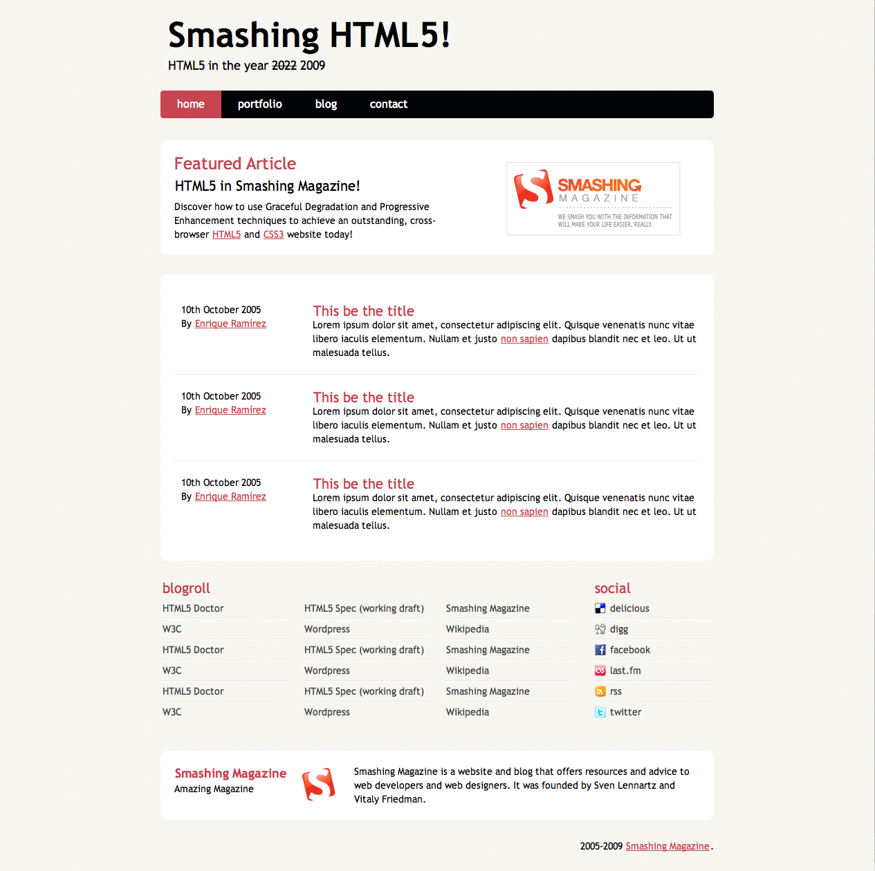
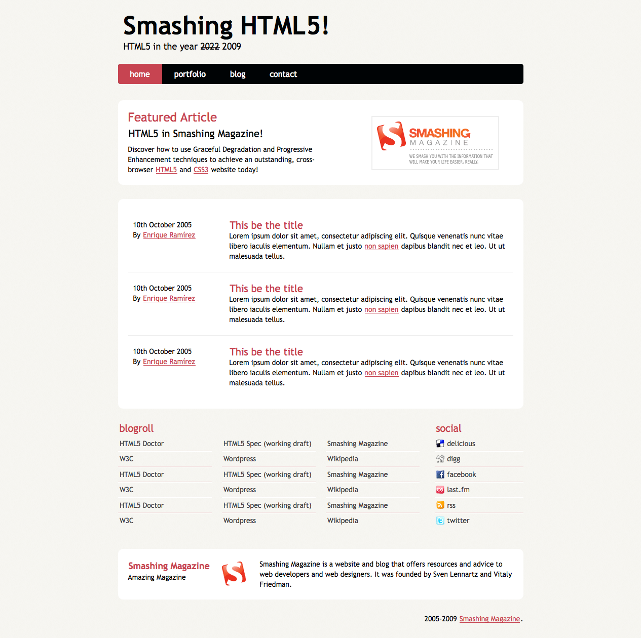
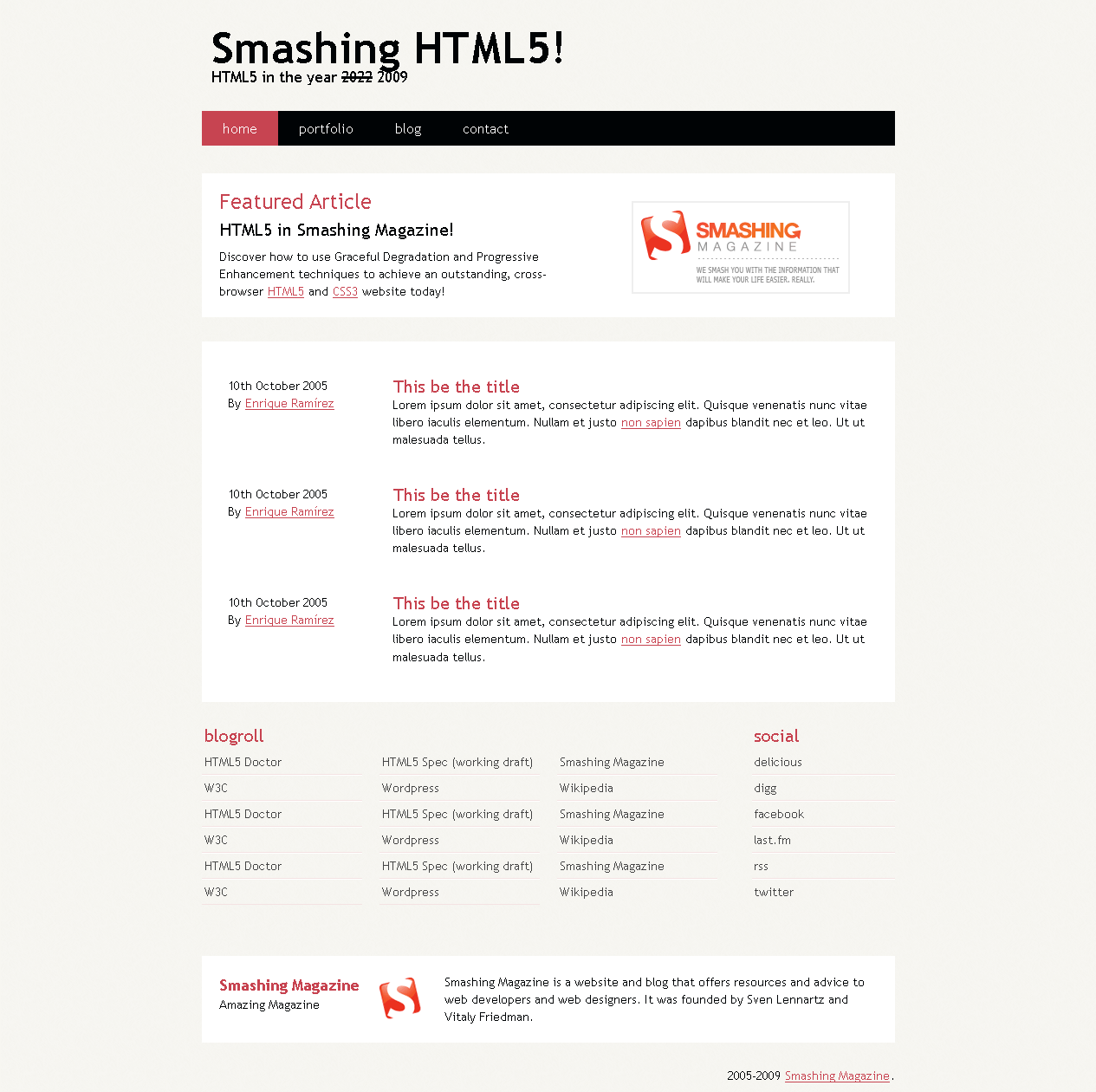
1. The Design
This will be the sample layout we’ll be coding:
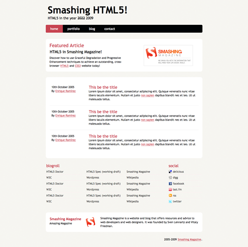
A very basic layout brilliantly named Smashing HTML5! which covers most of the elements we can start coding using HTML5. Basically: the page’s name and it’s slogan, a menu, a highlighted (featured) area, a post listing, an extras section with some external links, an about box and finally a copyright statement.
2. The markup
As a very basic start to our markup, this is our html file skeleton:
<!DOCTYPE html>
<html lang="en">
<head>
<meta charset="utf-8" />
<title>Smashing HTML5!</title>

<link rel="stylesheet" href="css/main.css" type="text/css" />

<!--[if IE]>
  <script src="https://html5shiv.googlecode.com/svn/trunk/html5.js"></script><![endif]-->
<!--[if lte IE 7]>
  <script src="js/IE8.js" type="text/javascript"></script><![endif]-->
<!--[if lt IE 7]>

  <link rel="stylesheet" type="text/css" media="all" href="css/ie6.css"/><![endif]-->
</head>

<body id="index" class="home">
</body>
</html>
A few highlights:
- 3 different Conditional comments for IE. First one includes html5 shiv code directly from Google Code for all versions of IE. The second one includes IE8.js for better backwards compatibility for IE7 and below as well as an ie.css file which will sove IE7 and below CSS bugs. Third one is just a CSS file to fix IE6 bugs.
- The use of an “index” id and a “home” class on the
<body>tag. This is just a habit I’ve developed over the past year that has simplified the coding of inner-sections of overly complicated websites. - A simplified version of the charset property for better backwards compatibility with legacy browsers.
- I’m using XHTML 1.0 syntax on a HTML5 document. That’s the way I roll. It’s a habit that I really like and since I can still use it, I will. You can, however, use normal HTML syntax here. That is, uppercase attribute and tag names, unclosed tags and no quotes for wrapping attributes’ values. It’s up to you.
This is a very basic and solid startup for all and any HTML5 projects you might do in the future. With this, we can start assigning tags to the different sections of our layout.
If we had an x-ray machine designed for websites, this would be our page’s skeleton:
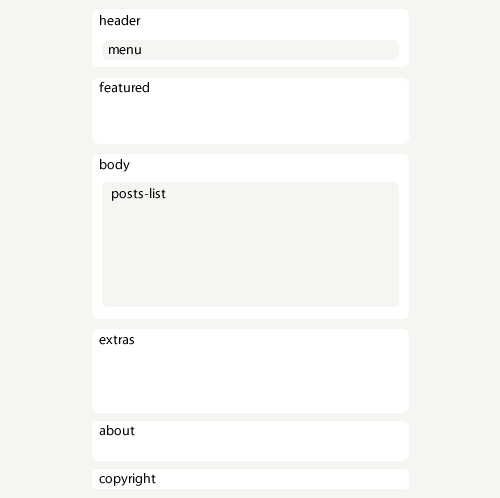
The header
The layout header is as simple as it gets. The new <header> tag spec reads as follows:
The header element represents a group of introductory or navigational aids
Thus it is more than logic that we use this to markup our header. We’ll also use the <nav> tag. The spec reads:
The nav element represents a section of a page that links to other pages or to parts within the page: a section with navigation links. Not all groups of links on a page need to be in a nav element — only sections that consist of major navigation blocks are appropriate for the nav element.There’s a lot of buzz regarding the spec of the nav element since “major navigation blocks” is not a very helpful description. But this time we’re talking about our main website navigation; it can’t get any major than that. So after a couple of id’s and classes our header ends up like this:
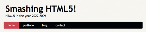
<header id="banner" class="body">
  <h1><a href="#">Smashing HTML5! <strong>HTML5 in the year <del>2022</del> <ins>2009</ins></strong></a></h1>

  <nav><ul>
    <li class="active"><a href="#">home</a></li>
    <li><a href="#">portfolio</a></li>

    <li><a href="#">blog</a></li>
    <li><a href="#">contact</a></li>
  </ul></nav>

</header><!-- /#banner -->
Featured block

Next is the featured block. This is best marked up as an <aside> since it’s spec says:
The aside element represents a section of a page that consists of content that is tangentially related to the content around the aside element, and which could be considered separate from that content. Such sections are often represented as sidebars in printed typography.
That pretty much sums up our featured block, so let’s go for it. Now, inside of this block there’s a lot going on. Firstly, this is an article, so alongside the <aside> tag, we should be using <article> right away.
We also have two consecutive headings (‘Featured Article’ and ‘HTML5 in Smashing Magazine!’) so we’ll be using yet another new element: <hgroup>. This is a wonderful tag used for grouping series of <h#> tags which is exactly what we have here. It exist to mask an h2 element (that acts as a secondary title) from the outline algorithm
, which will save developers some headaches in the future.
The last element on this block is the Smashing Magazine logo to the right. We have yet another new tag for this element: <figure>. This tag is used to enclose some flow content, optionally with a caption, that is self-contained and is typically referenced as a single unit from the main flow of the document
. This tag allows us to use a <legend> tag to add a caption to the elements inside. Sadly, this last feature is broken on some browsers as they try to add a <fieldset> around and it is impossible to override it with simple CSS rules. Therefore, I’d suggest leaving it aside and just use <figure> for the time being.
Featured block code will look like this in the end:
<aside id="featured" class="body"><article>
  <figure>
    <img src="images/temp/sm-logo.gif" alt="Smashing Magazine" />
  </figure>
  <hgroup>

    <h2>Featured Article</h2>
    <h3><a href="#">HTML5 in Smashing Magazine!</a></h3>
  </hgroup>
  <p>Discover how to use Graceful Degradation and Progressive Enhancement techniques to achieve an outstanding, cross-browser <a href="https://dev.w3.org/html5/spec/Overview.html" rel="external">HTML5</a> and <a href="https://www.w3.org/TR/css3-roadmap/" rel="external">CSS3</a> website today!</p>

</article></aside><!-- /#featured -->
The layout’s body
Next is our document’s body, where all the content will be. Since this block represents a generic document section
and a section is a thematic grouping of content
, this one is without a doubt a <section> tag.
For the posts, we’ll use the old <ol> tag since, well, it’s an ordered list of articles. Each <li> should have an <article> tag and within this, we’ll have a <header> for the post title, a <footer> for the post information and a <div> for the post content. Yes, a <div>.
The reason for using a div is simple: we’ll be using the hAtom 0.1 Microformat and it requires the content entry to be wrapped by an element. Since no other tag applies to this (it is not a section, it is not a full article, it is not a footer, etc.) we’ll use a <div> since it provides no semantic value by itself and keeps the markup as clean as possible.
With all these tags, and the hAtom microformat in place, the code shall look like this:
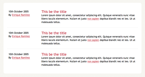
<section id="content" class="body">

  <ol id="posts-list" class="hfeed">

    <li><article class="hentry">
      <header>
        <h2 class="entry-title"><a href="#" rel="bookmark" title="Permalink to this POST TITLE">This be the title</a></h2>
      </header>

      <footer class="post-info">
        <abbr class="published" title="2005-10-10T14:07:00-07:00"><!-- YYYYMMDDThh:mm:ss+ZZZZ -->
          10th October 2005
        </abbr>

        <address class="vcard author">
          By <a class="url fn" href="#">Enrique Ramírez</a>

        </address>
      </footer><!-- /.post-info -->

      <div class="entry-content">
        <p>Lorem ipsum dolor sit amet, consectetur adipiscing elit. Quisque venenatis nunc vitae libero iaculis elementum. Nullam et justo <a href="#">non sapien</a> dapibus blandit nec et leo. Ut ut malesuada tellus.</p>

      </div><!-- /.entry-content -->
    </article></li>

    <li><article class="hentry">
      ...
    </article></li>

    <li><article class="hentry">
      ...
    </article></li>
  </ol><!-- /#posts-list -->

</section><!-- /#content -->
For the mighty ones: yes, I did not use the <time> element. This tag is rather new, and it is not compatible with the current microformat implementations out there. Since I’m indeed using hAtom it made little point to have both an invalid microformat and a yet-incomprehensible tag. If you’re not using a microformat, I’d suggest using <time> instead.
The extras block
The extras block is yet another section of our document. You might struggle for a while deciding whether an <aside> or a <section> tag would be best for this section. In the end, this section could not be considered separate from the main content
since it contains the blogroll links and some social information of the website. Thus, a <section> element is more appropriate.
Here we’ll also find another use for the <div> tag. For styling needs and grouping’s sake, we may add two divs here: one for the blogroll section and one for the social section.
For the rest of the block there’s nothing much to decide. It’s the everyday <ul> accommodated set of links on both sections, which in the end may look like this:
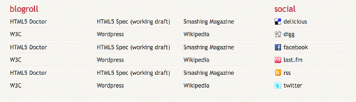
<section id="extras" class="body">
  <div class="blogroll">
    <h2>blogroll</h2>
    <ul>

      <li><a href="#" rel="external">HTML5 Doctor</a></li>
      <li><a href="#" rel="external">HTML5 Spec (working draft)</a></li>
      <li><a href="#" rel="external">Smashing Magazine</a></li>

      <li><a href="#" rel="external">W3C</a></li>
      <li><a href="#" rel="external">Wordpress</a></li>
      <li><a href="#" rel="external">Wikipedia</a></li>

    </ul>
  </div><!-- /.blogroll -->

  <div class="social">
    <h2>social</h2>
    <ul>

      <li><a href="https://delicious.com/enrique_ramirez" rel="me">delicious</a></li>
      <li><a href="https://digg.com/users/enriqueramirez" rel="me">digg</a></li>
      <li><a href="https://facebook.com/enrique.ramirez.velez" rel="me">facebook</a></li>

      <li><a href="https://www.lastfm.es/user/enrique-ramirez" rel="me">last.fm</a></li>
      <li><a href="https://website.com/feed/" rel="alternate">rss</a></li>
      <li><a href="https://twitter.com/enrique_ramirez" rel="me">twitter</a></li>

    </ul>
  </div><!-- /.social -->
</section><!-- /#extras -->
The About and footer blocks
The footer has no real difficulty. We’ll use the brand new <footer> tag to wrap both the about and the copyright information since the spec reads:
The footer element represents a footer for its nearest ancestor sectioning content. A footer typically contains information about its section such as who wrote it, links to related documents, copyright data, and the like.
Since the nearer ancestor of our <footer> tag is the <body> tag, is more than right to wrap both elements here since we’re adding information about the website’s owner (and thus, author).
For the about block we’ll use an <address> tag, which contains contact information for it’s nearest
. We’ll also use the hCard Microformat to enhance the semantic value. For the copyright information we’ll go with a simple <article> or <body> element ancestor<p> tag so the code ends like this:
<footer id="contentinfo" class="body">
<address id="about" class="vcard body">
<span class="primary">
<strong><a href="#" class="fn url">Smashing Magazine</a></strong>
<span class="role">Amazing Magazine</span>
</span><!-- /.primary -->
<img src="images/avatar.gif" alt="Smashing Magazine Logo" class="photo" />
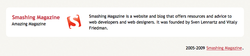
<span class="bio">Smashing Magazine is a website and blog that offers resources and advice to web developers and web designers. It was founded by Sven Lennartz and Vitaly Friedman.</span>
</address><!-- /#about -->
<p>2005-2009 <a href="https://smashingmagazine.com">Smashing Magazine</a>.</p>
</footer><!-- /#contentinfo -->
Summing it all up
So, after all this mess, the complete code looks like this:
<!DOCTYPE html>
<html lang="en">
<head>
<meta charset="utf-8" />
<title>Smashing HTML5!</title>

<link rel="stylesheet" href="css/main.css" type="text/css" />

<!--[if IE]>
  <script src="https://html5shiv.googlecode.com/svn/trunk/html5.js"></script><![endif]-->
<!--[if lte IE 7]>
  <script src="js/IE8.js" type="text/javascript"></script><![endif]-->

<!--[if lt IE 7]>
  <link rel="stylesheet" type="text/css" media="all" href="css/ie6.css"/><![endif]-->
</head>

<body id="index" class="home">

<header id="banner" class="body">
  <h1><a href="#">Smashing HTML5! <strong>HTML5 in the year <del>2022</del> <ins>2009</ins></strong></a></h1>

  <nav><ul>
    <li class="active"><a href="#">home</a></li>
    <li><a href="#">portfolio</a></li>

    <li><a href="#">blog</a></li>
    <li><a href="#">contact</a></li>
  </ul></nav>

</header><!-- /#banner -->

<aside id="featured" class="body"><article>
  <figure>
    <img src="images/temp/sm-logo.gif" alt="Smashing Magazine" />
  </figure>
  <hgroup>

    <h2>Featured Article</h2>
    <h3><a href="#">HTML5 in Smashing Magazine!</a></h3>
  </hgroup>
  <p>Discover how to use Graceful Degradation and Progressive Enhancement techniques to achieve an outstanding, cross-browser <a href="https://dev.w3.org/html5/spec/Overview.html" rel="external">HTML5</a> and <a href="https://www.w3.org/TR/css3-roadmap/" rel="external">CSS3</a> website today!</p>

</article></aside><!-- /#featured -->

<section id="content" class="body">
  <ol id="posts-list" class="hfeed">
    <li><article class="hentry">
      <header>
        <h2 class="entry-title"><a href="#" rel="bookmark" title="Permalink to this POST TITLE">This be the title</a></h2>

      </header>

      <footer class="post-info">
        <abbr class="published" title="2005-10-10T14:07:00-07:00"><!-- YYYYMMDDThh:mm:ss+ZZZZ -->
          10th October 2005
        </abbr>

        <address class="vcard author">

          By <a class="url fn" href="#">Enrique Ramírez</a>
        </address>
      </footer><!-- /.post-info -->

      <div class="entry-content">

        <p>Lorem ipsum dolor sit amet, consectetur adipiscing elit. Quisque venenatis nunc vitae libero iaculis elementum. Nullam et justo <a href="#">non sapien</a> dapibus blandit nec et leo. Ut ut malesuada tellus.</p>
      </div><!-- /.entry-content -->
    </article></li>

    <li><article class="hentry">
      ...
    </article></li>

    <li><article class="hentry">
      ...
    </article></li>

  </ol><!-- /#posts-list -->
</section><!-- /#content -->

<section id="extras" class="body">
  <div class="blogroll">
    <h2>blogroll</h2>

    <ul>
      <li><a href="#" rel="external">HTML5 Doctor</a></li>
      <li><a href="#" rel="external">HTML5 Spec (working draft)</a></li>

      <li><a href="#" rel="external">Smashing Magazine</a></li>
      <li><a href="#" rel="external">W3C</a></li>
      <li><a href="#" rel="external">Wordpress</a></li>

      <li><a href="#" rel="external">Wikipedia</a></li>
    </ul>
  </div><!-- /.blogroll -->

  <div class="social">

    <h2>social</h2>
    <ul>
      <li><a href="https://delicious.com/enrique_ramirez" rel="me">delicious</a></li>
      <li><a href="https://digg.com/users/enriqueramirez" rel="me">digg</a></li>

      <li><a href="https://facebook.com/enrique.ramirez.velez" rel="me">facebook</a></li>
      <li><a href="https://www.lastfm.es/user/enrique-ramirez" rel="me">last.fm</a></li>
      <li><a href="https://website.com/feed/" rel="alternate">rss</a></li>

      <li><a href="https://twitter.com/enrique_ramirez" rel="me">twitter</a></li>
    </ul>
  </div><!-- /.social -->
</section><!-- /#extras -->

<footer id="contentinfo" class="body">
  <address id="about" class="vcard body">
    <span class="primary">
      <strong><a href="#" class="fn url">Smashing Magazine</a></strong>

      <span class="role">Amazing Magazine</span>
    </span><!-- /.primary -->

    <img src="images/avatar.gif" alt="Smashing Magazine Logo" class="photo" />
    <span class="bio">Smashing Magazine is a website and blog that offers resources and advice to web developers and web designers. It was founded by Sven Lennartz and Vitaly Friedman.</span>

  </address><!-- /#about -->
  <p>2005-2009 <a href="https://smashingmagazine.com">Smashing Magazine</a>.</p>
</footer><!-- /#contentinfo -->

</body>
</html>
Say, isn’t that readable? It’s also way more semantic than a bunch of <div>s all over the place.
3. The CSS
Just like our markup, the CSS will also have a very basic start. Call this a frameworks of sorts which I’ve been using for a long time and works fairly well. Here’s the code for our main.css file:
/*
  Name: Smashing HTML5
  Date: July 2009
  description: >-
  Sample layout for HTML5 and CSS3 goodness.
  Version: 1.0
  Author: Enrique Ramírez
  Autor URI: https://enrique-ramirez.com
*/

/* Imports */
@import url("reset.css");
@import url("global-forms.css");

/***** Global *****/
/* Body */
  body {
    background: #F5F4EF url('../images/bg.png');
    color: #000305;
    font-size: 87.5%; /* Base font size: 14px */
    font-family: 'Trebuchet MS', Trebuchet, 'Lucida Sans Unicode', 'Lucida Grande', 'Lucida Sans', Arial, sans-serif;
    line-height: 1.429;
    margin: 0;
    padding: 0;
    text-align: left;
  }

/* Headings */
h2 {font-size: 1.571em} /* 22px */
h3 {font-size: 1.429em} /* 20px */
h4 {font-size: 1.286em} /* 18px */
h5 {font-size: 1.143em} /* 16px */
h6 {font-size: 1em} /* 14px */

h2, h3, h4, h5, h6 {
  font-weight: 400;
  line-height: 1.1;
  margin-bottom: .8em;
}

/* Anchors */
a {outline: 0;}
a img {border: 0px; text-decoration: none;}
a:link, a:visited {
  color: #C74350;
  padding: 0 1px;
  text-decoration: underline;
}
a:hover, a:active {
  background-color: #C74350;
  color: #fff;
  text-decoration: none;
  text-shadow: 1px 1px 1px #333;
}

/* Paragraphs */
p {margin-bottom: 1.143em;}
* p:last-child {margin-bottom: 0;}

strong, b {font-weight: bold;}
em, i {font-style: italic;}

::-moz-selection {background: #F6CF74; color: #fff;}
::selection {background: #F6CF74; color: #fff;}

/* Lists */
ul {
  list-style: outside disc;
  margin: 1em 0 1.5em 1.5em;
}

ol {
  list-style: outside decimal;
  margin: 1em 0 1.5em 1.5em;
}

dl {margin: 0 0 1.5em 0;}
dt {font-weight: bold;}
dd {margin-left: 1.5em;}

/* Quotes */
blockquote {font-style: italic;}
cite {}

q {}

/* Tables */
table {margin: .5em auto 1.5em auto; width: 98%;}

  /* Thead */
  thead th {padding: .5em .4em; text-align: left;}
  thead td {}

  /* Tbody */
  tbody td {padding: .5em .4em;}
  tbody th {}

  tbody .alt td {}
  tbody .alt th {}

  /* Tfoot */
  tfoot th {}
  tfoot td {}
This is our first step into getting the layout together. We can style most of the basic elements from here, so feel free to do so. Here’s a few highlights:
- For optimum coding, a few basic information on the .css file is at the top in comments form.
- 2 imports at the beginning of the file. The first one is Eric Meyer’s CSS reset file. Second one is a personalized global forms file which I’ll discuss more deeply later on.
- Very basic styling for the default tags.
Explaining some properties
For this very part, there’s little to be mentioned. Firstly there’s the text-shadow CSS3 property. To explain it, here’s a sample:
text-shadow: 1px 5px 2px #333;
This will give us a #333 shadow on our text that’s 1px to the right, 5px down and with a 2px blur. Simple, right? You can use hex and rgba values plus any CSS unit (except %) here.
We also have this little baby:
* p:last-child {margin-bottom: 0;}
This line will remove the margin bottom of any <p> tag that’s the last child of it’s parent. Useful when using boxes (like we’re doing) to avoid large vertical gaps.
Lastly, we have a couple of selectors:
  ::-moz-selection {background: #F6CF74; color: #fff;}
  ::selection {background: #F6CF74; color: #fff;}
::selection is a CSS3 selector that lets us style how the text selection looks. It only allows color and background CSS properties, so keep it simple. ::-moz-selection needs to go here since Mozilla haven’t implemented the ::selection selector.
Enabling HTML5 elements
Now, as I’ve stated before, browsers do not understand HTML5 as of yet. And since HTML5 is still in development, little has been discussed about the default styling the new elements will have. Thus, being tags that do not exist for the browser, it does not display any styling in them.
Perhaps it’s fair to assume that most browsers apply something like display: inline for all unknown tags that they might encounter. This is not what we want for some of them, such as <section>, so we need to tell explicitly to the browser how to display these elements:
/* HTML5 tags */
header, section, footer,
aside, nav, article, figure {
  display: block;
}
There! Now we can magically style our tags as if they were <div>s!
Limiting our blocks
Some of you might have noticed how I added the class=“body” attribute to the major sections of the layout in the markup. This is because we want the body of my website to be for a certain width (800px), and I’ve never been a fan of the big wrapping <div> to do that. So we’ll use the basic block centering technique using margins for this. I’m also adding a couple of generic classes to this section that might be used for a post side content.
/***** Layout *****/
.body {clear: both; margin: 0 auto; width: 800px;}
img.right figure.right {float: right; margin: 0 0 2em 2em;}
img.left, figure.left {float: right; margin: 0 0 2em 2em;}
Header styling
We’ll begin with our header. This one is fairly easy. We just want a couple of spacing and a few text styling here and there. Nothing we haven’t done before.
/*
  Header
*****************/
#banner {
  margin: 0 auto;
  padding: 2.5em 0 0 0;
}

  /* Banner */
  #banner h1 {font-size: 3.571em; line-height: .6;}
  #banner h1 a:link, #banner h1 a:visited {
    color: #000305;
    display: block;
    font-weight: bold;
    margin: 0 0 .6em .2em;
    text-decoration: none;
    width: 427px;
  }
  #banner h1 a:hover, #banner h1 a:active {
    background: none;
    color: #C74350;
    text-shadow: none;
  }

  #banner h1 strong {font-size: 0.36em; font-weight: normal;}
We now pass on to the navigation. Pretty much the same as before, nothing really new here. The regular horizontal list, a couple of colour edits. Nothing fancy.
  /* Main Nav */
  #banner nav {
    background: #000305;
    font-size: 1.143em;
    height: 40px;
    line-height: 30px;
    margin: 0 auto 2em auto;
    padding: 0;
    text-align: center;
    width: 800px;

    border-radius: 5px;
    -moz-border-radius: 5px;
    -webkit-border-radius: 5px;
  }

  #banner nav ul {list-style: none; margin: 0 auto; width: 800px;}
  #banner nav li {float: left; display: inline; margin: 0;}

  #banner nav a:link, #banner nav a:visited {
    color: #fff;
    display: inline-block;
    height: 30px;
    padding: 5px 1.5em;
    text-decoration: none;
  }
  #banner nav a:hover, #banner nav a:active,
  #banner nav .active a:link, #banner nav .active a:visited {
    background: #C74451;
    color: #fff;
    text-shadow: none !important;
  }

  #banner nav li:first-child a {
    border-top-left-radius: 5px;
    -moz-border-radius-topleft: 5px;
    -webkit-border-top-left-radius: 5px;

    border-bottom-left-radius: 5px;
    -moz-border-radius-bottomleft: 5px;
    -webkit-border-bottom-left-radius: 5px;
  }
We’re using another CSS3 property here: border-radius. This new CSS3 property lets us add rounded borders to our blocks without the need of unnecessary, non-semantic tags that will clutter our code or a million of images and clever background-positioning. No, that’s all a thing of the past. With this we just need to set the radius of our border and that’s it.
Of course, border-radius is not widely adopted yet, and thus, we need to use the equivalent properties for Mozilla- and Webkit-browsers. There are a lot of variations to this property, and can make your code a little big, but if you want rounded corners on most of the current browsers, you might as well add them.
You might as well notice the use of !important. This is basically to override the default styles (text-shadow) without complex specificity selectors. In this example it’s here mostly for educational purposes.
Featured block and Body styling
Here’s the CSS code for both blocks. Note that this is not the styling for the posts’ list. Just the major content block. As both of these blocks have no real special CSS properties, I’ll let you guys figure it out.
/*
  Featured
*****************/
#featured {
  background: #fff;
  margin-bottom: 2em;
  overflow: hidden;
  padding: 20px;
  width: 760px;

  border-radius: 10px;
  -moz-border-radius: 10px;
  -webkit-border-radius: 10px;
}

#featured figure {
  border: 2px solid #eee;
  float: right;
  margin: 0.786em 2em 0 5em;
  width: 248px;
}
#featured figure img {display: block; float: right;}

#featured h2 {color: #C74451; font-size: 1.714em; margin-bottom: 0.333em;}
#featured h3 {font-size: 1.429em; margin-bottom: .5em;}

#featured h3 a:link, #featured h3 a:visited {color: #000305; text-decoration: none;}
#featured h3 a:hover, #featured h3 a:active {color: #fff;}

/*
  Body
*****************/
#content {
  background: #fff;
  margin-bottom: 2em;
  overflow: hidden;
  padding: 20px 20px;
  width: 760px;

  border-radius: 10px;
  -moz-border-radius: 10px;
  -webkit-border-radius: 10px;
}
Again, this is our everyday coding style. Backgrounds, margins, colours and text styles we’ve been using for years. Perfect example of how styling HTML5 is not that different from current markup languages. It’s just as easy to style as it’s always been.
Extras block styling
Here things begin to get interesting. We’ll begin with basic styling for the block itself:
/*
  Extras
*****************/
#extras {margin: 0 auto 3em auto; overflow: hidden;}

#extras ul {list-style: none; margin: 0;}
#extras li {border-bottom: 1px solid #fff;}
#extras h2 {
  color: #C74350;
  font-size: 1.429em;
  margin-bottom: .25em;
  padding: 0 3px;
}

#extras a:link, #extras a:visited {
  color: #444;
  display: block;
  border-bottom: 1px solid #F4E3E3;
  text-decoration: none;
  padding: .3em .25em;
}

  /* Blogroll */
  #extras .blogroll {
    float: left;
    width: 615px;
  }

  #extras .blogroll li {float: left; margin: 0 20px 0 0; width: 185px;}

  /* Social */
  #extras .social {
    float: right;
    width: 175px;
  }
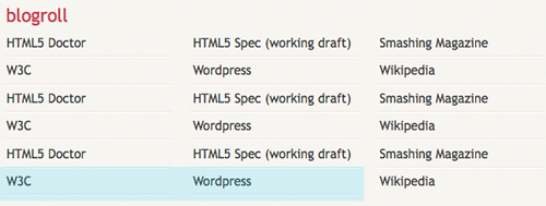
As you can see, I’m doing a 3 column layout for the blogroll block by floating the <li>s and a 1 column layout for the social block by merely changing its width. This already works very well by itself, but there’s one thing that bothers me. The borders I’ve added for separating each of the links:
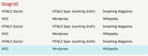
The highlighted row is the one troubling me. The borders I’ve added are actually on two elements. Each <li> and <a> tag have a border-bottom of 1px, which I don’t want on the last row. So we’ll remove the borders for the last 3 elements on blogroll, and the last element on social.
First we’ll remove the borders on the last <li> of each block. By using the CSS3 :last-child selector, we can target the last <li> of it’s parent <ul>.
  #extras li:last-child, /* last <li>*/
  #extras li:last-child a /* <a> of last <li> */
  {border: 0}
That will remove the border from the last link on both of our blocks. Now we have a new problem. How are we going to remove the border on the other two elements on the blogroll block?
Well, meet :nth-last-child().
#extras .blogroll li:nth-last-child(2),
#extras .blogroll li:nth-last-child(3),
#extras .blogroll li:nth-last-child(2) a,
#extras .blogroll li:nth-last-child(3) a {border: 0;}
Phew! Looks pretty hard, uh? Not really. This basically targets the second (2) and third (3) elements starting from the end. Exactly the ones I want to remove the border from.
As expected, this will not work on IE, though IE8.js does support :last-child, it does not support :nth-last-child, thus, borders will appear on IE. This is NOT a major design problem, information is still accessible, thus it is pointless to try to achieve the same effect on IE.
Adding icons to social
Now we’ll spice things up a little. We all love how little icons look besides each link. We’ve seen that design technique everywhere. There’s a million ways of applying them, but we’ll use some advanced CSS3 selectors to do this.
Let’s begin with a little introduction. a[n=‘b’] will target all <a> that has an n attribute value of b. So, for example, if we use this: a[href=‘picture.jpg’] we’ll be targeting an element like <a href="picture.jpg">. This is great, but not exactly what we want, since the follow-ups of the URL might have a different value. Here’s a couple of other selectors that might come in handy:
a[n]will target all<a>that has annattribute, regardless of its value.a[n='b']will target all<a>that has annattribute value ofb.a[n~='b']will target all<a>that has annattribute which one of its space-separated values isb.a[n^='b']will target all<a>that has annattribute that starts withb.a[n*='b']will target all<a>that has annattribute that hasbsomewhere within its value.
Note that neither of these is restricted to the <a> tag. This last one fits us perfectly. So we’ll search for an <a> tag that has a piece of text somewhere within its URL. So this is our code:
#extras div[class='social'] a {
  background-repeat: no-repeat;
  background-position: 3px 6px;
  padding-left: 25px;
}

/* Icons */
.social a[href*='delicious.com'] {background-image: url('../images/icons/delicious.png');}
.social a[href*='digg.com'] {background-image: url('../images/icons/digg.png');}
.social a[href*='facebook.com'] {background-image: url('../images/icons/facebook.png');}
.social a[href*='last.fm'], .social a[href*='lastfm'] {background-image: url('../images/icons/lastfm.png');}
.social a[href*='/feed/'] {background-image: url('../images/icons/rss.png');}
.social a[href*='twitter.com'] {background-image: url('../images/icons/twitter.png');}
The first bit lets us add a padding to the social links, where the icon will be. It’ll also set the default background settings so we don’t have to repeat ourselves. You might be wondering why I’m using div[class=‘social’] rather than the normal div.social. Simply because, for the browsers that don’t support this kind of selectors (cough IE Cough), we don’t want a white gap on the left of our links. Thus, using the same selector used for the background icons will keep me safe. IE won’t have a padding nor a background image, while the rest will do.
The second section uses the selector explained above to target each social network and add the proper icon.
This CSS technique is nothing new, and as powerful as it might be, it is not widely used (I’ve even seen JavaScript used to achieve this same thing). Yet another CSS feature that goes unnoticed and shouldn’t be.
Footer Styling
Lastly, we have our footer. As other examples above, this has just basic styling here and there. Besides the border-radius property, there’s nothing new in here.
/*
  About
*****************/
#about {
  background: #fff;
  font-style: normal;
  margin-bottom: 2em;
  overflow: hidden;
  padding: 20px;
  text-align: left;
  width: 760px;

  border-radius: 10px;
  -moz-border-radius: 10px;
  -webkit-border-radius: 10px;
}

#about .primary {float: left; width: 165px;}
#about .primary strong {color: #C64350; display: block; font-size: 1.286em;}
#about .photo {float: left; margin: 5px 20px;}

#about .url:link, #about .url:visited {text-decoration: none;}

#about .bio {float: right; width: 500px;}

/*
  Footer
*****************/
#contentinfo {padding-bottom: 2em; text-align: right;}
The Posts List
There’s only one last element to style. Once again, basic styling here, but this time, we’ll add a quick effect for when the user hovers over the post.
/* Blog */
.hentry {
  border-bottom: 1px solid #eee;
  padding: 1.5em 0;
}
li:last-child .hentry, #content > .hentry {border: 0; margin: 0;}
#content > .hentry {padding: 1em 0;}

.entry-title {font-size: 1.429em; margin-bottom: 0;}
.entry-title a:link, .entry-title a:visited {text-decoration: none;}

.hentry .post-info * {font-style: normal;}

  /* Content */
  .hentry footer {margin-bottom: 2em;}
  .hentry footer address {display: inline;}
  #posts-list footer address {display: block;}

  /* Blog Index */
  #posts-list {list-style: none; margin: 0;}
  #posts-list .hentry {padding-left: 200px; position: relative;}
  #posts-list footer {
    left: 10px;
    position: absolute;
    top: 1.5em;
    width: 190px;
  }
Some basics. I’m removing all margin and padding for the last post entry (so I don’t end up with a big gap at the bottom of my box). I’m also using the > selector which basically targets a direct child. For example, #content > .hentry will target a .hentry element that’s directly inside the #content. If the .hentry is inside, let’s say, an ordered list, this rule will not apply since it’s a grandchild and not a direct child of #content. This is to target the single post view once we get onto that.
Continuing with our code, we’ll get this:
#posts-list .hentry:hover {
  background: #C64350;
  color: #fff;
}
#posts-list .hentry:hover a:link, #posts-list .hentry:hover a:visited {
  color: #F6CF74;
  text-shadow: 1px 1px 1px #333;
}
This code will change the <li> background color, text color and its <a> color when the mouse is directly above the <li>. This is nothing new and has been possible since forever, but we’re adding it for a simple reason.
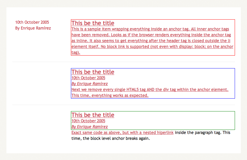
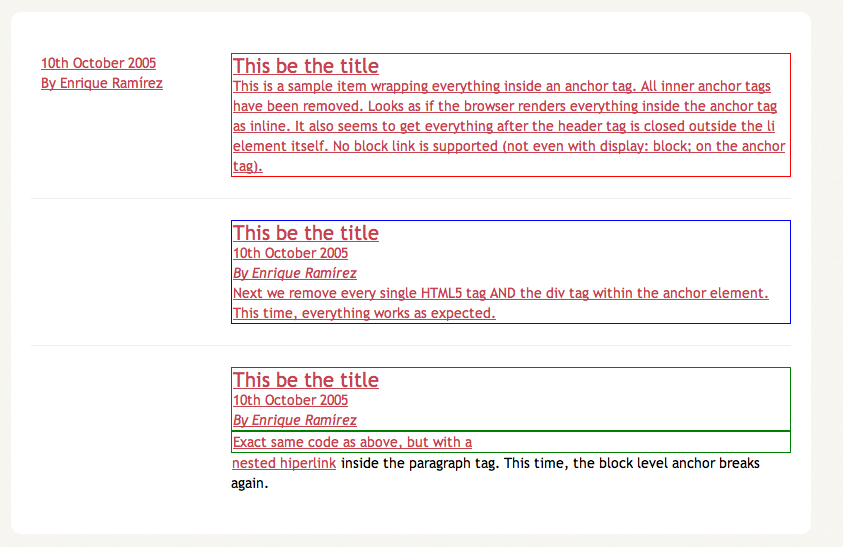
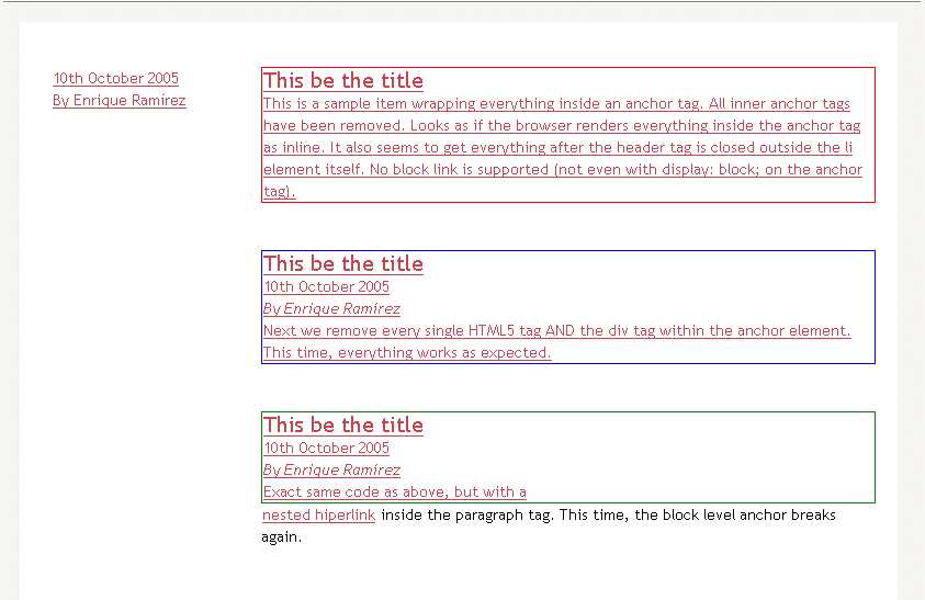
HTML5 lets users wrap block-level elements with <a> tags to create block linking areas. Basically, we’ll be able to wrap the entire <hentry> contents with an anchor and have it behave as a proper link. However, after some testing, I’ve figured that Firefox 3.5.1 is not ready for this. Perhaps because of the non-understandable new elements inside of each .hentry, everytime I added an anchor to wrap the contents, everything inside started to behave in weird manners. Safari, Opera and even IE6 work properly. Take a look at the test page. Below are a couple of screenshots for all of you single-browser users.
Opera 9.64:
Safari 4.0.2:
Internet Explorer 6:
Firefox 3.5.1:
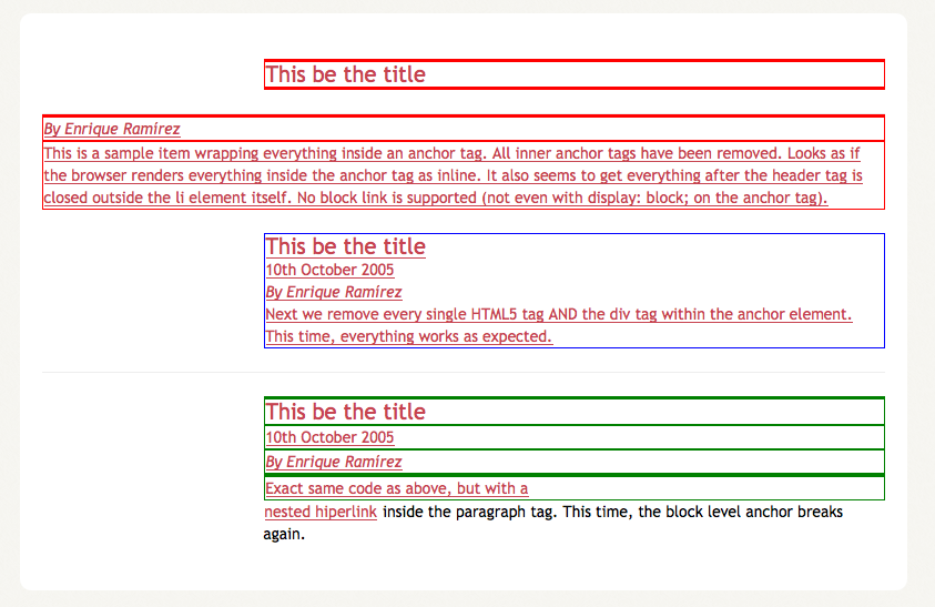
So block level anchors are really broken on Firefox, yet we can add a nice :hover effect to the <li>. So we can enhance our user experience visually, though not from the accessibility point of view.
Fixing IE6
Finally, we need to do some fixing for IE6. Below is the complete ie.css and ie6.css file. Each line has a comment on its right side or on the top explaining what it’s fixing. Pretty straightforward. This is ie.css:
#banner h1 {line-height: 1;} /* Fixes Logo overlapping */
And this is ie6.css file:
#featured figure {display: inline;} /* Double margin fix */
#posts-list footer {left: -190px;} /* Positioning fix */

/* Smaller width for Social block
so it won't jump to next line */
#extras .social {width: 165px;}
4. The aftermath
So, how does everything look now? It has been tested on IE6, Firefox 3, Firefox 3.5, Opera 9.64 and Safari 4.0.2. They all behave properly. Below are a series of screenshots of every browser.

It is now safe to say that you can achieve an HTML 5 Layout with CSS3 today that will work on past, current and future browsers without a problem. We are still far away from the time we can fully implement much of HTML5 video player code, but we can begin using it today.
Further Resources
There’s a lot of hype and websites dedicated right now to the HTML5 wonder. Here’s a couple:
- HTML5 Doctor Tips and tutorials that will help you implement HTML 5 today
- HTML5 Editor’s Draft Current Draft with everything you’ll ever need to know about HTML5
- HTML5 Gallery In the wild examples of HTML5 implementations
- The power of HTML 5 and CSS 3 Great article about some of the major HTML 5 and CSS 3 features
- HTML 5 and the Future of the Web This articles gives you some tips and insights into HTML5 to help ease the inevitable pain that comes with transitioning to a slightly different syntax.
- Take Your Design To The Next Level With CSS3 In this article, we’ll look at the advantages of CSS3 and some examples of how Web designers are already using it. By the end, we’ll know a bit of what to expect from CSS3 and how we can use its new features in our projects.


