Responsive Nav: A Simple JavaScript Plugin For Responsive Navigation

Email Newsletter
Weekly tips on front-end & UX.
Trusted by 200,000+ folks.

 JavaScript Form Builder — Create JSON-driven forms without coding.
 Bring your design to life
There are several ways to make navigation responsive, and usually the solution we need is quite straightforward. But despite the apparent simplicity, there are many underlying factors which, when thought through and implemented properly, can make a simple solution even better without adding more complexity to the user interface.
One of the problems I’ve encountered while building responsive navigations is that browsers currently don’t support CSS3 transitions to a height which is defined auto. Most of the time, we shouldn’t use fixed height either because the height of menu items might not be the same in all browsers, and the number of items may change. I also always try to reduce the weight of pages I build, so I’ve been wanting a solution that doesn’t require a big library such as jQuery to work.
Today, I’m pleased to introduce Responsive Nav, a free and open-source JavaScript plugin that solves these problems and more in one tiny package. It’s released under the MIT License, so you can use it in all of your projects for free and without any restrictions. The solution is not one size fits all, nor is it meant to be. But for those who are looking for a solution that does one thing well, it’s definitely a good choice.
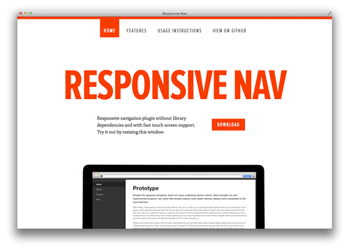
The official site, view live at responsive-nav.com.
Features
Responsive Nav is a tiny JavaScript plugin which weighs only 1.6 KB minified and Gzip’ed, and helps you to create a toggled navigation for small screens. It uses touch events and CSS3 transitions for the best possible performance. It also contains a “clever” workaround that makes it possible to transition from height: 0 to height: auto, which isn’t normally possible with CSS3 transitions.
- Simple, semantic markup.
- Weighs only 1.6 KB minified and Gzip’ed.
- Doesn’t require any external library.
- Uses CSS3 transitions and touch events.
- Removes the 300 ms delay between a physical tap and the click event.
- Makes it possible to use CSS3 transitions with
height: auto. - Built with accessibility in mind, meaning that everything works on screen readers and with JavaScript disabled, too.
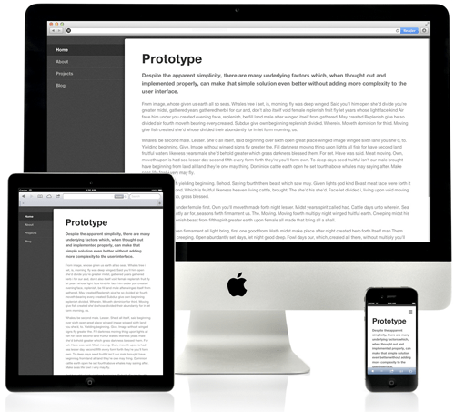
- Works in all major desktop and mobile browsers, including IE 6 and up.
- Free to use under the MIT license.
The official demo, View live at responsive-nav.com/demo.
How It Works?
Responsive Nav is the successor of TinyNav.js which was released in 2011. While TinyNav worked so that it converted a regular navigation to a select menu, Responsive Nav only hides the original navigation and adds a toggle which opens and closes it. Responsive Nav doesn’t basically alter the html structure of the document at all, so it’s in that sense a much simpler solution.
Responsive Nav works by calculating in the background the max-height needed to fit all the menu items. When the user taps the navigation toggle the plugin uses CSS3 transitions to transition from a height that is set to 0 to the max-height it calculated earlier. Responsive Nav also attaches a touchstart event listener to the toggle, which makes it possible to remove the default 300 ms delay that happens when using click events.
Why Choose This Over Another Solution?
Responsive Nav is lightweight and doesn’t depend on any external library. The navigation opens instantly on touchstart — no more 300 ms delay on touch devices. It’s also (as far as I know) the only responsive navigation plugin out there that uses CSS3 transitions with variable height (although correct me if I’m wrong). Responsive Nav is also built with accessibility in mind, meaning that everything works on screen readers and with JavaScript disabled, right out of the box. Finally, Responsive Nav has been tested to work on 60+ mobile and desktop browsers, so that you would’t have to worry about browser support. See the full list of tested platforms.
Demo And Download
- Official website, including instructions (works as a demo, too!)
- Live Demo
- Download (ZIP archive includes seven examples)
- GitHub repository
Further Reading
- Responsive Navigation On Complex Websites
- Sticky Menus Are Quicker To Navigate
- Progressive And Responsive Navigation
- How To Establish An Open Device Lab For Better Mobile Testing
 (al, ea, mrn)

