How To Customize Twitter’s Bootstrap
Twitter’s Bootstrap has taken off like a rocket since its release a year ago. The popular CSS framework supplies a responsive grid system, pre-styled components and JavaScript plugins to a parade of websites.
One of Bootstrap’s appeals is that it just works. It’s a significant time-saver when starting a website, so much so that major organizations such as NBC, NASA and the White House are adopting it. And it empowers even the non-designers among us to turn out something decent.
To illustrate, you can transform the default button below on the left to the polished one on the right just by adding two classes: btn and btn-primary.

A browser’s default button (left) and a Bootstrap button (right).
But what if your company logo is a different shade of blue? Not to worry. You don’t have to stick with the defaults. This article shows some ways to customize Bootstrap to fit your needs, whether it’s a tweak to a button or a full-fledged theme.

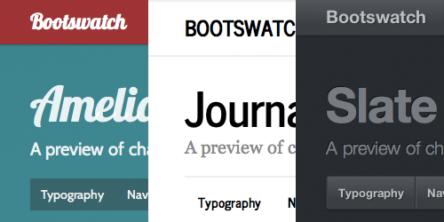
Three Bootstrap themes from Bootswatch
Overriding With CSS
The most straightforward approach is to override Bootstrap’s styles using CSS. This can be accomplished by writing your own styles for the classes used in Bootstrap. You could, for example, make your buttons more rounded by adding the following code:
.btn {
   -webkit-border-radius: 20px;
   -moz-border-radius: 20px;
   border-radius: 20px;
}
A Bootstrap button customized with an increased border radius.
For the overrides to be successful, remember to add your code after Bootstrap’s have been declared.
The advantage of this method is that it hardly changes your workflow. Even when using Bootstrap, you’ll want your own style sheet in order to fit the framework to your content just right. You might not realize it, but Bootstrap’s own website relies on a thousand-line style sheet on top of Bootstrap.
But for more extensive changes (such as overhauling the navigation bar) or for changes that aren’t localized (such as changing the highlight color used throughout the website), overriding in this piecemeal fashion can feel like a band-aid solution. And your new styles are tacked onto Bootstrap’s default style sheet, adding bloat to the already considerable 100 KB size. If you’re planning more than a few such overrides, you may want to consider a more extensive approach.
Generating A Custom Build
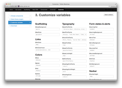
An alternative is to create a custom build entirely. With the official generator, you can assign your own values to key variables that are reused throughout the framework, such as @linkColor, @navbarHeight and @baseFontFamily. Click the big button at the end of the generator and download the resulting style sheet. You can even pick and choose which components to include, slimming down your file size.

Some of the variables that can be set in the official generator. (Large version)
Several third-party generators are also available on the Web. Unlike the official generator, they provide live previews as you adjust variables. Bootswatchr organizes itself by variable, and StyleBootstrap by component. BootTheme adds a roll-the-dice feature to randomize your values. If lady luck isn’t on your side, Lavish can generate a theme from any image you provide, and PaintStrap from existing color schemes.
Using a generator simplifies the logistics of custom-building Bootstrap. And with a deft hand, you can pull together a well-designed, unique look.
Digging Into LESS
Even with over a hundred variables, you still might find generators too constraining. Or you might not want to work in-browser, which can limit integration with your workflow. In either case, it’s time to dig into Bootstrap’s source.
Getting To The Source
As an open-source project, Bootstrap’s source code is freely available (ZIP) for downloading.
Open the source and you’ll notice that Bootstrap’s styles aren’t written in CSS after all, but in LESS. LESS is a dynamic style sheet language that sports a number of advantages over CSS, including the ability to nest selectors and to create variables (as used in the generators above). Once written, the LESS code is compiled to CSS either in advance or at runtime. If Sass is your preferred language, there’s a Sass conversion of Bootstrap.
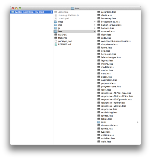
In the less directory, you’ll find a bunch of LESS files labelled by component.

The LESS files that make up Bootstrap’s source. (Large version)
Some things to note about these files:
bootstrap.lessThis is the central file. It imports all of the others and is the one you’ll ultimately compile.reset.lessAlways the first file to be imported.variables.lessandmixins.lessThese always follow because they’re dependencies for the rest. The former contains the same variables as used on the generator websites.utilities.lessThis is always the last file to be imported, in order for the classes that it contains to override the rest of the styles where necessary.
Open up the LESS files and check out how Bootstrap styles each component. For example, in buttons.less, here is the rule for the .btn-large class:
.btn-large {
   padding: 9px 14px;
   font-size: @baseFontSize + 2px;
   line-height: normal;
   .border-radius(5px);
}
As you can see, it looks very similar to CSS. It does have a couple of LESS-specific features, however. In the font-size declaration, the variable @baseFontSize — specified in variables.less — and an addition operation are combined to calculate the value. The .border-radius mixin, defined in mixins.less, also handles vendor prefixes so that we don’t have to.
It’s within these LESS files that you can make your customizations. Start with the values in variables.less, then experiment with the styles in the rest of the source. Have some fun with it.
Installing LESS
After you’ve made some changes and are ready to view them, you’ll want to compile to CSS. To do this, you’ll need to install LESS. You have a number of options; for starters, I’d suggest a client such as LESS.app.
If you prefer the command line, then install Node.js, which includes the Node Package Manager (NPM). Then, issue the following command:
npm install less
Once it’s installed, you can compile bootstrap.less like so:
lessc bootstrap.less > bootstrap.css
And for the minified version, use this instead:
lessc --compress bootstrap.less > bootstrap.min.css
Regardless of how you compile, target only bootstrap.less when compiling, not any of the other files.
Modularizing Your Changes
You might notice a limitation of the approach above. Your changes are now intertwined with the original source. So, when Bootstrap is inevitably updated with bug fixes and new features, disentangling your customizations and updating them to the new version will be nearly impossible.
To avoid this issue, you’ll want to modularize your changes. Here’s the approach I take when making themes for Bootswatch.
First, I download Bootstrap’s source code, rename it to bootstrap and leave it untouched. Instead of making changes to the files that it contains, I create a separate folder, named custom, with these three files:
custom-variables.lessI make a copy ofvariables.lessfrom Bootstrap’s source and modify the variables in this copy instead.custom-other.lessThis file holds any other customizations that I want to make that aren’t possible with the variables.custom-bootstrap.lessThis is the new “central” file that you’ll compile to CSS. Along with the original LESS files, it imports the two custom files above using the following commands:
@import "../bootstrap/less/bootstrap.less";
@import "custom-variables.less";
@import "custom-other.less";
@import "../bootstrap/less/utilities.less";
By keeping the changes separate, you can easily upgrade to newer versions of Bootstrap. Just replace the old bootstrap directory with the new one, and recompile.
I’ve created a boilerplate for this set-up, named swatchmaker. It also includes some extras, such as test pages and commands to update Bootstrap to the latest version, to automatically compile whenever changes are saved, and to reset your customizations.
Tips And Techniques
Here are additional tips and techniques that you might find helpful when customizing Bootstrap.
- Get to know Bootstrap. Read the official documentation, familiarize yourself with all of the components, and learn the ins and outs of the source. If you will be regularly customizing Bootstrap, then the time you invest here will pay off down the line.
- Start with variables first. Whether you’re using a generator or editing the source, begin your modifications with the supported variables. You might discover that they’re sufficient for your needs. Just changing the navigation bar and basic colors is a huge start.
- Pick your palette. Think about your website’s color scheme, particularly your primary and secondary accent colors. Some good resources are out there to help you with this. After you’ve decided on a palette, set up and use these colors as variables. You shouldn’t be seeing hex codes sprinkled throughout your code.
- Add some assets. A textured background and custom font make a world of difference. For Web fonts, you can add the
@importstatement anywhere in your code, because LESS will hoist it to the top of the generated CSS. I like to keep mine at the top ofcustom-other.less. - Use alpha transparency. When adding touches like
box-shadowandtext-shadow, define your colors using RGBa, with fallbacks for old browsers, and use your values consistently. This will add cohesion to your components. - Match selectors. When overriding a class, try to use the same selector that Bootstrap uses. This will help to keep your classes in sync with the originals and avoid an escalating specificity war. Remember that, in a tie, the last one wins. With the modularized set-up above, your customizations will always override the defaults.
- Encapsulate your code. Remember that LESS allows for nested selectors. Make use of this to encapsulate each component. I’ve found this to be a big help in keeping code tidy and readable. While both work the same, rather than using this…
.navbar .brand {
  color: @white;
}

.navbar .nav > li > a {
  color: @grayLighter;
}
… try this:
.navbar {

   .brand {
    color: @white;
   }

   .nav > li > a {
    color: @grayLighter;
   }
}
- Take advantage of mixins. Out of the box, LESS includes handy mixins such as
lighten()anddarken(). The ones that Bootstrap defines inmixins.lessare also at your disposal. And don’t forget that you can always create your own. - Learn by example. Look at how others are customizing Bootstrap. For instance, the sources for all of my themes are available on GitHub.
Do you have a tip to add? Please share in the comments below.
Final Word
If performance is a priority — as it often should be — then you’ll be best served by tailoring your own solution atop a more lightweight foundation.
But if your goal first and foremost is to launch your website, or if front-end development isn’t your strong suit, then Twitter Bootstrap may be right for you. Many people put themselves in these camps, judging by Bootstrap’s popularity.
Given its heavy usage across the Web, consider taking everything good about Bootstrap and making it your own.
Further Reading
- How Marketing Changed OOP In JavaScript
- How To Build Server-Side Rendered (SSR) Svelte Apps With SvelteKit
- New CSS Viewport Units Do Not Solve The Classic Scrollbar Problem
- Making Sense Of “Senseless” JavaScript Features


 Register!
 Flexible CMS. Headless & API 1st


