How To Set Weights And Styles With The @font-face Declaration

Email Newsletter
Weekly tips on front-end & UX.
Trusted by 200,000+ folks.
 Flexible CMS. Headless & API 1st


If people are on your website, they’re probably either skimming quickly, looking for something, or they’ve found what they’re looking for and want to read it as easily as possible. Either way, keeping text readable will help them achieve their goal.
Bold And Italic Help To Organize Content
A few months ago, I wrote an article on “Avoiding Faux Weights and Styles with Google Web Fonts.” I ended the article by showing that weights and styles are an important UX element when setting text. Bold and italic forms of a font help people to skim your website. They add emphasis — both strong and subtle — that can help visitors understand the organization of content before even starting to read it.
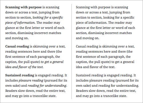
Weights and styles are an important UX element. Bold and italic help readers to see structure and to skim the text more efficiently (left). The same text without bold or italic (right) feels more like a narrative.
In this article, we’ll start where we left off. Because weights and styles help our visitors to read our content, we should make sure they work! And getting weights and styles to work correctly using the @font-face declaration can be a bit crazy-making. Let’s look at two popular approaches to setting weights and styles with the @font-face declaration. I’ll show you why they are not the best solutions, and show you a third more effective approach to follow.
Unique Font-Family Names, Normal Weights And Styles
If you’ve used one of FontSquirrel’s amazing @font-face kits, then you’re familiar with this approach to setting weights and styles. The CSS provided in every kit uses a unique font-family name for each weight and style, and sets the weight and style in the @font-face declaration to normal.
For example, the syntax for Ubuntu Italic and Ubuntu Bold looks like this:
@font-face {
   font-family: 'UbuntuItalic';
      src: url('Ubuntu-RI-webfont.eot');
      src: url('Ubuntu-RI-webfont.eot?#iefix') format('embedded-opentype'),
           url('Ubuntu-RI-webfont.woff') format('woff'),
           url('Ubuntu-RI-webfont.ttf') format('truetype'),
           url('Ubuntu-RI-webfont.svg#UbuntuItalic') format('svg');
   font-weight: normal;
   font-style: normal;
}

@font-face {
   font-family: 'UbuntuBold';
      src: url('Ubuntu-B-webfont.eot');
      src: url('Ubuntu-B-webfont.eot?#iefix') format('embedded-opentype'),
           url('Ubuntu-B-webfont.woff') format('woff'),
           url('Ubuntu-B-webfont.ttf') format('truetype'),
           url('Ubuntu-B-webfont.svg#UbuntuBold') format('svg');
   font-weight: normal;
   font-style: normal;
}
Notice that the font-family names are unique, with each font-family name accessing the appropriate Web font files. For example, UbuntuItalic accesses Ubuntu-RI-webfont.woff, while UbuntuBold accesses Ubuntu-B-webfont.woff.
Also, notice that the font-weight and font-style for both @font-face declarations are set to normal.
Styling Text Using This Method
To style text using this method, use the appropriate font-family name, and keep all weights and styles set to normal. For example, the Regular, Regular Italic, Bold and Bold Italic headings below are set with classes. The classes are styled like so:
.u400 {
   font-family: 'UbuntuRegular', arial, sans-serif;
   font-weight: normal;
   font-style: normal;
}

.u400i {
   font-family: 'UbuntuRegularItalic', arial, sans-serif;
   font-weight: normal;
   font-style: normal;
}

.u700 {
   font-family: 'UbuntuBold', arial, sans-serif;
   font-weight: normal;
   font-style: normal;
}

.u700i {
   font-family: 'UbuntuBoldItalic', arial, sans-serif;
   font-weight: normal;
   font-style: normal;
}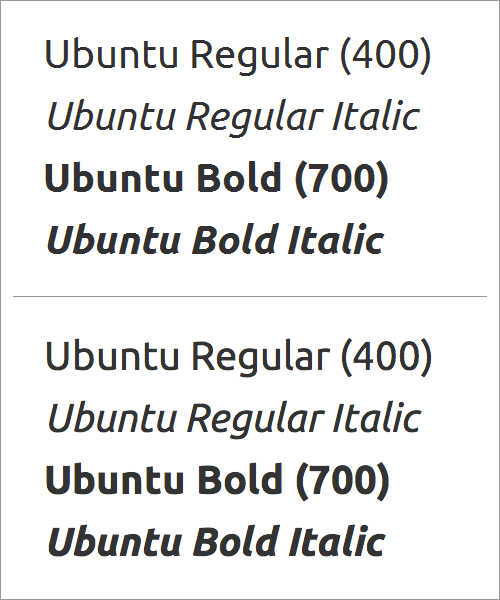
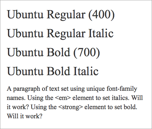
Ubuntu Regular, Italic, Bold and Bold Italic on Windows 7 in Internet Explorer 8 (top) and on Mac OS X in Chrome 23 (bottom). Unique font-family names with normal weights and styles (á la FontSquirrel) work fine.
Make Sure The Weights And Styles Match!
Because the weights and styles are set to normal in the @font-face declarations, keeping the weights and styles set to normal when styling the text is important. Otherwise, the bolds may double-bold (some browsers will add a bold weight to the already bold Web font), and the italics may double-italic (some browsers will add an italic style to the already italic Web font).
For example, let’s say we incorrectly set the font-style to italic and the font-weight to 700 (bold) in our corresponding classes:
.u400 {
   font-family: 'UbuntuRegular', arial, sans-serif;
   font-weight: normal;
   font-style: normal;
}

.u400i {
   font-family: 'UbuntuRegularItalic', arial, sans-serif;
   font-weight: normal;
   font-style: italic;
}

.u700 {
   font-family: 'UbuntuBold', arial, sans-serif;
   font-weight: 700;
   font-style: normal;
}

.u700i {
   font-family: 'UbuntuBoldItalic', arial, sans-serif;
   font-weight: 700;
   font-style: italic;
}
The fonts will render incorrectly in Mac OS X browsers and on iPad Safari browsers.
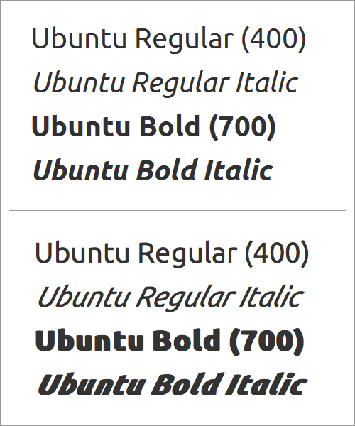
When using normal weights and styles in the @font-face declaration, give text elements normal weights and styles, too. Otherwise, your text may end up with a double-bold and double-italic. If you set text elements as bold or italic, then Ubuntu Italic, Bold and Bold Italic won’t double-bold or double-italic on Windows 7 in Internet Explorer 8 (top). But look at what happens on Mac OS X in Firefox 17 and on iPad 3 with iOS 5.1 in Safari (bottom) — yikes!
Using <em> And <strong> Elements
While <em> and <strong> can be styled to communicate emphasis and importance in a variety of ways, they are often used in their default forms: with <em> set to italic text and <strong> set to bold text.
For example, the paragraph below is styled like so:
p {
   font-family: 'UbuntuRegular', arial, sans-serif;
   font-weight: normal;
   font-style: normal;
}
And the <em> and <strong> elements are left in their default states:
em {
   font-style: italic;
}

strong {
   font-weight: bold;
}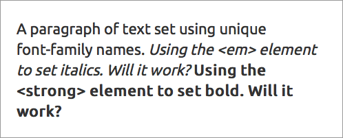
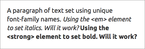
Applying <em> and <strong> in their default states results in faux italic and faux bold.
The result is a faux italic and a faux bold. Why? Because the paragraph is set to Ubuntu Regular, with the weight and style set to normal. When the <em> element is applied, the text remains Ubuntu Regular but is slanted to look like it’s italic. Notice the angular “e” and the double-story “a.” When the <strong> element is applied, the text remains Ubuntu Regular but is stretched to look like it’s bold. Notice the letter “e” is no longer monoline — the sides of the letter look thicker than the top and bottom of the letter.
We can fix this problem by making sure the <em> and <strong> elements use the correct font-family name. For example, the paragraph below continues to be styled like so:
p {
   font-family: 'UbuntuRegular', arial, sans-serif;
   font-weight: normal;
   font-style: normal;
}
And the <em> and <strong> elements are styled to use the correct corresponding font-family names:
em {
   font-family: 'UbuntuRegularItalic', arial, sans-serif;
   font-weight: normal;
   font-style: normal;
}

strong {
   font-family: 'UbuntuBold', arial, sans-serif;
   font-weight: normal;
   font-style: normal;
}
Notice that the font-weight and font-style for both <em> and <strong> are set to normal. This is counterintuitive, but necessary so that the text doesn’t end up with a double-italic or a double-bold.
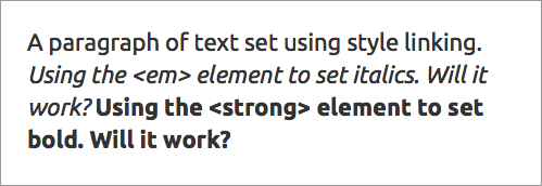
Using the correct font-family names — and setting weights and styles to normal — results in true italic and true bold.
The result is a true italic and true bold. Why? Because while the paragraph is set to Ubuntu Regular, the <em> element is set to Ubuntu Italic and the <strong> element is set to Ubuntu Bold — and all weights and styles are set to normal.
Problem: If The Fallback Font Loads, Weights And Styles Will Be Lost
While purposely stripping out weights and styles is counterintuitive, using a unique font-family name and normal weights and styles does work — as long as the Web font loads.
If the fallback font loads, then all bolds and italics will be lost — because we had set all weights and styles to normal — thus making it harder for readers to see the structure of your website’s content and making it harder for them to skim the text.
If the Web font doesn’t load, then the fallback font (here, Times New Roman) will load with a normal weight and style — undermining hierarchy and readability. Remember, we had set all weights and styles to normal when we styled the elements!
The Short Version
Using unique font-family names combined with setting font-weight and font-style to normal is unforgiving. Mismatching weights and styles could easily result in either faux italic and faux bold or double-italic and double-bold. If the Web font doesn’t load, then the result will be no italic or bold! So, this approach to setting weights and styles using the @font-face declaration isn’t the best solution.
Style Linking
Another way to set weights and styles is to use the same font-family name multiple times, setting the weights and styles in each @font-face declaration to match the weight and style of the Web font file being accessed. This approach is called style linking.
For example, using style linking, the syntax for Ubuntu Italic and Ubuntu Bold would look like this:
@font-face {
   font-family: 'Ubuntu';
      src: url('Ubuntu-RI-webfont.eot');
      src: url('Ubuntu-RI-webfont.eot?#iefix') format('embedded-opentype'),
           url('Ubuntu-RI-webfont.woff') format('woff'),
           url('Ubuntu-RI-webfont.ttf') format('truetype'),
           url('Ubuntu-RI-webfont.svg#UbuntuItalic') format('svg');
   font-weight: 400;
   font-style: italic;
}

@font-face {
   font-family: 'Ubuntu';
      src: url('Ubuntu-B-webfont.eot');
      src: url('Ubuntu-B-webfont.eot?#iefix') format('embedded-opentype'),
           url('Ubuntu-B-webfont.woff') format('woff'),
           url('Ubuntu-B-webfont.ttf') format('truetype'),
           url('Ubuntu-B-webfont.svg#UbuntuBold') format('svg');
   font-weight: 700;
   font-style: normal;
}
Notice that the font-family names are the same, regardless of what Web font file is being accessed. For example, Ubuntu accesses Ubuntu-RI-webfont.woff, and Ubuntu also accesses Ubuntu-B-webfont.woff. How does that work?
Notice that the font-weight and font-style for each @font-face declaration is set to match the weight and style of the Web font file being accessed. The Ubuntu that accesses the italic Web font file has font-style: italic. The Ubuntu that accesses the bold Web font file has font-weight: 700.
In this method, the weights and styles in the @font-face declarations act as “markers.” When a browser encounters those weights and styles elsewhere in the CSS, it knows which @font-family declaration to use and which Web font files to access.
Styling Text Using Style Linking
To style text with this method, use the same font family for all versions of the font. Set weights and styles to trigger the correct Web font files that the browser should access. If you want the italic version of the font, make sure to set font-style: italic. For example, the Regular, Regular Italic, Bold and Bold Italic headings below are set with classes. The classes are styled like so:
.u400 {
   font-family: 'Ubuntu', arial, sans-serif;
   font-weight: 400;
   font-style: normal;
}

.u400i {
   font-family: 'Ubuntu', arial, sans-serif;
   font-weight: 400;
   font-style: italic;
}

.u700 {
   font-family: 'Ubuntu', arial, sans-serif;
   font-weight: 700;
   font-style: normal;
}

.u700i {
   font-family: 'Ubuntu', arial, sans-serif;
   font-weight: 700;
   font-style: italic;
}
Ubuntu Regular, Italic, Bold and Bold Italic on Windows 7 in Internet Explorer 8 (top) and on Mac OS X in Chrome 23 (bottom). Using style linking to set weight and style appears to work fine.
Again, Make Sure The Weights And Styles Match!
Because weight and style are used to “trigger” the correct @font-face declaration, setting weights and styles to match those used in the @font-face declarations is important. As a bonus, when default rules for weights and styles are applied by browsers — like italic for <em> and bold for <strong> — then the correct fonts will automatically load (as long as your font has a bold and italic version), because the default rules will also trigger the correct @font-face declaration.
When default rules for weights and styles are applied by browsers — like italic for <em> and bold for <strong> — then the correct fonts will automatically load (as long as your font has a bold and italic version). Again, using style linking to set weight and style appears to work fine.
Bonus: If The Fallback Font Loads, Weights And Styles Will Be Retained
Unlike the first approach, setting weights and styles with style linking means that weights and styles will be retained even when the Web font fails to load. Why? Because all weights and styles were set correctly (for example, not normal) when styling the text.
Note: If the Web font doesn’t load, then the fallback font (here, Times New Roman) will still provide hierarchy — bolds and italics will remain intact. Remember, we set all weights and styles to match the Web fonts when we styled the elements!
But style linking has its own problems…
Problem: Internet Explorer 7 and 8 Can Only Apply Up to Four Weights and Styles to a Single Font-Family Name
Style linking works — as long as you’re not using more than four weights and styles (and as long as the person reading your Web page isn’t the one of the one in eight people who still use Internet Explorer (IE) 7 or 8). If you use more than four weights and styles on the website, then IE 7 and 8 will convert all light and medium weights to normal, and all black and heavy weights to bold — so, you’ll lose some of your carefully set text.
IE 7 and 8 can’t apply more than four weights and styles to a single font-family name. Ubuntu has eight weights and styles. If you used all eight with the font-family name Ubuntu, then the Light, Light Italic, Medium and Medium Italic would convert to Regular and Regular Italic.
Problem: Crashes Browsers On BlackBerry And iPad 1
No matter how well your fonts load, if the page crashes the browser, people won’t be able to see your content! And as of this writing, Web pages that use style linking crash BlackBerry 9900 browsers on a regular basis. They also crash iPad 1 browsers 100% of the time.
The Short Version
Using style linking appears to be more forgiving. It greatly reduces the potential for setting text that is faux italic and faux bold, or double-italic and double-bold. In addition, if the Web font doesn’t load, the text will retain both style and weight. But if you’re using more than four weights and styles, then text won’t render properly in IE 7 and 8. In addition, style linking crashes the browsers on BlackBerry and iPad 1 devices. So, this approach to setting weights and styles using the @font-face declaration isn’t the best solution at this time (although the future — when IE 7 and 8, BlackBerry 9900 and iPad 1 are all defunct — looks bright!).
Unique Font-Family Names, Matching Weights And Styles
A third — and currently the most effective — way to set weights and styles is to merge the first two methods. If you’ve used FontDeck (service closed dec/16) for Web fonts, then you’ll be familiar with this approach.
Use the unique font-family names — which allows IE to show all of the weights and styles you need. Also, use matching weights and styles (for example, do not set weights and styles to normal), which will keep the weights and styles intact should the Web font fail.
For example, the syntax for Ubuntu Italic and Ubuntu Bold would like this:
@font-face {
   font-family: 'UbuntuItalic';
      src: url('Ubuntu-RI-webfont.eot');
      src: url('Ubuntu-RI-webfont.eot?#iefix') format('embedded-opentype'),
           url('Ubuntu-RI-webfont.woff') format('woff'),
           url('Ubuntu-RI-webfont.ttf') format('truetype'),
           url('Ubuntu-RI-webfont.svg#UbuntuItalic') format('svg');
   font-weight: 400;
   font-style: italic;
}

@font-face {
   font-family: 'UbuntuBold';
      src: url('Ubuntu-B-webfont.eot');
      src: url('Ubuntu-B-webfont.eot?#iefix') format('embedded-opentype'),
           url('Ubuntu-B-webfont.woff') format('woff'),
           url('Ubuntu-B-webfont.ttf') format('truetype'),
           url('Ubuntu-B-webfont.svg#UbuntuBold') format('svg');
   font-weight: 700;
   font-style: normal;
}
Notice that the font-family names are unique, with each font-family name accessing the appropriate Web font files. For example, UbuntuItalic accesses Ubuntu-RI-webfont.woff, while UbuntuBold accesses Ubuntu-B-webfont.woff.
Also, notice the weight and style: The font-weight and font-style for each @font-face declaration is set to match the weight and style of the Web font file being accessed. The UbuntuItalic that accesses the italic Web font file has font-style: italic. The UbuntuBold that accesses the bold Web font file has font-weight: 700.
Styling Text Using The Combined Method
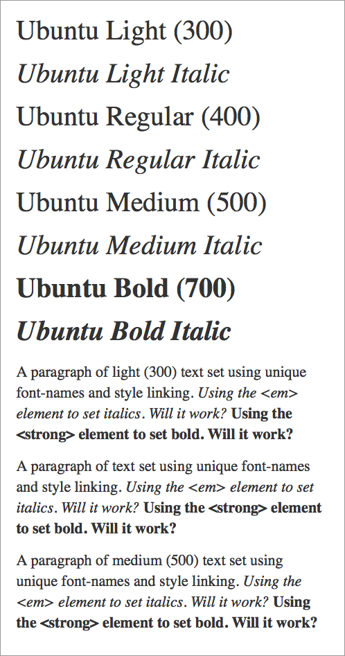
To style text with this method, use the unique font-family names, and set weights and styles to match those used in the @font-face declarations. For example, the Light, Light Italic, Regular, Regular Italic, Medium, Medium Italic, Bold and Bold Italic headings below are set with classes. The classes are styled like so:
.u300 {
   font-family: 'UbuntuLight', arial, sans-serif;
   font-weight: 300;
   font-style: normal;
}

.u300i {
   font-family: 'UbuntuLightItalic', arial, sans-serif;
   font-weight: 300;
   font-style: italic;
}

.u400 {
   font-family: 'UbuntuRegular', arial, sans-serif;
   font-weight: 400;
   font-style: normal;
}

.u400i {
   font-family: 'UbuntuRegularItalic', arial, sans-serif;
   font-weight: 400;
   font-style: italic;
}

.u700 {
   font-family: 'UbuntuMedium', arial, sans-serif;
   font-weight: 500;
   font-style: normal;
}

.u700i {
   font-family: 'UbuntuMediumItalic', arial, sans-serif;
   font-weight: 500;
   font-style: italic;
}

.u900 {
   font-family: 'UbuntuBold', arial, sans-serif;
   font-weight: 700;
   font-style: normal;
}

.u900i {
   font-family: 'UbuntuBoldItalic', arial, sans-serif;
   font-weight: 700;
   font-style: italic;
}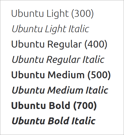
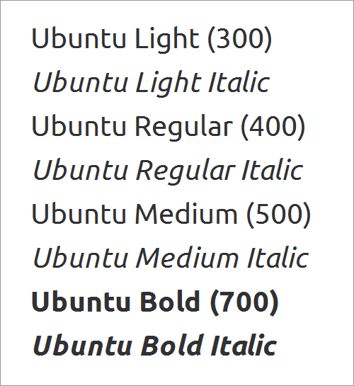
By combining unique font-family names with matching weights and styles, all eight weights and styles of Ubuntu will work — even on Windows 7 in IE 8. And BlackBerry and iPad 1 browsers won’t crash.
Again, Make Sure The Weights And Styles Match!
Although using unique font-family names means we no longer need the weights and styles to “trigger” the correct @font-face declaration, setting all weights and styles to match is important. Applying weights and styles to text elements will keep them intact in case the Web font fails. Also, because the weights and styles match, the text won’t end up with either a double-bold or double-italic, or a faux bold or faux italic.
Problem: Using <em> And <strong> Elements
Using unique font-family names brings back an earlier problem: getting <em> and <strong> elements to work properly. Default styling on these elements will result in faux italic and faux bold text.
For example, the three paragraphs below are styled like so:
p.light {
   font-family: 'UbuntuLight', arial, sans-serif;
   font-weight: 300;
   font-style: normal;
}

p {
   font-family: 'UbuntuRegular', arial, sans-serif;
   font-weight: normal;
   font-style: normal;
}

p.medium {
   font-family: 'UbuntuMedium', arial, sans-serif;
   font-weight: 500;
   font-style: normal;
}
And the <em> and <strong> elements are left in their default states:
em {
   font-style: italic;
}

strong {
   font-weight: bold;
}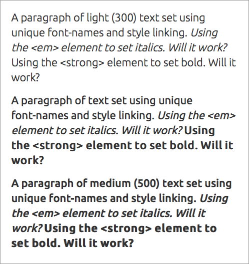
Applying <em> and <strong> in their default states will result in faux italic and (usually) faux bold.
The result is a faux italic and a faux bold (when it’s applied). Why? Because we’re using unique font-family names. Let’s look at the middle paragraph. It’s set to Ubuntu Regular, with weight and style set to match (weight: normal and style: normal). When the <em> element is applied, the text remains Ubuntu Regular but is slanted to look like it’s italic. When the <strong> element is applied, the text remains Ubuntu Regular but is stretched to look like it’s bold.
We can fix the bold text by making sure the <strong> element uses the correct font-family name, weight and style:
strong {
   font-family: 'UbuntuBold', arial, sans-serif;
   font-weight: 700;
   font-style: normal;
}
The <em> is a bit more difficult to fix. We can set it to Ubuntu Regular Italic and use the matching weight and style:
em {
   font-family: 'UbuntuRegularItalic', arial, sans-serif;
   font-weight: 400;
   font-style: italic;
}
Setting <em> to UbuntuRegularItalic and <strong> to UbuntuBold will result in an italic that’s too heavy for light text and too light for medium text.
The result is a bold and italic that are consistent throughout, regardless of the weight of the paragraph text. This may be fine for the <strong> element, but the <em> element looks a bit out of place on both the light and medium text.
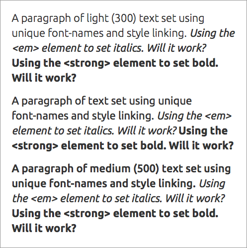
The only way to fix this is to create a variety of classes for the <em> element, like so:
em {
   font-family: 'UbuntuRegularItalic', arial, sans-serif;
   font-weight: 400;
   font-style: italic;
}

em.light {
   font-family: 'UbuntuLightItalic', arial, sans-serif;
   font-weight: 300;
   font-style: italic;
}

em.medium {
   font-family: 'UbuntuMediumItalic', arial, sans-serif;
   font-weight: 500;
   font-style: italic;
}
Creating three versions of the <em> element (em, em.light, em.medium) will result in italics that “match” the weight of the text.
This will result in italics that match the weight of the text in each paragraph. This creates much better hierarchy, but it undermines the beauty of cascading style sheets and the simplicity of using a single <em> element.
Bonus: If The Fallback Font Loads, Weights And Styles Will Be Retained
Setting all weights and styles correctly (for example, not normal) when styling the text means that basic weights and styles will be retained even if the Web font doesn’t load.
If the Web font doesn’t load, then the fallback font (here, Times New Roman) will still provide hierarchy — bolds and italics will remain intact. But because fallback fonts don’t usually have “extra” weights (such as Light, Medium and Black), some weights will revert to Normal and Bold.
The Short Version
Using unique font-family names and setting weights and styles to match (for example, not setting them to normal) is the most effective method of getting weights and styles to work with the @font-face declaration. An extra step is required (i.e. setting and using unique font-family names — even with elements such as <em> and <strong>) to avoid faux italic and faux bold, but the solution does reduce the potential for double-italic and double-bold text. In addition, if the Web font doesn’t load, then the text will retain both style and weight. Finally, text will render properly in IE 7 and 8 (even if you’re using more than four weights and styles), and your pages won’t crash the browsers on BlackBerry 9900 and iPad 1 devices.
Make Sure Your Weights And Styles Work
Weights and styles help visitors read the content on your website. So, make sure your weights and styles load correctly — whether for IE 8, Chrome, Mac OS X Firefox or an iPad and whether or not the Web font loads correctly (or visitors see a fallback font).
When choosing which method to use for your website, ask yourself two questions:
- Will I be using more than four weights and styles on the website?
- Are BlackBerry and iPad 1 users part of my target audience?
If the answer to both questions is “no,” then go ahead and use style linking. It’s elegant and forgiving.
If the answer to either question is “yes,” then use the combined method. Currently, the only way to make sure your weights and styles work cross-browser is to use unique font-family names in conjunction with matching weights and styles (and, of course, to make sure your font has a bold and italic version). This might sound like a chore, requiring extra care and typing (UbuntuRegularItalic is longer to type than Ubuntu, after all), but as with most typographic details, the best results take time and effort. Even Typekit, which uses JavaScript to handle the intricacies of Web fonts, requires variation-specific font-family names to support older versions of IE.
Once IE 7 and 8, BlackBerry 9900 browsers and the iPad 1 are defunct, using style linking alone should be enough to get the job done. But as of 28 January 2013, StatCounter reports that IE 7 and 8 alone were used for 12.3% of the 45 billion page views collected from November 2012 to January 2013. Information on mobile browsers is not clear, but a minimum of 1 in 8 visitors still need us to go the extra mile. So, for now, we’ve got some extra typing to do.
Other Resources
- Say No to Faux Bold, Alan Stearns, A List Apart
- New From Typekit: Variation-Specific Font-Family Names in IE 6–8, Typekit blog
Further Reading
- The @Font-Face Rule And Useful Web Font Tricks
- 80 Beautiful Typefaces For Professional Design
- How To Choose The Right Face For A Beautiful Body
- How To Choose A Typeface — A Step-By-Step Guide!


