Hex Color – The Code Side Of Color

Email Newsletter
Weekly tips on front-end & UX.
Trusted by 200,000+ folks.

 Flexible CMS. Headless & API 1st
The trouble with a color’s name is that it never really is perceived as the exact same color to two different individuals — especially if they have a stake in a website’s emotional impact. Name a color, and you’re most likely to give a misleading impression. Even something like “blue” is uncertain. To be more precise, it could be “sky blue”, “ocean blue”, “jeans blue” or even “arc welder blue”.
Descriptions vary with personal taste and in context with other colors. We label them “indigo”, “jade”, “olive”, “tangerine”, “scarlet” or “cabaret”. What exactly is “electric lime”? Names and precise shades vary — unless you’re a computer.
Code Demands Precision
When computers name a color, they use a so-called hexadecimal code that most humans gloss over: 24-bit colors. That is, 16,777,216 unique combinations of exactly six characters made from ten numerals and six letters — preceded by a hash mark. Like any computer language, there’s a logical system at play. Designers who understand how hex colors work can treat them as tools rather than mysteries.
Breaking Hexadecimals Into Manageable Bytes
Pixels on back-lit screens are dark until lit by combinations of red, green, and blue. Hex numbers represent these combinations with a concise code. That code is easily broken. To make sense of #970515, we need to look at its structure:
The first character # declares that this “is a hex number.” The other six are really three sets of pairs: 0–9 and a–f. Each pair controls one primary additive color.

Each pair can only hold two characters, but #999999 is only medium gray. To reach colors brighter than 99 with only two characters, each of the hex numbers use letters to represent 10–16. A, B, C, D, E, and F after 0–9 makes an even 16, not unlike jacks, queens, kings and aces in cards.

Being mathematical, computer-friendly codes, hex numbers are strings full of patterns. For example, because 00 is a lack of primary and ff is the primary at full strength, #000000 is black (no primaries) and #ffffff is white (all primaries). We can build on these to find additive and subtractive colors. Starting with black, change each pair to ff:
#000000is black, the starting point.#**ff**0000stands for the brightest red.#00**ff**00stands for the brightest green.#0000**ff**stands for the brightest blue.
Subtractive colors start with white, i.e. with the help of #ffffff. To find subtractive primaries, change each pair to 00:
#ffffffis white, the starting point.#**00**ffffstands for the brightest cyan.#ff**00**ffstands for the brightest magenta.#ffff**00**stands for the brightest yellow.

Shortcuts In Hex
Hex numbers that use only three characters, such as #fae, imply that each ones place should match the sixteens place. Thus #fae expands to #ffaaee and #09b really means #0099bb. These shorthand codes provides brevity in code.
In most cases, one can read a hex number by ignoring every other character, because the difference between the sixteens place tells us more than the ones place. That is, it’s hard to see the difference between 41 and 42; easier to gauge is the difference between 41 and 51.

The example above has enough difference among its sixteens place to make the color easy to guess — lots of red, some blue, no green. This would provide us with a warm violet color. Tens in the second example (9, 9 and 8) are very similar. To judge this color, we need to examine the ones (7, 0, and 5). The closer a hex color’s sixteens places are, the more neutral (i.e. less saturated) it will be.
Make Hexadecimals Work For You
Understanding hex colors lets designers do more than impress co-workers and clients by saying, “Ah, good shade of burgundy there.” Hex colors let designers tweak colors on the fly to improve legibility, identify elements by color in stylesheets, and develop color schemes in ways most image editors can’t.
Keep Shades In Character
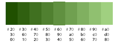
To brighten or darken a color, one’s inclination is often to adjust its brightness. This makes a color run the gamut from murky to brilliant, but loses its character on either end of the scale. For example, below a middle green becomes decidedly black when reduced to 20% brightness. Raised to 100%, the once-neutral green gains vibrancy.
A funny thing happens when we treat hex colors as if they were increments of ten. By adding one to each of the left-hand character of each pair, we raise a color’s brightness while lowering its saturation. This prevents shades of a given color from wandering too closely to pitch black or brilliant neon. Altering hex pairs retains the essence of a color.

In the example above, the top set of shades appears to gain yellow or fall to black, even though it’s technically the same green hue. By changing its hex pairs, the second set appears to keep more natural shades.
Faded Underlines
By default, browsers underline text to denote links. But thick underlines interfere with letters’ descenders. Designers can make underlines less obtrusive by scaling back hex colors. The idea is to make the tags closer to the background color, while the text itself gains contrast against the background.
- For dark text on a bright background, we make the links brighter.
- For bright text on a dark background, we make the links darker.
To make this work, every embedded link needs a <span> inside of every :
a { text-decoration:underline;color:#aaaaff; }
a span { text-decoration:none;color:#0000ff; }

As you can see here, underlines in the same color as the text can interfere with parts of type that drop below the baseline. Changing the underline to resemble the background more closely makes descenders easier to read, even though most browsers place underlines above the letterforms.
Adding spans to every anchor tag can be problematic. A popular alternative is to remove underlines and add border-bottom:
a { text-decoration: none; border-bottom: 1px solid #aaaaff; }
Better Body Copy
A recurring design problem is that a specific color may be technically correct but has an unintended effect. For example, some designs call for headers and body copy to be the same color. We have to keep in mind that the thicker the strokes of large text appears, the darker the small text appears.

h1, p { color: #797979; }

h1 { color: #797979; }
p { color: #393939; }
While technically identical, the body of the copy is narrower, and more delicate letterforms make it visually brighter than the heading. Lowering the sixteens places will make the text easier to read.
How To Warm Up Or Cool Down A Background
Neutral backgrounds may be easy to read against, but “neutral” doesn’t have to mean “bland”. Adjusting the first and last byte can make a background subtly warmer or cooler.

#404040— neutral#504030— warmer#304050— cooler
Is that too much? For a more subtle shift, use the ones places instead:

#404040— neutral#4f4040— warmer#40404f— cooler
Coordinate Colors With Copy-Paste
Recognizing the structure of a hex number’s number/letter pairs gives designers a unique tool to explore color combinations. Unlike color wheels and charts, rearranging pairs in a hex number is a simple process to change hues while keeping values similar. As a bonus, the results can be unpredictable. The simplest technique is to move one pair of characters to a different spot, which trades primary colors.
A common design technique to make text or other visual elements coordinate with a photo is to use colors from within that photo. Understanding hex colors can take that a step further, by deriving new colors that coordinate with the photo without taking directly from the photo.

Going Forward
Don’t let the code intimidate you. With a little creativity, hex colors are a tool at your disposal. If nothing else, next time someone asks if you can solve a problem with code in any language, you can simply say:
“Shouldn’t be harder than parsing hexadecimal triplets in my head.”
Hex Color Tools
You may be interested in the following tools and apps:
Further Reading
- Color Theory for Designers: The Meaning of Color
- A Simple Web Developer’s Guide To Color
- Understanding Color Concepts And Terminology
- Creating Your Own Color Palettes


