99 Powerful New CSS- and JavaScript Techniques

Email Newsletter
Weekly tips on front-end & UX.
Trusted by 200,000+ folks.


 Flexible CMS. Headless & API 1st

With CSS3, some of the older techniques now have become obsolete, others have established themselves as standards, and many techniques are still in the “crazy experimentation” stage.
Since the release of the previous post, we’ve been collecting, sorting, filtering and preparing a compact overview of powerful new CSS techniques. Today we finally present some of these techniques. Use them right away or save them for future reference.
Further Reading on SmashingMag:
- 50 Useful Coding Techniques
- 45 Powerful CSS and JavaScript Techniques
- 50 Brilliant CSS3/JavaScript Coding Techniques
Please note that many techniques are not only CSS-based, but also use HTML5 and JavaScript. We are going to present useful CSS tools and responsive design techniques in separate posts. Please don’t hesitate to comment on this post and let us know how exactly you are using them in your workflow. However, please avoid link dropping; share your insight and experience instead, and feel free to link to techniques that really helped you recently. Thanks to all of the featured designers and developers for their fantastic work!
Table of Contents
- CSS Transitions and Animations
- Useful and Practical CSS Techniques
- CSS Typography and Text Techniques
- CSS Navigation Menus and Hover Effects
- Visual Techniques With CSS
CSS Transitions And Animations
CSS transitions and animations are often used to make the user experience a bit more smooth and interesting, especially when it comes to interactive effects on hover or on click. Designers are experimenting with technology and create sometimes crazy, sometimes practical—but often innovative techniques which you could use to make your websites just a tiny bit more engaging.
Interactive CSS3 lighting effects An interesting effect to create interactive lighting effects with 3-D transforms, CSS gradients and masks; the cast shadow was created using box shadows and transforms.

CSS3 dodecahedron A fancy dodecahedron experiment, created using CSS Transforms and a tiny JavaScript snippet.

CSS 3D Lighting Engine Photon Our editor Tom Giannattasio has created a JavaScript library that adds simple lighting effects to DOM elements in 3D space using the WebKitCSSMatrix object. It would be great to have an implementation for other rendering engines as well.

3D Thumbnail Hover Effects With CSS This technique produces 3D thumbnail hover effects with CSS 3D transforms. The code is quite verbose and probably could be optimized, but the effect is quite neat.
Slide In Image Boxes A technique for creating a “slide in” effect for boxes on hover to make them a bit more interactive.
CSS3 bitmap graphics
The bitmap graphics is rendered with CSS: no images, no canvas, no data URIs and no extra markup. The pixels are drawn with CSS gradients, sized precisely to the pixel’s boundaries.

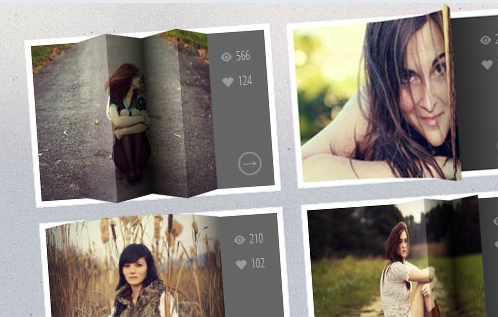
Paperfold CSS A visual folding effect for hidden comments by Felix Niklas. The plugin takes a DOM element, slices it into parts and arranges them like a folded paper in 3-D space.

Beercamp: An Experiment With CSS 3D A CSS 3D popup book á la Dr. Seuss. The website was a test to see how far SVG and CSS 3D transforms could be pushed. This is the article about it.

Covers: A JS / CSS Experiment Now, that’s quite an experiment: what if we combined a music song, stylesheet and beat detector to create animated… covers? Sure, we can do it with CSS3 and JavaScript! Covers does exactly that. The result is interesting, what can you do with this approach?

Animation on Apple’s page John B. Hall explains the CSS animation on Apple’s Web page for the iPhone 4S.

Experimental animations for image transitions A post about experimental 3-D image transitions that use CSS3 animations and jQuery. Only CSS3 transforms are used.

Maintaining CSS style states using “infinite” transition delays This demo allows you to move the character around with the D-pad, and notice how it always keeps its position after you stop moving. This demo doesn’t use any JavaScript. The effect is made possible by using a virtually infinite transition delay, so that the CSS rules never return to their default state. The figure will be stuck in a transition and will move only when you hold down a button.

CSS 3-D clouds An experiment in creating 3-D-like clouds with CSS3 transforms and a bit of JavaScript.

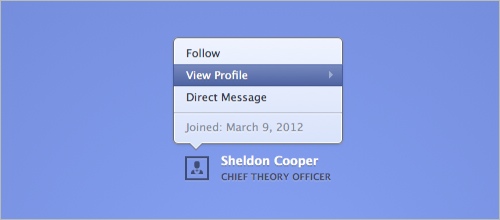
Animated popover of profile box A technique for an animated profile popover menu, built using CSS transitions.
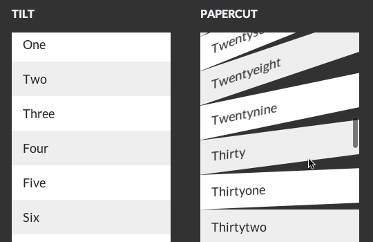
CSS3 scrolling effects A library of various scrolling effects, such as curl, wave, flip, fly, skew and helix, created with CSS3 and sometimes with JavaScript to spice up the scrolling behavior.
Spin those icons with CSS3 A simple technique for creating a neat effect that spins social icons with the help of a transform and transition when you hover over them. By Tom Kenny.
Scrolling the Z Axis with CSS 3D Transforms This article explains how to create the z-scroll effect step by step.
Useful and Practical CSS Techniques
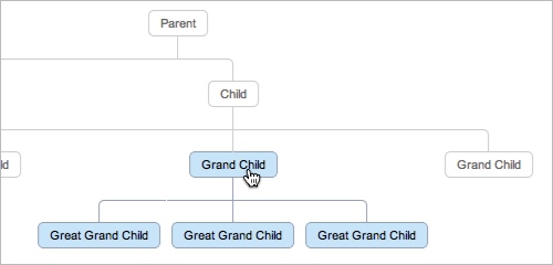
CSS3 Family Tree Display organizational data or a family tree using just CSS, without Flash or JavaScript. The markup is very simple and uses just nested lists. Pseudo-elements are used to draw the connectors. It also has hover effects: hover over a parent element and the entire lineage will be stylized. Make sure to check Nicolas Gallagher’s Introduction to CSS Pseudo Element Hacks.
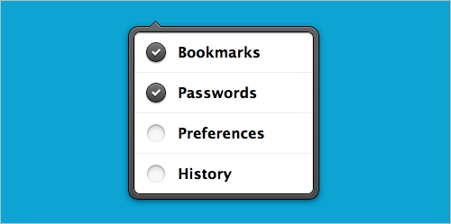
iOS-style popover A simple technique for iOS-style custom checkboxes and a subtle hover effect. The technique is a bit buggy but a good starting point in case you need it. Also, check an excerpt from Lea Verou’s talk on customized checkboxes and her article on rule filtering based on specific selector(s) support.
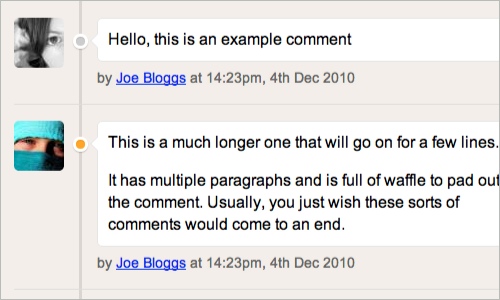
Timeline-Style Comments Nicolas Gallagher developed a simple and clean technique to present comments in a timeline-alike overview.
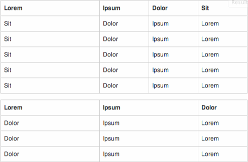
CSS Table Grid
Here is a nice technique for aligning columns in a table, building a “table grid system” of sorts. The idea is to apply classes to col elements in a table’s colgroup; you always leave one col without a class so that it remains fluid and can “soak up” the effects of any breakages elsewhere in the table.
Confirmation Feedback Buttons This article explains how to create buttons that take on different states depending on the user’s interaction. This type of interaction is especially useful on links such as “Purchase” and “Delete” for which it’s wise to confirm that the user indeed wants to take the specific action. It looks too much like an iTunes button, though.

A calendar in CSS3 and jQuery A step by step tutorial on how to create a CSS3 calendar with some jQuery animation. Also, check out David Bushell’s responsive calendar demo.

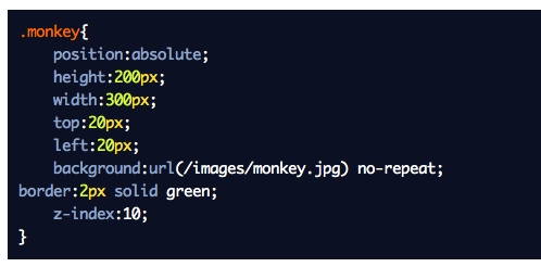
Outdenting properties for debug CSS Let’s assume you are experimenting with CSS or debugging code. You add properties to figure out how things fit together. How often do you forget to remove all of them? A simple technique for this is to mark a CSS property as a temporary or debugging property by outdenting it and putting it at column 0 in the file. A small trick that can save a lot of time.
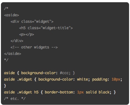
Show Markup in CSS Comments Chris Coyier discusses the idea of including the basic markup that you will be styling as a comment at the top of your CSS file.
Selectively displaying data This technique shows how to selectively display content in a table and add responsive breakpoints to create an responsive, complex multi-column table.

Remove Margins for First/Last Elements
If you ever wanted to remove the top or left margin from the first element in a container, or the right or bottom margin from the last element in a container, you can do this by using pseudo-selectors :first-child and :last-child.
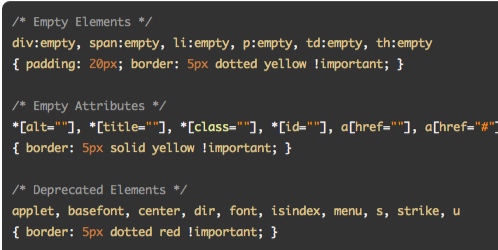
CSS Diagnostics Stylesheet A very useful snippet to have nearby when you are debugging your CSS or want to find mistakes in HTML.
Radio Buttons With Two-Way Exclusivity
Learn about the :empty pseudo-class selector and jQuery to ensure that when a radio button is clicked, the area is determined and all other radio buttons in that column are turned off, and then is turned back on when clicked on.
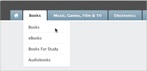
Tabbed Navigation With CSS An elegant tabbed navigation menu with drop-down menus — no JavaScript, of course. Nothing new, but it’s a quite clean solution.
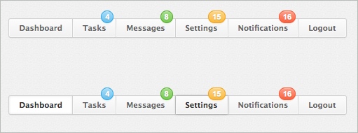
Menu With Notification Badges With CSS A ready-to-use snippet for a navigation menu with notification badges.
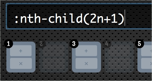
Styling based on sibling count (slides) A fantastic overview of the possibilities for styling based on sibling count. Also, make sure to click through the rest of the slide deck — valuable and useful techniques. Make sure to watch Lea Verou’s presentation as well.
Stuff you can do with the “Checkbox Hack” Wiht the “checkbox hack,” you use a connected label and checkbox input and usually some other element that you are trying to control. Learn what you can do with it.
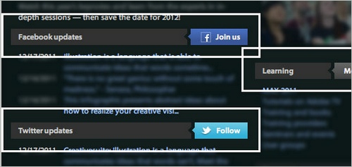
CSS3 Facebook Buttons Nicolas Gallagher presents a set of CSS buttons for Facebook with different colors and icons. You might want to check Nicolas’ CSS3 Social Sign-In buttons as well as Free Social CSS3 Buttons that we released earlier as well.
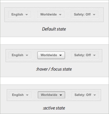
YouTube Popup Buttons
This article explores the default state of YouTube buttons, which have a very subtle bevel but pop up on :hover and :focus states, eager to be clicked.
Centering in the Unknown When it comes to centering things in Web design, the more information you have about the element being centered and its parent element, the easier it is. Chris Coyier shows how to do it when you do not know anything.

Uncle Dave’s Ol’ Padded Box
What if you combined background-size: cover and Thierry Koblentz’ intrinsic ratios. The result is images and video than maintain their aspect ratio; but you can also use background-size: cover to change the aspect ratio and auto-cropping of images with just a little CSS. And the great news is that the property is supported in all modern browsers and matches media-query support exactly.
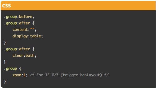
Micro Clearfix: Force Element To Self-Clear its Children Chris Coyier presents various technique for forcing elements to self-clear its children, including Nicolas Gallagher’s short code snippet from 2011.
Conditional CSS
A clever technique by Jeremy Keith to load additional content conditionally. The idea is that once a media query fires, the content on the body element is generated and can be detected by a JavaScript, prompting extra content to be loaded.
* { box-sizing: border-box } FTW
Once you start mixing and matching various units in CSS — such as % for the container width, em for padding and px for border — then you run right into the box-model problem because the width of the container doesn’t include padding and border. We can easily solve this using box-sizing: border-box. And the best part: it is even supported in IE 8.
Multiple Attribute Values How to treat multiple values in attributes rather than classes.

Diagonal CSS Sprites If you build a sprite on a diagonal, there will be no components below or to the right of the component you are showing. This allows you to make the element using the sprite as wide or as tall as it needs to be, without worrying about exposing the next component. Also, check out David Storey’s article on CSS sprites for the moder era.
Double Click in CSS Is there a way to detect whether a link is tapped or double-clicked on mobile devices? In fact, we can. However, the code requires some hardcore CSS nerdery. Also, check Pure CSS Clickable Events Without :target by Ryan Collins.
Replacing the -9999px hack (new image replacement) In the beginning was FIR (Fahrner image replacement). Scott Kellum, design director at Treesaver, has now developed this refactored code for hiding text.
")
Fighting the Space Between Inline Block Elements A series of inline-block elements formatted like you would normally format HTML will have spaces between them. But we often want the elements to butt up against each other, thus avoiding in the case of navigation) those awkward little unclickable gaps. How do you solve it? Chris Coyier has found a couple of solutions.
CSS pointer-events and a pure CSS3 animating tooltip The pointer-events property allows you to specifiy how the mouse interacts with the element it is touching. See what you can do with it and what to consider when using them.
Anatomy of a mobile-first responsive Web design An excellent article by Brad Frost about the different considerations for responsive designs. How do you start? What features would you implement and how? What about advanced optimization such as LocalStorage or AppCache? This article provide an excellent guide for getting started with future-friendly responsive designs.

SouthStreet Progressive Enhancement Workflow A fantastic article by Scott Jehl and Filament Group in which they present a set of tools that form the core of an advanced responsive design workflow. Definitely useful to keep in mind for your next responsive design project.
Typography And Text With CSS
Advanced CSS techniques provide us with remarkable options to style text in very different ways. Not only can we make the typography look sharper and beautiful on the Web with tools such as Lettering.js, Kerning.js and FitText; we can also play with glyphs, line breaks, font sizing, truncating text and styling lists. The typography can be adjusted and improved with just a couple of practical approaches.
Interactive Typography effects with HTML5
This techniques uses canvas and JavaScript to create ab interactive typography effect. Users can interact with the glyphs and as designer you can define forms or shapes of the word you’d like to present and how you’d like them to change on hover. Fancy!

Rocking letters with CSS3 and jQuery A simple animation of letters with CSS3 and jQuery.

CSS 3D Typography What about integrating stripes into glyphs and adjust the shadow on hover? This technique uses just that, creating a nice, subtle yet engaging visual effect. You can find more interesting type experiments in CSS3type Showcase.


CSS3 animation and masking text Chandler Van De Water had a challenge for Trent Walton after seeing the header animation in his “CSS3 in Transition” post. Noticing that he used a PNG image file with knockout transparency, he wanted to do the same CSS animation with selectable text. Trent was happy to oblige! At the moment, this works only in Safari and Chrome.

CSS mask-image and text
Trent Walton uses background-clip: text and mask-image to implement a subtle gray-flecked texture effect over white text. Hover over the box to see how it degrades in unsupported browsers. Make sure to check out Lea Verou’s “Text Masking: The Standards Way” as well.
Fake bolding of Web fonts
Most browsers simulate bold weights for fonts that do not actually have bold weights. For example, Helvetica Neue Light does not have a bold weight. If you used font-weight: bold with it, browsers would artificially create a bold weight. This article explains how to avoid fake bolding of Web fonts in your designs. By Divya Manian.

Tomorrow’s Web type today: Say it With a Swash The excellent series “Tomorrow’s Web type today” by Elliot Jay Stocks provides insights into what will be possible with Web typography soon, e.g. swashes. In fact, you can already use them today if you include a swash subset of a font to achieve the desired effect.

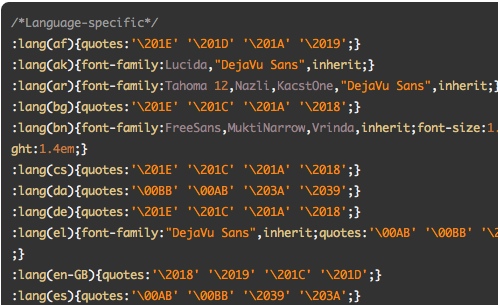
Internationalization Language CSS A very handy CSS nippet with language-specific quotes. Perfect for international, multilingual projects.
Experiments with background-clip: text
With the CSS property background-clip: text, we can add a background image to a text element.

A Call for ::nth-everything With CSS3, we have positional pseudo-class selectors to help us select a particular element when it has no distinguishing characteristics other than where it is in the DOM in relation to its siblings.

Smooth font using the text-shadow property
A common problem: is there a way smooth the appearance of glyphs on older machines, especially Windows XP (standard / ClearType rendering mode)? Yes, perhaps. You can give a try the text-shadow-property which adds text-shadow on the top-left and the bottom-right to smooth text.

Fluid Type Trent Walton explains his approach to fluid typography in which he asks himself how we can make sure that browser width and typographic settings such as measure or font-size and how should we handle panoramic viewports? An interesting article, especially if you use a typography-out approach in your designs.
Pragmatic, practical font sizing in CSS Harry Roberts shares his thoughts on how to size fonts more efficiently, writing your CSS differently in the process.
Automatic line breaks with CSS3 hyphens and word-wrap
Roger Johansson shows how to solve a common problem: as columns of text become narrower, the risk of a single word being longer than the column’s width increases. When that happens, the text normally extends beyond the column. Luckily, CSS offers two properties to improve the situation: word-wrap and hyphens.
Molten leading (or fluid line height) When a responsive composition meets a viewport, there are different ways to fill space. Adjusting any one element without also adjusting the others is a recipe for uncomfortable reading, which is one reason why designers have such a difficult time with fluid Web layouts. Tim Brown started a discussion about this issue and provides a couple of techniques for opimization.
")
Prevent Long URL’s From Breaking Out of Container
Another snippet by Chris Coyier for keeping long URLs within the container. word-wrap, word-break and hyphens properties in use. Also, learn how to Prevent Superscripts and Subscripts from Affecting Line-Height.
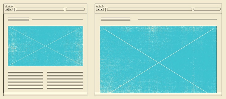
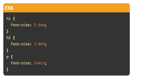
Viewport-sized typography
This technique uses new CSS values for sizing elements relative to the viewport’s current size: vw, vh and vmin. This allows you to couple the size of, say, a typographic heading to the available screen space. Browser support is quite poor for now, so if you are looking for an alternative, check out FitText.js.
Minimum paragraph widths in fluid layouts This article shows how to solve the problem of paragraphs that are too narrow, by implementing a minimum paragraph width. If the space left a the floating image is less than this width, then the whole paragraph moves below the image.
Styling ordered list numbers
Roger Johansson shows how we can style ordered list numbers with the :before pseudo element, which can take a counter as a value through the content property. Also check out Chris Coyier’s post and Louis Lazaris’ CSS Counters: counter-increment and friends.

Reverse ordered lists in HTML5 The reverse attribute allows you to write a descending list of numbered items. Louis Lazaris summarizes what it does and offers a solution to get around a lack of browser support for this attribute.

Preserving white space with CSS3 tab size By default, HTML pages ignore anything more than a single space and collapses them. But there are occasions when you’ll want to preserve this space via one of several possible techniques.
Truncating text using only CSS This code snippet can be used to shorten a line of text using nothing but CSS.
New CSS3 properties to handle text and word wrapping Louis Lazaris explains the possibilities and problems of text-wrap, overflow-wrap, line-break and word-break, text-overflow and hyphens. Also worth reading: Kenneth Auchenberg discusses the options for word wrapping and hyphenation in combination with dynamic width elements.
End Articles with Ivy Leaf
A clever technique for adding an extra touch to the end of your articles. :last-child, :after and content in use.
Hover Effects and Navigation Menus with CSS
We are used to classical navigation patterns such as tabbed navigation or drop-downs, but we can do a lot more to spice up our navigation menus with pleasant hover effects, often without extra images. Especially if you’d like to add a bit more polish to your portfolio, gallery or e-commerce website, these techniques can be quite useful. What about “over-the top” hover effect for your links,
Circle Navigation Effect With CSS3 A bubble-like thumbnail preview for your navigation with CSS3.

Create a CSS3 Image Gallery With a 3D Lightbox Animation Tom Kenny has extended a CSS lightbox gallery by adding a few hover effects to the gallery grid itself and a 3D rotation to the lightbox content, all with CSS.

3D Gallery With CSS3 and jQuery This article shares an experimental gallery that uses CSS 3D transforms. The idea is to create a circular gallery with an image in the center and two on the sides. Because perspective is being used, the two lateral images will appear three dimensional when rotated.

Creative CSS3 animation menus Mary Lou presents a couple of creative navigation menu hover effects. The idea is to have a simple composition of elements, an icon, a main title and a secondary title that will be animated on hover using only CSS transitions and animations.

How to spice up your menu with CSS3 Yes, another technique by Tympanus: this tip shows how to spice up a menu by adding a neat hover effect to it. The idea is to slide an image out to the right when the menu item is hovered over.

Create a zoomable user interface David DeSandro reveals how to use CSS transforms to create a zoomable user interface similar to that of Beercamp 2011. In this tutorial, you’ll also learn how to use JavaScript to hijack scrolling to manipulate the zoom.

Flipboard Navigation An experimental page layout inspired by Flipboard’s interface.

Multi-direction hover This element shows different hover effects when hovering from different directions.

Experimental Hover Effects Original and innovative hover effects discovered via Twitter on what appears to be a Japanese code sharing website.

Over-the-top hover effect
A CSS and JavaScript technique for creating an “over-the-top” hover effect using the transform-origin transform-style properties as well as 3-D transforms.
Accordion With CSS3
Mary Lou experiments with the adjacent and general sibling combinator and the :checked pseudo-class. Using hidden inputs and labels, she creates an accordion that animates the content areas on opening and closing.

Expanding Text Areas Made Elegant An expanding text area is a good choice when you don’t know how much text the user will write and you want to keep the layout compact. In this article, Neil Jenkins explains how to do this simply. Also, you might want to take a look at Textarea Auto Resize, another technique by Louis Lazaris, using a hidden clone element.
Filter Functionality With CSS3
Using the general sibling combinator and the :checked pseudo-class, we can toggle states of other elements by checking a box or radio button. This tutorial explores those CSS3 properties by creating a experimental portfolio filter that toggles the states of items of a specific type.

An accessible, keyboard-friendly custom select menu
A new approach for more accessibility by Roger Johansson. He styles only the select element.
Visual Techniques with CSS
We used to heavily on images and visual elements to create basic visual effects on the Web. With CSS3, we can not only improved the loading speed of the content, but also make our visual elements more flexible and adaptive. Let’s take a look on a couple of examples of how we can achieve that.
Create the Illusion of Stacked Elements with CSS3 Pseudo-Elements Tom Kenny shows how to create a simple “stacked” look to a group of images.

CSS3 Unfold Map with Pins A handy snippet for placing pins on a map. The code looks a bit verbose, so you might want to remove a couple of visual “nice-to-have” elements.

Turn Images Into Postage Stamps With CSS3 border-image
Dudley Storey shows a simple way to create a postage stamp from a simple image with border-image.

Slopy elements with CSS3 Angled shapes and diagonal lines can create an interesting visual flow and add some unexpected excitement. This tutorial shows some simple examples and ways how to create slopy, skewed elements with only CSS.

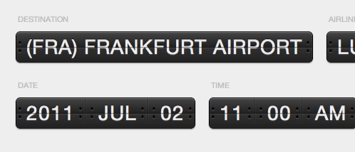
CSS Flip Clock A code snippet for displaying a flip clock-alike time display using CSS.
CSS3 Image Styles
When applying a CSS3 inset box-shadow or border-radius directly to an image element, the browser won’t render the CSS style perfectly. Here’s a quick tutorial on how to use jQuery to make perfect rounded corner images dynamically. And check out the second part.

Creating Reusable and Versatile Background Patterns A simple tutorial on how to create reusable background patterns with Photoshop and CSS.

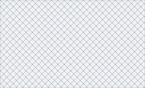
Diagonal Graph Paper Gradient
A very nice CSS technique for creating diagonal graph paper gradients using repeating-linear-gradient property in CSS.
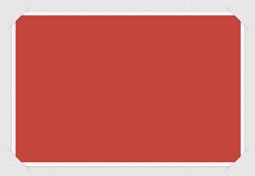
Tucked Corner Effect
A clean CSS technique for producing tucked corners using the pseudo-elements :after and :before as well as data URI-coded images. Also, check out Corner Ribbon Effect with CSS.
Scrolling… shadows!
An original technique by Roman Komarov to create CSS-only shadow-scrolling effect using background-attachment: local. Developed by Lea Verou, inspired by Roman Komarov.

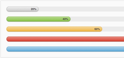
Multi-colored CSS progress bars
A quite verbose yet CSS-only solution for displaying multi-colored progress bars. It’s linear-gradient in action! Also, check out CSS3 progress bars that display data inside localized leaderboards for the new analytics platform at G5. They are lightweight and require no JavaScript or images.
CSS3 breadcrumbs Learn how to create your own cool CSS3 breadcrumbs. Also, check the CSS Breadcrumbs Example which uses only CSS linear gradients.

Adobe-like Arrow Headers A detailed article about the technique Adobe uses to create header bars for modules on its website.
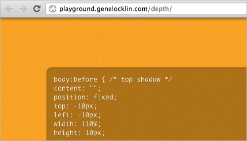
Adding a Top Shadow to a website
If you ever wanted to add a shadow along the top edge of the website, you can easily do it by styling body:before.
A flexible shadow with background-size It’s amazing what you can achieve when you combine different techniques—even when facing a challenge such as a flexible shadow. If you had to create an adaptive shadow effect, how would you create it?

Star Ratings With Very Little CSS Chris Coyier shows how to code star ratings done with very little CSS code and lots of a bit of Unicode madness.
Convert Images to Black And White With CSS Filters allow us to visually process an image in the browser without needing to go through PhotoShop or use cycle-intensive, script-heavy methods in JavaScript or PHP. CSS3 filters are broadly supported in the most recent versions of Firefox and Chrome, and we can gain support in older versions and alternative browsers — even IE — by using a combination of techniques.

Punching Holes With CSS A clever and simple technique to make a block in a container appear transparent and display a background image. Also, take a look at Lea Verou’s accessible star rating widget with CSS.
Simple Styles for Horizontal Rules With the help of a few contributors, Chris Coyier put together this page of simple styles for horizontal rules.

Optimizing Graphics With CSS Masks In this video, Aaron Bushnell shows how CSS masks can help make the process easier on you and how to make sure you have fallbacks in place for non-Webkit browsers.
Browser-Specific CSS Hacks A useful, comprehensive list of browser-specific CSS hacks for targeting legacy browsers. Unfortunately, most of us will need them quite often.
Last Click
CSS3 Lasers! Shows a laser shot effect when hovering over an element.

The DOM Tree
This DOM tree is generated via JavaScript every time you visit the page, so you’ll never see the same one twice. All of the forms are filled with holiday greetings in a variety of languages. CSS3 3D transforms are used to position and rotate, via translate3d() and rotate3d() respectively, the elements when the page loads. The infinitely looping rotation on the tree is controlled by an infinitely looping CSS3 animation. Just one word: crazy!

What’s Your Favourite Technique?
We’d love to know your experience with some of the featured techniques, or perhaps you’ve stumbled upon another interesting CSS technique recently? Let us know in the comments to this post!
What kind of techniques would you like to see featured on SmashingMag?
(jvg) (al) (vf) (ml)


