Adventures In The Third Dimension: CSS 3D Transforms

Email Newsletter
Weekly tips on front-end & UX.
Trusted by 200,000+ folks.


 Flexible CMS. Headless & API 1st

This proposal was called 3D Transforms, and it was soon implemented in Safari for Mac and iOS. About a year later, support followed for Chrome, and early in 2011, for Android. Outside of WebKit, however, none of the other browser makers seemed to show much enthusiasm for it, so it’s remained a fairly niche and underused feature.
That’s set to change, though, as the Firefox and Internet Explorer teams have decided to join the party by implementing 3D Transforms in pre-release versions of their browsers. So, if all goes according to plan, we’ll see them in IE 10 and a near-future version of Firefox (possibly 10 or 11, but that’s not confirmed yet), both of which are slated for release sometime this year.
Further Reading on SmashingMag:
- Beercamp: An Experiment With CSS 3D
- Front-End Challenge Accepted: CSS 3D Cube
- Creating Responsive Shapes With Clip-Path And Breaking Out Of The Box
- Let’s Play With Hardware-Accelerated CSS
That being the case, this is an ideal time to get ahead of the curve and start learning about the possibilities and potential of adding an extra dimension to your Web pages. This article aims to help you do just that, by taking you on a flying tour of the 3D Transforms syntax.
Please bear in mind that in order to see the examples in this article, you’ll need a browser that supports 3D Transforms; as I write this, that’s Safari, Chrome, IE 10 Platform Preview or Firefox Aurora.
The Third Dimension
On the Web, we’re accustomed to working in two dimensions: all elements have width and height, and we move them around the screen horizontally (left to right) and vertically (top to bottom). The move to a third dimension can be thought of as adding depth to elements, and adding movement towards and away from you (the viewer). Think about 3D films in which objects are constantly thrust out of the screen towards you in an attempt to demonstrate the possibilities of the extra depth.
To use 3D Transforms in CSS, you’ll need to know about axes (that’s the plural of axis, not the plural of axe). If you already know about working in three dimensions or remember using axes in math class at school, you can skip the next section. For everyone else, here is…
A Quick Primer On Axes
I just mentioned that on the 2-D Web, we move elements around horizontally and vertically. Each of these directions is called an axis: the horizontal line is known as the x-axis, and the vertical line is the y-axis. If we think of the top-left corner of an element as our origin (i.e. the point from which movement is measured), a movement to the left is a negative movement along the x-axis, and a move to the right is a positive movement along the x-axis. The same goes for moving an element up (negative on the y-axis) and down (positive on the y-axis).
The third dimension is known as the z-axis and, as I said, can be thought of as towards or away from you; a negative movement along the z-axis is away from you, and a positive movement is towards you.
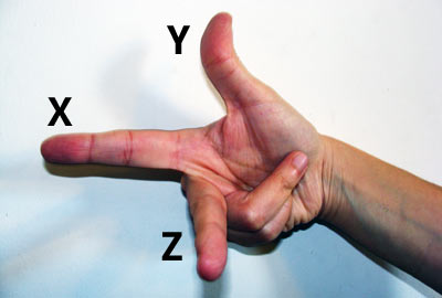
Showing the three axes: x (left-right), y (up-down) and z (away-towards).
If you’ve read all of this talk of axes and negative movements and you’re rubbing your eyes and blinking in disbelief and misunderstanding, don’t worry: it will all become clear when you get stuck in the code. Come back and read this again after a few examples and it should all be clear.
Transformation Functions
The various transformations are all applied with a single CSS property: transform — yes, the same property that’s used for 2-D CSS Transforms. At the moment, this property is still considered experimental, so remember to use all of the browser prefixes, like so:
div {
  -moz-transform: foo;
  -ms-transform: foo;
  -o-transform: foo;
  -webkit-transform: foo;
}
Note that Opera doesn’t currently have an implementation of 3D Transforms, but I’m including it here because work is apparently underway. For the sake of clarity, in the examples throughout this article, I’ll use only non-prefixed properties, but remember to include all of the prefixed ones in your own code.
Anyway, the transform property accepts a range of functions as values, each of which applies a different transformation. If you’ve used 2-D CSS Transforms, then you’ll already know many of these functions because they are quite similar (or, in some cases, the same). Here are all of the 3D functions:
matrix3dperspectiverotateX,rotateY,rotateZ,rotate3dscaleX,scaleY,scaleZ,scale3dtranslateX,translateY,translateZ,translate3d
Now, matrix3d definitely sounds the coolest, but it’s so unbelievably complex (it takes 16 values!) that there’s no way I could cover it in this article. So, let’s put that aside and take a quick look at the others.
Rotation
To explain what this does, I’ll have to ask you to do a little mental exercise (which will come in useful later in the article, too). Imagine a sheet of card with a string running through the middle that fixes it in place. By taking the top corners in your fingers, you can move the card up and down, left and right, and forwards and backwards, pivoting around the string. This is what the rotate() function does. The individual functions rotateX(), rotateY() and rotateZ() take a deg (i.e. degree) value and move the element around its point of origin (where the string passes through it) by that much.
Have a look at our first example (a screenshot is shown below in case you don’t have access to a supported browser). Here we’ve rotated each of the elements 45° around a different axis (in order: x, y, z), so you can see the effect of each. The semi-translucent red box shows the original position of the element, and if you mouse over each, you’ll see the transformations removed (I’ve used this convention in all of the examples in this article).
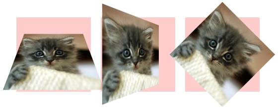
Each element is rotated 45° around a different axis: x (left), y (center) and z (right).
There is a rotate3d() function as well, but it’s too complex to explain in a brief article like this one, so we’ll skip it.
Translation
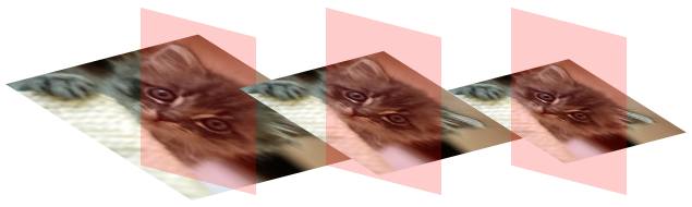
This is really just a fancy way of saying “movement.” The functions translateX(), translateY() and translateZ() each take a length value, which moves the element by that distance along the given axis. So, translateX(2em) would move the element 2 ems to the right, and translateZ(-10px) would move the element 10 pixels away from the viewer. There’s also a shorthand function, translate3d(), which takes three values in order, one for each axis, like so: translate3d(x, y, z).
In our second example, we’ve translated each of the elements by -20 pixels along a different axis (in order: x, y, z).

Each element is translated by -20 pixels along a different axis: x (left), y (center) and z (right).
Note that translation of an element is similar to relative positioning, in that it doesn’t affect the document’s flow. The translated element will keep its position in the flow and will only appear to have moved, meaning it might cover or show through surrounding elements.
Scaling
This just means making bigger or smaller. The three functions scaleX(), scaleY() and scaleZ() each take a unitless number value, which is used as a multiplier. For scaleX() and scaleY(), this is applied directly to the width and height; for example, applying scaleY(1.5) to an element with a height of 100 pixels would transform it to 150 pixels high, and applying scaleX(0.75) to an element with a width of 100 pixels would transform it to 75 pixels wide.
The scaleZ() function behaves slightly differently. Transformed elements don’t actually have any depth to increase or decrease; what we’re doing is more like moving a 2-D object around in 3D space. Instead, the value given to scaleZ() acts as a multiplier for the translateZ() function that I explained in the last section. So, applying both translateZ(10px) and scaleZ(2) would translate an element 20 pixels along the z-axis.
There’s also a shorthand property, scale3d(), which, like translate3d(), takes three values, one for each of the individual functions: scale3d(x,y,z). So, in the following code example, the same transformation applies to both of the elements:
.e1 {
   transform: scaleX(1.5) scaleY(1.5) scaleZ(0.75);
}

.e2 {
   transform: scale3d(1.5,1.5,0.75);
}
Perspective
The perspective() function is quite simple, but what it actually does is quite complex. The function takes a single value, which is a length unit greater than 0 (zero). Explaining this is a little complicated; the length is like a distance between you and the object that you’re viewing (a tutorial on Eleqtriq has a more technical explanation and diagram). For our purposes, you just need to know that the lower the number, the more extreme the 3D effect will appear; any value below 200px, for example, will make the transformation appear very exaggerated, and any value of 1000px or more will seem to have no effect at all.
In our third example, we have three transformed elements, each with a different value for the perspective() function: 25px, 50px and 200px, respectively. Although the difference between the three is very discernible, it’s even clearer when you mouse over to see the transformations removed.
Each element has a different value for the perspective() function: 25px (left), 50px (center) and 200px (right).
Note that I’ve transformed the parent elements (equally) so that we can see the degree of perspective more clearly; sometimes the difference in perspective values can be imperceptible.
Other Properties
In addition to transform, you’ll need to know about a few other important properties.
transform-style
If you’ll be applying 3D transformations to the children of an already transformed element, then you’ll need to use this property with the value preserve-3d (the alternative, and default, is flat). This means that the child elements will appear on their own planes; without it, they would appear flat in front of their parent.
Our fourth example clearly illustrates the difference; the element on the left has the flat value, and on the right, preserve-3d.
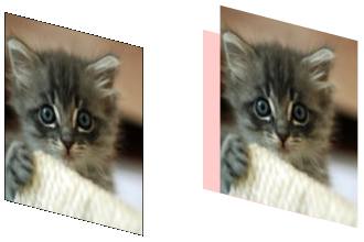
The element on the left has a transform-style value of flat, and the one on the right has a value of preserve-3d.
Something else to note is that if you are transforming child elements, the parent must not have an overflow value of hidden; this would also force the children into appearing on the same plane.
transform-origin
As mentioned, when you apply a transformation to an element, the change is applied around a point directly in the horizontal and vertical middle — like the imaginary piece of string we saw in the earlier illustration. Using transform-origin, you can change this to any point in the element. Acceptable values are pairs of lengths, percentages or positional keywords (top, right, etc.). For example:
div {
   transform-origin: right top;
}
In our fifth example, you can see the same transformations applied to two elements, each of which has a different transform-origin value.

The element on the left has a transform-origin value of center center, and the one on the right has a value of right top.
The difference is clearly visible, but even more obvious if you pass the mouse over to see the transformation removed.
backface-visibility
Depending on which transformation functions you apply, sometimes you will move an element around until its front (or “face”) is angled away from you. When this happens, the default behavior is for the element to be shown in reverse; but if you use backface-visibility with a value of hidden, you’ll see nothing instead, not even a background color.
perspective and perspective-origin
We introduced the perspective() function earlier, but the perspective property takes the same values; the difference is that the property applies only to the children of the element that it’s used on, not the element itself.
The perspective-origin property changes the angle from which you view the element that’s being transformed. Like transform-origin, it accepts lengths, percentages or positional keywords, and the default position is the horizontal and vertical middle. The effect of changing the origin will be more pronounced the lower the perspective value is.
Conclusion
By necessity, we’ve flown through the intricacies of the 3D transformations syntax, but hopefully I’ve whetted your appetite to try it out yourself. With a certain amount of care for older browser versions, you can implement these properties in your own designs right now. If you don’t believe me, compare the list of “More adventures” on The Feed website that I built last year in a browser that supports 3D transforms and in one that doesn’t, and you’ll see what I mean.
Some of the concepts used in 3D transforms can be quite daunting, but experimentation will soon make them clear to you in practice, so get ahold of a browser that supports them and start making some cool stuff. But please, be responsible: not everything on the Web needs to be in three dimensions!
Further Reading and Resources
- The Bright (Near) Future of CSS Eric Meyer’s comprehensive article on CSS3, covering CSS3 3D Transforms as well.
- Support of CSS Transforms: A Reference Table A great reference for the current state of support of CSS Transforms in browsers.
- 3D Transforms, Westciv This tool lets you play around with different transformation values and shows you the result in real time.
- “CSS3 3D Transforms,” W3C The CSS 3D Transforms module is the full specification, although it is very dry and technical.
- “20 Stunning Examples of CSS 3D Transforms,” Paul Hayes See what you can build when you master 3D Transforms.
- The Book of CSS3, Peter Gasston My book contains much more detail about all of the functions that I’ve covered in this article, as well as the ones I had to leave out.
 (al)
(al)

