An Introduction To Object Oriented CSS (OOCSS)

Email Newsletter
Weekly tips on front-end & UX.
Trusted by 200,000+ folks.


 Flexible CMS. Headless & API 1st

From a Web developer’s perspective, however, some may argue that speed is king. More and more, I’m starting to favour that stance. In recent years many experienced front-end engineers have offered their suggestions on how we can improve the user experience by means of some performance best practices.
Further Reading on SmashingMag:
- The Road To Reusable HTML Components
- Decoupling HTML From CSS
- Classes? Where We’re Going, We Don’t Need Classes!
- The Other Interface: Atomic Design With Sass
Unfortunately, CSS seems to get somewhat overlooked in this area while many developers (for good reason) focus largely on JavaScript performance and other areas.
In this post, I’ll deal with this often overlooked area by introducing you to the concept of object oriented CSS and how it can help improve both the performance and maintainability of your Web pages.
The Principles Of OOCSS
As with any object-based coding method, the purpose of OOCSS is to encourage code reuse and, ultimately, faster and more efficient stylesheets that are easier to add to and maintain.
As described on the OOCSS GitHub repo’s Wiki page, OOCSS is based on two main principles.
Separation of Structure From Skin
Almost every element on a styled Web page has different visual features (i.e. “skins”) that are repeated in different contexts. Think of a website’s branding – the colors, subtle uses of gradients, or visible borders. On the other hand, other generally invisible features (i.e. “structure”) are likewise repeated.
When these different features are abstracted into class-based modules, they become reusable and can be applied to any element and have the same basic result. Let’s compare some before and after code so you can see what I’m talking about.
Before applying OOCSS principles, you might have CSS that looks like this:
#button {
  width: 200px;
  height: 50px;
  padding: 10px;
  border: solid 1px #ccc;
  background: linear-gradient(#ccc, #222);
  box-shadow: rgba(0, 0, 0, .5) 2px 2px 5px;
}

#box {
  width: 400px;
  overflow: hidden;
  border: solid 1px #ccc;
  background: linear-gradient(#ccc, #222);
  box-shadow: rgba(0, 0, 0, .5) 2px 2px 5px;
}

#widget {
  width: 500px;
  min-height: 200px;
  overflow: auto;
  border: solid 1px #ccc;
  background: linear-gradient(#ccc, #222);
  box-shadow: rgba(0, 0, 0, .5) 2px 2px 5px;
}
The three elements above have styles that are unique to each, and they’re applied with the non-reusable ID selector to define the styles. But they also have a number of styles in common. The common styles might exist for branding purposes or consistency of design.
With a little bit of planning and forethought, we can abstract the common styles so the CSS would end up instead like this:
.button {
  width: 200px;
  height: 50px;
}

.box {
  width: 400px;
  overflow: hidden;
}

.widget {
  width: 500px;
  min-height: 200px;
  overflow: auto;
}

.skin {
  border: solid 1px #ccc;
  background: linear-gradient(#ccc, #222);
  box-shadow: rgba(0, 0, 0, .5) 2px 2px 5px;
}
Now all the elements are using classes, the common styles are combined into a reusable “skin” and nothing is unnecessarily repeated. We just need to apply the “skin” class to all the elements and the result will be the same as what the first example would produce, except with less code and a possiblity for further reuse.
Separation of Containers and Content
The second principle described on the OOCSS GitHub wiki page is the separation of containers from their content. To illustrate why this is important, take the following CSS:
#sidebar h3 {
  font-family: Arial, Helvetica, sans-serif;
  font-size: .8em;
  line-height: 1;
  color: #777;
  text-shadow: rgba(0, 0, 0, .3) 3px 3px 6px;
}
These styles will apply to any third-level headings that are children of the #sidebar element. But what if we want to apply the exact same styles to third-level headings that appear in the footer, with the exception of a different font size and a modified text shadow?
Then we would need to do something like this:
#sidebar h3, #footer h3 {
  font-family: Arial, Helvetica, sans-serif;
  font-size: 2em;
  line-height: 1;
  color: #777;
  text-shadow: rgba(0, 0, 0, .3) 3px 3px 6px;
}

#footer h3 {
  font-size: 1.5em;
  text-shadow: rgba(0, 0, 0, .3) 2px 2px 4px;
}
Or we might end up with something worse:
#sidebar h3 {
  font-family: Arial, Helvetica, sans-serif;
  font-size: 2em;
  line-height: 1;
  color: #777;
  text-shadow: rgba(0, 0, 0, .3) 3px 3px 6px;
}

/* other styles here.... */

#footer h3 {
  font-family: Arial, Helvetica, sans-serif;
  font-size: 1.5em;
  line-height: 1;
  color: #777;
  text-shadow: rgba(0, 0, 0, .3) 2px 2px 4px;
}
Now we’re unnecessarily duplicating styles, and might not realize it (or simply don’t care). With OOCSS, we’re encouraged to give more forethought to what is common among different elements, then separate those common features into modules, or objects, that can be reused anywhere.
The styles that are declared using the descendant selector in those above examples are not reusable, because they are dependent on a particular container (in this case either the sidebar or the footer).
When we use OOCSS’s class-based module building, we ensure that our styles are not dependent on any containing element. This means they can then be reused anywhere in the document, regardless of structural context.
A Real-World Example
To further illustrate how OOCSS can be used, I’ll use something similar to what I did on my site’s recent redesign. After coding the inner header element on my site, I realized that the basic structural styles for the inside of the header could be reused on other elements on the page.
So here’s something along the lines of what I had when I started styling my header:
.header-inside {
  width: 980px;
  height: 260px;
  padding: 20px;
  margin: 0 auto;
  position: relative;
  overflow: hidden;
}
A few of the styles listed here are unique to the .header-inside element. But the rest can form a module that I can reuse. So I can abstract the structural styles into their own reusable class. Here’s the result:
.globalwidth {
  width: 980px;
  margin: 0 auto;
  position: relative;
  padding-left: 20px;
  padding-right: 20px;
  overflow: hidden;
}

.header-inside {
  padding-top: 20px;
  padding-bottom: 20px;
  height: 260px;
}
The styles belonging to the .globalwidth class cover the following:
- A fixed width
- Centering using margin: auto
- Relative positioning to create a positioning context for child elements
- Left and right padding of 20px
- Overflow set to “hidden” for clearfixing
Now we’re free to use these styles on any elements that require these same characteristics by simply adding that class to the desired element – without writing a single extra line of CSS.
For my site, I reused these structural styles on the primary content element and the inner footer element. Depending on the design, these styles could also apply to a horizontal navigation element that might appear between the header and the content, or any other element that has a fixed-width and needs to be centered on the page.
After adding the “globalwidth” styles to these elements, the markup would look something like this:
<header>
  <div class="header-inside globalwidth">
  </div>
</header>

<div class="main globalwidth">
</div>

<footer>
  <div class="footer-inside globalwidth">
  </div>
</footer>
Some may feel that this type of styles abstraction clutters the HTML and goes against the principle of separating markup from presentation.
But putting aside any debates about how this might affect the markup, no one can question that this abstraction has now made it easier to track down and modify the common styles that are used to structure these three elements.
The Media Object
One of the pioneers of the OOCSS movement is Nicole Sullivan. She’s created a reusable module called the media object which, as she explains, can save hundreds of lines of code.
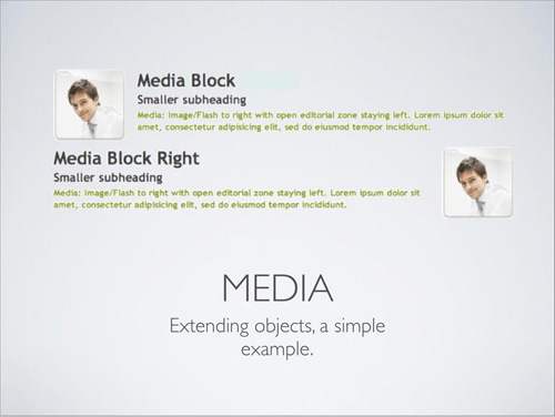
The media object is a great example of the power of OOCSS because it can contain a media element of any size with content to its right. Although many of the styles that apply to the content inside of it – and even the size of the media element itself – could change, the media object itself has common base styles that help avoid needless repetition.
The Benefits Of OOCSS
I’ve already alluded to some of the benefits of OOCSS. Here I’ll expand on these.
Faster Websites
The performance benefits of OOCSS should be fairly clear. If you have fewer styles that are repeated in your CSS, then this will lead to smaller file sizes and thus faster downloading of those resources.
It’s true that markup will be more cluttered and thus create larger HTML files. But in many cases the amount of loss in markup performance will be greatly surpassed by the amount of gain in stylesheet performance.
Another concept to keep in mind is something that the OOCSS wiki refers to as performance freebies. This refers to the fact that every time you reuse something in your CSS, you’re essentially creating new styled elements with zero lines of CSS code. For large, high-traffic projects, these “freebies” could be a crucial performance gain.
Maintainable Stylesheets
With OOCSS, instead of a constantly growing stylesheet full of specificity wars, you’ll have an easy to maintain set of modules where the natural cascade plays an important role.
When making additions to an existing site, you won’t be adding new styles to the bottom of your stylesheet without regard for what came before. Instead you’ll be reusing existing styles and extending your styles based on existing rule sets.
With this type of forethought, it’s possible to create entire pages while coding very little CSS. Any existing CSS modules can serve as a basis for all new pages, and any new CSS will be minimal. In some cases you might even be able to create a new fully-styled page without coding a single line of CSS.
These maintainability benefits also extend to the robustness of your stylesheets. Because the styles are modular, pages built on OOCSS will be less likely to break when a new developer starts to use the stylesheet.
Points Worth Noting
OOCSS has created a great deal of discussion in the community, raising some controversies. Here I’ll try to dispel a couple of common misconceptions.
You Can Still Use IDs
If you decide to work exclusively in an OOCSS manner, then your styles will be based largely on CSS classes, and you won’t be styling elements using the ID selector.
Because of this, many have falsely claimed that OOCSS encourages dropping the use of IDs completely. But this is not true.
The rule to avoid IDs is, more specifically, don’t use IDs in selectors. So it’s perfectly acceptable to use OOCSS principles (and thus avoid styling using the ID selector) while using IDs in your HTML for JavaScript hooks and fragment identifiers.
Of course, you may have a situation where you already have an ID applied to an element that you know is unique to the page. So, you can save a few bytes by avoiding adding a class to that element and instead style it using an ID selector. But even in this instance, it’s much safer to rely on a class to ensure you don’t run into specificity problems in the future.
Dealing With Smaller Projects
For smaller sites and apps, you could certainly make the case that OOCSS would be overkill. So don’t take this article as an advocacy for OOCSS in all circumstances – it will vary depending on the project.
Nonetheless, I think it’s a good idea, at the very least, to start thinking in terms of OOCSS in all your projects. Once you get the hang of it, I’m sure you’ll find it much easier to get it working on bigger projects where the benefits would be more noticeable and relevant.
Some Guidelines For Implementation
Getting started working with OOCSS could take time. I’m still working on it, so I don’t claim to have all the answers and experience in this area.
But here are some things you might want to start doing to help you get into an OOCSS mode of thinking:
- Avoid the descendent selector (i.e. don’t use
.sidebar h3) - Avoid IDs as styling hooks
- Avoid attaching classes to elements in your stylesheet (i.e. don’t do
div.headerorh1.title) - Except in some rare cases, avoid using
!important - Use CSS Lint to check your CSS (and know that it has options and method to its madness)
- Use CSS grids
There will obviously be times when some of these rules will be broken, but overall, these are good habits to develop and will lead to stylesheets that are smaller and easier to maintain.
Follow Nicole Sullivan’s Work
If you want to continue learning about OOCSS, the most important person in the industry to keep up with is Nicole Sullivan.
In addition to posting articles regularly on OOCSS on her blog, Nicole has done a number of presentations with accompanying slideshows. Below are some that you might want to check out:
- Object Oriented CSS (Slideshow)
- High Performance Websites: Nicole Sullivan (Video)
- Our Best Practices Are Killing Us (Slideshow)
- CSS Bloat (Slideshow)
Conclusion
Many people fear the OOCSS ideology because it seems to go against many of the so-called “best practices” we’ve learned. But once the long-term benefits of using OOCSS are understood, I’m sure many developers will become converts.
Overall I think OOCSS has a bright future in CSS development, and it’s a concept that all developers should start incorporating into their projects – at least on some level – to help create Web pages that are faster, more efficient, and easier to maintain.
 (il)
(il)

