The Future Of CSS: Embracing The Machine

Email Newsletter
Weekly tips on front-end & UX.
Trusted by 200,000+ folks.
 Flexible CMS. Headless & API 1st


But how does this tradition fit in a world where the websites and applications that we want to create are becoming increasingly complex?
Further Reading on SmashingMag:
- The Bright (Near) Future of CSS
- Push Your Web Design Into The Future With CSS3
- Laying Out A Flexible Future For Web Design With Flexbox
- The Future Of CSS: Experimental CSS Properties
Looking Back
If we look back in history, deep into the Industrial Revolution, we will see a parallel with what will happen with our handcrafted style sheets once the complexity of the products that we want to build becomes too great.
The Industrial Revolution (which took place approximately between the middles of the 18th and 19th centuries, starting in the UK) was a period of upheaval in society; several aspects of life were changing. Much of this was due to the way people produced goods: during this period, manual labor started to become mechanized. The textile industry, for example, moved from primarily human- to machine-based production, and its artisans started looking at ways to be more efficient.

One of the many products of the Industrial Revolution. (Image: McCord Museum)
These machines that were created with efficiency in mind were initially quite primitive, and the public didn’t know what to think of them. It took us some time to adapt the way we worked with them and the way we thought of them.
Jobs that previously required human labor now didn’t require anyone; a machine could do the job cheaper and faster; employees became redundant. But the jobs in which people were being replaced by machines were mainly repetitive ones, jobs for which manual labor didn’t necessarily make for better products — at least not in any significant way.
Some argued that the output suffered in quality, that machine-made objects lacked personality, that craftsmanship was being lost, and yet production improved and evolved. We were also getting to the point that some products were getting too complex to be made by hand anymore.
This revolution shaped the world we live in today and gave us access to things that were until then too expensive or even non-existent.
Getting back to our topic, we’re seeing increasing complexity in the world of Web design and CSS. We want to create increasingly complex websites and apps — systems so complicated that they cannot be made entirely by hand.

MobileMe, with its extensive functionality and comprehensive interface, is an example of a complex Web application.
The World Of Developers
Developers and programmers are already inclined towards automation. Developers instinctively avoid reinventing the wheel. They understand the need to automate production (at least some stages of it); they understand that hand-crafted code is not needed at every step of the process.
Even if you are a great front-end developer who knows JavaScript like the back of your hand, you still defer a lot of your work to jQuery or some other library. Even if you’re able to write the code yourself, the time you’d save by not doing that frees you to deal with more significant problems. The gains in writing a script from scratch are no match for the gains in being able to focus attention on problems that no machine or automated process can solve.
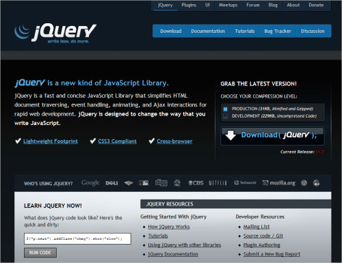
jQuery, a well-known developer’s tool.
The skills and knowledge you’ve gathered through the years are not in vain, though. This knowledge is what makes you the best person to decide whether to choose jQuery; it’s what makes you able to adjust a plugin that doesn’t quite do what you need; and it’s what makes you capable of determining the best tool for the job.
The Wrong Attitude
Web designers don’t approve of these kinds of shortcuts. This way of thinking doesn’t translate to CSS; in the world of CSS, taking these “shortcuts” is not well regarded.
We CSS authors have a list of dirty words that we avoid saying when we’re speaking with fellow Web designer friends. For example, when someone says they’ve used a CSS framework, the apology immediately follows: “It wasn’t our fault.”
Principles such as DRY (don’t repeat yourself) are not present in CSS.
DRY states that “Every piece of knowledge must have a single, unambiguous, authoritative representation within a system.” This applies not only to code but to every aspect of a product, such as design itself. When DRY principles are followed, we’re supposed to end up with products that are of higher quality and easier to maintain.
We CSS authors don’t think of the cost of maintenance or the increased complexity that duplication and cancelling out of styles add to our CSS sheets.
We usually follow something closer to WET: we enjoy typing. Why someone would want to hand-code vendor prefixes for CSS gradients is beyond my understanding, but the truth is that some people do, and they take pride in it.
CSS authors — i.e. Web designers who write CSS — don’t like the machine. We don’t think any CSS that the machine can produce will ever be as good as the one we make ourselves by hand. But what if this is not true? What if the result is as good as our own manual labor from scratch?
Other groups have had the same fears. The Luddites were workers who fiercely opposed the Industrial Revolution and progress. They said that machines were taking their jobs — which was true. But they fought, protested, became violent and eventually lost. Things would evolve whether they liked it or not.

The Luddites, smashing the machine. (Image: Wikipedia)
Context Matters
It’s true that we don’t all code for the Facebooks and Yahoos of this world; your CSS’ performance might not be the most important thing to focus on in your projects. But this is why considering context matters, and this is why it’s important not to dismiss techniques and solutions because someone once told us they were wrong or dirty.
We can embrace the flexibility that some measure of automation gives us and focus our worries and energies on deeper problems. We could focus on so many things: accessibility, usability, design theory, psychology, business, economics, experimentation and even programming are all suitable candidates and are areas in which having some knowledge, even at a basic level, can greatly improve our work.
An interesting reading list. (Image: Mike Kuniavsky)
Expanding our skill set can give us a better understanding of the products we create, the people we create them for (and their context), and how they are supposed to work behind the curtains.
Rethinking our processes might lead to better quality work. It might lead to perfecting a machine still in its infancy. If we don’t deny mechanization from coming into our work, we get the chance to shape it so that it does exactly what we want it to do.
Try This At Home
If we look around, we’ll see that several people are already trying to change the way we write our CSS, whether by introducing some kind of automation or by looking at ways of creating style sheets that don’t bypass issues such as maintainability. We can take inspiration from the work they produce in a number of interesting ways. Below are some of the most prominent examples, but feel free to add your own list in the comments section.
Frameworks: Don’t Reinvent the Wheel
As mentioned, “frameworks” are probably the dirtiest word in a CSS author’s vocabulary — or second dirtiest, after “Dreamweaver.” (Note: this article was written before the advent of Adobe’s Muse.)
Often when discussing the subject of this article, people walk away assuming that the message I am trying to get across is to use CSS frameworks. That’s not correct. But it isn’t entirely incorrect either. Let me explain.
Frameworks are an important tool in a CSS author’s repertoire. By that, I don’t mean that you should blindly use popular frameworks such as Blueprint or 960 Grid System. Sure, these frameworks have nailed some things, and we can certainly learn a lot from their flexibility and modularity, but it’s more important that you — especially if you’re on a team — adapt a framework to the needs of you, your company and your team.
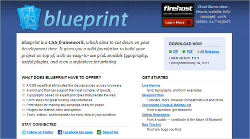
Blueprint, a popular CSS framework.
Perhaps you or your company works with such disparate clients and projects that a framework wouldn’t really be helpful, though. Perhaps a library in which you can collect snippets of frequently used code would be more useful. Or perhaps a starter template is what you need.
Whatever you need, more often than not you can find a way without having to reinvent the wheel from project to project. And if indeed you work with a number of other designers and developers and share CSS, then these tools will make collaboration easier, and you won’t have to adapt to the style of the person who created a particular file.
Frameworks can also be useful tools for wireframing and prototyping, especially when there are time constraints and you need to put something in front of users or stakeholders quickly.
There are differences between a framework and a patterns library, components or even a simple collection of code snippets. A framework is a system that is flexible and can be adjusted to a myriad types of layouts, creating various page templates, whereas a library constitutes smaller individual modules that don’t have to be tied to any particular overarching framework or page construction.
A pattern demonstrates how, for example, tabbed navigation should function or how to mark it up; a design component could be the exact visual representation of an instance of tabbed navigation, with its colors, shapes and fonts. This explanation of these two distinct and important concepts is very simplistic. The “Further Reading“ section at the end of this article lists some useful resources on both.
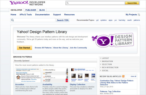
The Yahoo Design Pattern Library.
A framework doesn’t have to spit out numerous unsemantic class names to every container in your markup. If you are creating your own, you are free to name those classes whatever you feel is right.
Let’s imagine you are starting to write a framework that can be shared across various development teams in your news organization. You might start with the following skeleton:
/* Resets */

/* Structure */

/* Global elements */

/* Visual media */

/* Article structure */

/* Forms */

/* Tables */

/* Reusable */
This structure is probably similar to many of your own style sheets. Let’s look at the “Article structure” section as an example of something that would probably benefit from some framework inspiration. In the project, you will probably have to accommodate several variations of templates from various departments, sub-departments, content creators, editors, etc. Rather than using classes like span-6 and pull-3, you can define a naming system that better ties into the website’s content. For example:
/* Article structure */

article {
    width: 80%;
}
article.charticle { /* Charticle pages have no sidebar */
    width: 100%;
}
article.listicle {
    width: 70%;
}

article > .headline {
    font-size: 2em;
}
article.feature > .headline {
    color: #000;
}
article.breaking > .headline {
    text-decoration: underline;
}

article > section {
    border-bottom: 1px solid #efefef;
}

article > aside {
    background: #efefef;
    padding: .5em;
}

article > footer {
    font-size: .9em;
}
Several things about the above CSS could be debated (I’m sure many of you have strong feelings about descendent selectors and named elements and even whether some of these classes could have been simple element selectors — to name but a few points), but none of this matters in this example. What does matter is how you can be influenced by what popular do-it-all frameworks are doing, and how you can apply that to your clean, semantic and perfectly named markup and CSS.
If you can plan for and analyze the needs of the people who create the content, then you can ensure that they have the flexibility they need to do their jobs and that you can be proud of your code. Sometimes an extra class is necessary, but if that makes everyone’s life easier, then why not, right?
Think of Others
Following what we discussed in the previous section, the fact that your CSS doesn’t live in a vacuum can be extremely useful.
Other people — and the future you — might need to come back later on to edit the style sheet that you’re creating today. Wouldn’t you want your future self to be free to go home to your spouse and kids earlier on a Friday afternoon rather than have to stay up late refactoring a CSS file that is hard to comprehend and impossible to extend?
Do yourself and others a favor by considering what you’re doing. Add comments to your CSS files for such things as the following:
Calculations Font sizes (especially when dealing with ems) and layout measurements are great candidates for these types of comments.
h2 {
font-size: 18px;
line-height: 1.167; /* 21 (original line-height) / 18 (h2 font-size) */
}
Hacks On the rare occasion that you use a hack, explain what you’re doing, refer to the hack by its common name, and link to an online reference that explains what you’ve just done.
aside section {
float: left;
width: 50%;
display: inline; /* fixes the double float margin bug on IE5/6. More on this bug/solution: https://www.positioniseverything.net/explorer/doubled-margin.html */
}
To-dos Even CSS documents have “nice to haves,” so listing what you’ve been planning to do but haven’t gotten around to yet might be a good idea.
/* To-do
Change all colors to RGB format.
Sanitize reusable classes section.
*/
File structure Summarizing what is contained in a particular file can save time when someone is looking for a certain selector.
/*  Table of contents
Resets
Structure
Links
Typography
Small screens
*/
Dependencies Is this file being imported by some other file? Does it override something else? Explain what and how.
/* Christmas style sheet 2011

Overriding: main.css
Importing reset file: reset.css */
The fact that CSS comments are not standardized could cause a problem with all of this preparedness: everyone does them differently. In my quest for the ideal CSS formatting style, I discovered the dusty CSSDOC standard, which tries (or tried) to introduce some kind of sanity to the situation.
The old dusty CSSDOC website.
CSSDOC is an adaptation of Javadoc (a documentation generator that extracts comments from Java source code into HTML). It is also similar to PHPDoc, Javadoc’s adaptation for PHP. A comment that follows the CSSDOC format (a “DocBlock”) looks like the following:
/**
 * Short description
 *
 * Long description (optional)
 *
 * @tags (optional)
 */
Every block starts with /* and ends with a space followed by /. Every line must start with a space followed by an asterisk. The tags may contain information such as @author, @copyright, @todo and so on.
The CSSDOC standard suggests that a CSS file should include a comment about the file itself at the top, containing meta data that is relevant to the whole file. This comment should include information such as the title of the document, a description and tags such as @project, @version, @author, @copyright and even @colordef, indicating which colors are used in the file. The file comment may be followed by any number of section comments that divide the style sheet into relevant blocks. Section comments include the tag @section:
/**
 * Typography
 *
 * @section typography
 */
The CSSDOC documentation is not lengthy. Also, it hasn’t been maintained for a while, but I did find it interesting and have started applying it to my projects because it takes some of the guesswork and subjectivity out of comments.
Another way to make sharing documents on a team easier is to standardize the style. We all have our preferences on how to format CSS, how to name classes and IDs, address bugs, etc. Creating a style guide that recommends a way to do these things in your company will make it easier for anyone who edits the CSS to dive straight into what they need to do, rather than having to decipher someone else’s style.
This may be overkill for a team of one or two, but it can improve efficiency and save time when the team grows. In this case, consistency should have final say; personal preference is not important. If you’re the only one on a team of 12 who prefers single-line CSS, you will have to take one for the team. (Pardon me if I sound bitter; perhaps I still recall what happened on my own team…)
Here are some examples of style guidelines:
- “Class and ID names must be lowercase.”
- “Do not specify units for values of 0 (zero). They are unnecessary.”
When creating a style guide, include a succinct explanation for its inclusion, otherwise it will be easy for people to challenge it. The BBC has some great examples of guidelines that are relevant to CSS authors.
An example of CSS guidelines, part of BBC’s “Future Media Standards & Guidelines” documents.
Learn About Object-Oriented CSS
Object-oriented CSS was started by front-end performance consultant Nicole Sullivan. The methodology brings modularity and flexibility to CSS by forcing you to create small flexible style sheets.
It follows two main principles. First, it states that an element should behave predictably, no matter where you place it on a page. So, a child element should behave the same independent of the parent, and parent elements shouldn’t need child elements to render correctly.
The second principle is that the rules that control the structure of elements should be separate from the rules that control their skin.
So, if you look at the pages that you need to build in a modular way and think of individual objects first and the pages second, then after creating the initial CSS you should be able to build any page layout using just the existing modules.
All of this sounds great, but object-oriented CSS does have some drawbacks.
For instance, in order for an element to be adaptable enough to be placed anywhere on the page, the name of its class should also be flexible. If you style a box and give it a class name of footer, and later on you decide to apply that style to a box in the sidebar, then the initial class name you gave it will be wrong — it’s not flexible enough. Thus, class names in style sheets that follow object-oriented CSS can sometimes be less content-driven or less semantic than we’d like.
Despite its drawbacks, object-oriented CSS has its value in certain situations. If we are working on a big website for which a small style sheet (small file size) and flexibility and maintainability are important, then following the principles of object-oriented CSS can bring huge improvements to our processes and huge savings to our company.
Once again, you don’t have to follow this methodology blindly in order to gain from its benefits.
Going back to the news company, let’s imagine you want to make a box that sits in the sidebar more prominent than other elements contained there. You might write the following CSS:
#sidebar .highlight {
    background: #efefef;
    border: 1px solid #000;
    box-shadow: 0 0 .5em #000;
}

#sidebar .highlight > h1 {
    font-weight: bold;
}
What’s so wrong with the CSS above? If you are following object-oriented CSS, then you shouldn’t restrict a style that you will probably reuse in the main content area by confining it to the #sidebar container. In our example, though, we’ll happily keep the descendent element selector in the second rule (object-oriented CSS advises against child elements being dependent on parent elements, but you can draw the line on how closely to adhere to a particular technique as you see fit, and that’s the beauty of it!).
So much more could be said about this technique. It is indeed well worth looking into, all bias aside. You will read things that you probably don’t consider good practice, but remember: context is important, and your expertise equips you to adopt the principles that will help you in your situation.
Step Into Programming
The command line is a boundary between designers and developers that we designers usually don’t want to cross. Instructions on opening the terminal can be quite intimidating for designers if they’re not familiar with it. I confess I’m guilty of steering clear of it most of the time.
But consider this: we keep talking about how we should learn and draw inspiration from the past — from print design, for example. We claim with pride to have deep knowledge of typography, color theory, layout, grids and scales. We see it as a requirement for anyone who calls themselves a professional designer.
This knowledge should be extended to encompass programming, at least at a basic level. After all, it is what powers our most precious creations.
Instead of being inspired by architecture — by its teachings, its processes and its vocabulary — why don’t we get inspired by the architect’s example, by what they have to learn? Why not be inspired by the multitude of disciplines that an architect has to know intimately in order to be a great professional?

How many disciplines can you spot in this model? (Image: n fiore)
Why not start now? Open Terminal. (Go on, don’t be scared. It’s only there to help.) Now type the following:
$ gem install sass
(You don’t have to write the $; it’s just there to indicate this is a Terminal command.) There, you’ve just installed Sass (which we’ll cover shortly). That didn’t hurt, did it?
If you’re working on a Sass file, you could type the following simple command to make the original Sass-formatted file automatically update the corresponding normal CSS file whenever changes are made:
$ sass --watch style.scss:style.css
The List Goes On
There are several more tools you can keep in your arsenal that can move CSS another step into the future.
Quite a few Web designers and CSS authors are becoming enamoured with CSS preprocessors such as Sass, which make it possible to extend CSS’ syntax to include, for example, variables, complex calculations and nested selectors. Not only do they enable you to use functionality not yet available in normal CSS, but you can increase efficiency by automating tasks such as updating a frequently used color on a file-wide basis, rather than having to change each instance by hand.
The increasingly popular Sass.
And with all the improvements brought by CSS3, even pure and simple CSS is becoming more powerful, enabling us to create very complex layouts and animations more easily and with fewer lines of code.
The list presented here is a short one, and I’d be happy to know what techniques you apply in your own projects to make the process of writing CSS more fluid and to make your style sheets smaller and more easily maintainable and sharable.
This Is Just The Beginning
Eric Meyer says, “You can’t identify a code craftsman by whether or not they use this framework or that language. You can identify them by how they decide which framework or language to use, or not use, in a given situation.” This statement couldn’t be closer to the truth. Discussing tools without context is pointless.
Saying that something is good or bad should be done in context. By deciding that a certain technique is fundamentally flawed because someone once said so, and holding to that opinion throughout your career without ever challenging it, is not what being creative is about.
In his Critique of Pure Reason, Kant says, “Have the courage to use your own intelligence.” I would ask you to set your biases aside when when speaking about tools, techniques and processes with other designers and developers who write CSS. Don’t view different opinions as a sign of ignorance or poor craftsmanship.
Certainly, we may question certain aspects of our jobs as Web designers, and whether to be more liberal in letting automation into our processes is just one of them — but one I’m particularly interested in.
I know and work alongside very intelligent and creative programmers. These are people who understand systems so complex that my brain shrinks every time it tries to even begin to understand them. These are also people who are proud of their work, true craftsmen of their times. I find it quite interesting how these two groups (CSS authors and programmers) work on the same products but in such different ways, how they both work with code but with such contrasting values.
There is a place for carefully handwritten, handmade, perfect CSS — I take great pleasure in this myself. But there is also a place for the study and perfection of a more mechanized approach to style sheets. Both can certainly run side by side.
What are your views on this subject? Have you been trying to automate any part of your CSS writing? Do you think style sheets should always be handcrafted?
Further Resources
The Artisan and the Mass Producer by Patrick Lauke Creating web pages is not the exclusive domain of those hardcore enough to hand-code anymore. WYSIWYG editors, blogging tools, content management systems and CSS frameworks have helped lower some of the technological entry barriers. Does this spell the end for the traditional craft of the web “artisan”?

Are CSS Frameworks Evil? by Inayaili de León CSS frameworks have a tendency to be dismissed by many CSS authors; code bloat and non-semantic class names are usually at the top of the list of reasons why. Even without ever using one, I shared the same opinion, but that might have changed after trying a few of them out while doing some research recently…

The Designer’s Guide to the OS X Command Prompt by John W. Long A tutorial for the modern web designer. The command prompt. Once the lofty domain of that guy you know with the computer science degree. Now more and more the every day domain of the hacker web designer. Perhaps you’ve mastered a little Javascript or PHP, but you are realizing that the cool kids are playing around with stuff that is only accessible to people who are comfortable with the command prompt. Or, perhaps you are just interested in upping your game.

The Book of CSS3 by Peter Gasston This book uses real-world examples to teach developers the fundamentals of the CSS3 specification, highlighting the latest developments and future features, while paying close attention to current browser implementations.

What Is the Difference Between a Framework and a Library? at Stack Overflow I always thought of a library as a set of objects and functions that is focussed around solving a particular problem or around a specific area of application development (i.e. database access); a framework on the other hand is a collection of libraries centred around a particular methodology (i.e. MVC) and covers all areas of application development.

Design Patterns: Introduction by Luke W., James Reffell, Bill Scott, Jenifer Tidwell and Martijn van Welie In the Spring of 2006, a group of designers intimately familiar with the organization and development of design pattern resources got together to discuss the current and future role of design patterns in the real world. We talked about defining and documenting patterns, the context required to communicate how patterns should be applied, what it takes to develop a design language, and how disparate lists of patterns could converge. It’s our hope this conversation continues.

Patternry A tool to create design pattern libraries. Create, share and organize design pattern libraries. Patternry keeps your User Interface design patterns, components and code snippets in one place. It helps designers, developers and others communicate and design great User Experiences.

Interaction Design Pattern: Wikipedia Interaction design patterns are a way to describe solutions to common usability or accessibility problems in a specific context. They document interaction models that make it easier for users to understand an interface and accomplish their tasks.

High-Performance Websites by Nicole Sullivan Website performance is a growing challenge for web developers and designers. The net effect of features like rounded corners and rich Ajax integration is slower performance. At Web Directions North, performance guru and former Yahoo! engineer, Nicole Sullivan, shared some of the tools and techniques she developed and used to maximize performance for Yahoo! sites and applications.

Last Remarks
Jens O. Meiert One of my favorite bloggers on the subjects of Web design, development, etc. His blog is on professional web design, web development, accessibility, and usability. Be sure to take a look!

And I haven’t actually read this book, but its premise sure sounds interesting:
Learning Processing: A Beginner’s Guide to Programming Images, Animation and Interaction by Daniel Shiffman

This book teaches you the basic building blocks of programming needed to create cutting-edge graphics applications including interactive art, live video processing, and data visualization. A unique lab-style manual, the book gives graphic and web designers, artists, and illustrators of all stripes a jumpstart on working with the Processing programming environment by providing instruction on the basic principles of the language, followed by careful explanations of select advanced techniques.
Front page image credits go to Creativity103.
(al) (il)


