The Guide To CSS Animation: Principles and Examples
With CSS animation now supported in both Firefox and Webkit browsers, there is no better time to give it a try. Regardless of its technical form, whether traditional, computer-generated 3-D, Flash or CSS, animation always follows the same basic principles.
In this article, we will take our first steps with CSS animation and consider the main guidelines for creating animation with CSS. We’ll be working through an example, building up the animation using the principles of traditional animation. Finally, we’ll see some real-world usages.

CSS Animation Properties
Before diving into the details, let’s set up the basic CSS:
Animation is a new CSS property that allows for animation of most HTML elements (such as div, h1 and span) without JavaScript or Flash. At the moment, it’s supported in Webkit browsers, including Safari 4+, Safari for iOS (iOS 2+), Chrome 1+ and, more recently, Firefox 5. Unsupported browsers will simply ignore your animation code, so ensure that your page doesn’t rely on it!
Because the technology is still relatively new, prefixes for the browser vendors are required. So far, the syntax is exactly the same for each browser, with only a prefix change required. In the code examples below, we use the -webkit syntax.
All you need to get some CSS animation happening is to attach an animation to an element in the CSS:
/* This is the animation code. */
@-webkit-keyframes example {
   from { transform: scale(2.0); }
   to   { transform: scale(1.0); }
}

/* This is the element that we apply the animation to. */
div {
   -webkit-animation-name: example;
   -webkit-animation-duration: 1s;
   -webkit-animation-timing-function: ease; /* ease is the default */
   -webkit-animation-delay: 1s;             /* 0 is the default */
   -webkit-animation-iteration-count: 2;    /* 1 is the default */
   -webkit-animation-direction: alternate;  /* normal is the default */
}
First, we have the animation code itself. This can appear anywhere in the CSS, as long as the element that you’re animating can find the relevant animation-name.
When assigning the animation to your element, you can also use the shorthand:
div {
-webkit-animation: example 1s ease 1s 2 alternate;
}
We can cut this down further by not entering all of the values. Without a value specified, the browser will fall back to the default.
Those are the basics. We’ll work through more code in the following section.
Applying Principles of Traditional Animation
Disney — the masters of traditional animation, in my opinion — developed the 12 principles of traditional animation early on and documented them in its famous book The Illusion of Life. These basic principles can be applied to all manner of animation, and you needn’t be an expert in animation to follow along. We’ll be working through an example of CSS animation that uses the 12 principles, turning a basic animation into a more believable illusion.
These may just be bouncing balls, but you can see a world of difference between the two versions.
This example demonstrates the features of CSS animation. In the code below, we use empty divs to show how it works; this isn’t the most semantic way to code, as we all know, but the point is to show how simple it is to bring a page to life in a way that we haven’t been able to do before in the browser.
Squash and Stretch

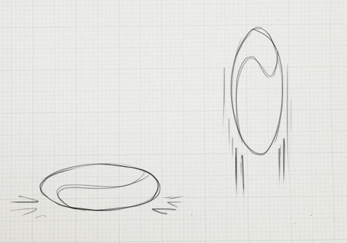
The crude bouncing ball is a great demonstration of this first point. If the ball falls at a high velocity and hits the floor, you’ll see it squash down from the force and then stretch back out as it bounces up.
At a basic level, this should give our animation a sense of weight and flexibility. If we dropped a bowling ball, we wouldn’t expect it to flex at all — it might just damage the floor.
We can apply this squash and stretch effect through a CSS3 property, transform:
@-webkit-keyframes example {
   0% { -webkit-transform: scaleY(1.0); }
   50% { -webkit-transform: scaleY(1.2); }
   100% { -webkit-transform: scaleY(1.0); }
}
This will scale the object lengthwise (on the y axis, up and down) to 1.2 times the original size, and then revert to the original size.
We’re also using more complex timing for this animation. You can use from and to for basic animations. But you can also specify many actions for your animation using percentages, as shown here.
That covers the squashing. Now we need to move the object using translate. We can combine transforms together:
50% {
-webkit-transform: translateY(-300px) scaleY(1.2);
}
The translate property allows us to manipulate the object without changing any of its base properties (such as position, width or height), which makes it ideal for CSS animation. This particular translate property makes it look like the ball is bouncing off the floor at the mid-point of the animation.
(Please note: to view the sample animations, you’ll need the latest version of Firefox, Chrome or Safari. At the time of writing, Safari provides the best viewing experience of CSS animation.)
Yes, it still looks rubbish, but this small adjustment is the first step in making this animation more believable.
Anticipation
Anticipation adds suspense, or a sense of power, before the main action. For example, the bend in your legs before you jump helps viewers anticipate what will come next. In the case of our bouncing ball, simply adding a shadow beforehand suggests that something is falling from above.
We’ve added another div for the shadow, so that we can animate it separate from the ball.
To create anticipation here, we keep the ball from dropping into the scene immediately. We do this simply by adjusting the percentage timings so that there is no movement between the start point and the first action.
@-webkit-keyframes example {
   0% { -webkit-transform: translateY(-300px) scaleY(1.2); }
   35% { -webkit-transform: translateY(-300px) scaleY(1.2); } /* Same position as 0% */
   65% { -webkit-transform: translateY(0px) scaleY(1.2); }    /* Starts moving after 35% to this position */
   67% { -webkit-transform: translateY(10px) scaleY(0.8); }
   85% { -webkit-transform: translateY(-100px) scaleY(1.2); }
   100% { -webkit-transform: translateY(0px); }
}
At the 35% point of the animation, the ball is in the same location, positioned off the stage, not moving. Then, between 35% and 65%, it suddenly moves onto the stage, and the rest of the animation follows.
You can also use animation-delay to create anticipation:
div {
-webkit-animation-delay: 1s;
}
However, this could have an undesired effect. The animation-delay property simply ignores any animation code until the specified time. So, if your animation starts in a position different from the element that you are animating, then the object will appear to suddenly jump as soon as the delayed animation starts.
This property works best for looping animations that begin and end in the same location.
Staging

Try to give a stage to the scene; put the animation in context. Thinking back to Disney films, what would they be without the fantastic background artwork? That’s half of the magic!
The stage is also key to focusing attention. Much like on a theater stage, lighting will be cast on the most important area. The stage should add to the illusion. With our bouncing ball, I’ve added a simple background to focus on where the ball will land. Now the viewer knows that the action will take place in the center, and the scene is no longer lost in snow.
Straight-Ahead vs. Pose to Pose
In traditional animation, this is a choice in how to construct your animation. The straight-ahead option is to draw out every frame in the sequence. The pose-to-pose option is to create a few keyframes throughout the sequence, and then fill in the gaps later. Filling in these gaps is known as “in-betweening,” or “tweening,” a familiar term for those used to animating in Flash.
With CSS animation, we typically use the latter, pose to pose. That is, we’ll add keyframes of action, and then the browser will “tween” the intermediate frames automatically. However, we can learn from the straight-ahead technique, too. The browser can do only so many effects; sometimes, you have to do it the hard way and put in more animation hard-graft to get the desired effect.
Follow-Through And Overlapping
Also known as physics! Follow-through and overlapping are more commonly used in character animation for body movement, such as to show arms swaying as the character drops them or long hair falling. Think of someone with a big stomach turning quickly: their body will turn first, and their bulging gut will follow shortly after.
For us, this means getting the physics right when the ball drops. In the demonstrations above, the ball drops unnaturally, as if beyond the control of gravity. We want the ball to drop and then bounce. However, this is better achieved through the next principle.
Slow In And Out
This has to do with speeding up and slowing down. Imagine a car that is speeding along and has to come to a stop. If it were to stop instantly, it wouldn’t be believable. We know that cars take time to slow down, so we would have to animate the car braking and slowly coming to a stop.
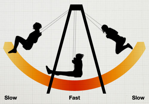
This is also relevant to showing the effect of gravity. Imagine a child on a swing. As they approach the highest point, they will slow down. As they come back down and gain speed, their fastest point will be at the bottom of the arc. Then they will rise up on the opposite side, and the action repeats.

Back to our example, by adjusting the in and out speeds, we can make the ball much more believable (finally).
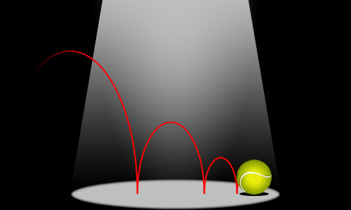
When the ball hits the floor, the impact will make it bounce back up instantly. As it reaches its highest point, it will slow down. Now it looks like the ball is really dropping.
In CSS, we can control this with the animation-timing-function property:
-webkit-animation-timing-function: ease-out;This property takes the following values:
ease-inSlow at the beginning, and then speeds up.ease-outFast at the beginning, and then slows to a stop.ease-in-outStarts slow, speeds up in the middle, and then slows to a stop.linearMoves at an even speed from start to finish.
You can also use the bezier-curve function to create your own easing speeds.
Arcs

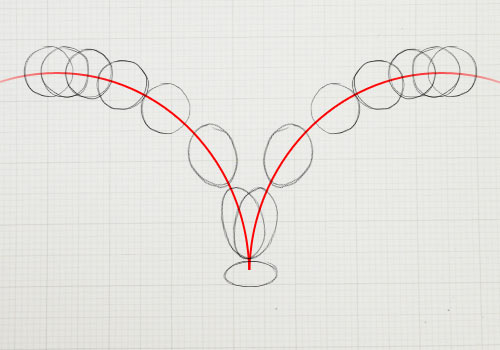
Similar to the follow-through principle of physics, arcs follow the basic principle of “what goes up must come down.” Arcs are useful in thinking about the trajectory of an object.
Let’s throw the ball in from the left of the stage. A convincing animation would predict the arc along which the ball will fall; and in our example it will have to predict the next arc along which the ball will fall when it bounces.
This animation can be a bit more fiddly to adjust in CSS. We want to animate the ball going up and down and side to side simultaneously. So, we want our ball to move in smoothly from the left, while continuing the bouncing animation that we’ve been working on. Rather than attempt to capture both actions as one animation, we’ll do two separate animations, which is easiest. For this demonstration, we’ll wrap our ball in another div and animate it separately.
The HTML:
<div class="ball-arc">
   <div class="ball"></div>
</div>
And the CSS:
.ball-arc {
-webkit-animation: ball-x 2.5s cubic-bezier(0, 0, 0.35, 1);
}
   /* cubic-bezier here is to adjust the animation-timing speed.
   This example makes the ball take longer to slow down. */

@-webkit-keyframes ball-x {
   0% { -webkit-transform: translateX(-275px); }
   100% { -webkit-transform: translateX(0px); }
}
Here, we have one animation to move the ball sideways (ball-x) and another animation to bounce the ball (ball-y). The only downside to this method is that if you want something really complex, you could end up with a code soup with poor semantics!
Secondary Action
A secondary action is a subtlety that makes the animation much more real. It addresses the details. For example, if we had someone with long hair walking, the primary action would be the walking, and the secondary action would be the bounce of the hair, or perhaps the ruffling of the clothes in the wind.
In our example, it’s much simpler. By applying more detail to the ball, we make the secondary action the spinning of the ball. This will give the illusion that the ball is being thrown in.
Rather than add another div for this animation, we can be more specific by adding it to the new img element that we’re using to give the ball texture.
.ball img {
-webkit-animation: spin 2.5s;
}

@-webkit-keyframes spin {
   0% { -webkit-transform: rotate(-180deg); }
   100% { -webkit-transform: rotate(360deg); }
}Timing

This is simply the timing of your animation. The better the timing of the animation, the more realistic it will look.
Our ball is a perfect example of this. The current speed is about right for a ball this light. If it were a bowling ball, we would expect it to drop much more quickly. Whereas, if the animation were any slower, then it would look like we were playing tennis in space. The correct timing basically helps your animation look realistic.
You can easily adjust this with the animation-duration property, and you can adjust the individual timings of your animation using percentage values.
Exaggeration
Cartoons are known for exaggeration, or impossible physics. A cartoon character can contort into any shape and still manage to spring back to normal. In most cases, though, exaggeration is used for emphasis, to bring to life an action that would otherwise look flat in animation.
Nevertheless, use exaggeration modestly. Disney had a rule to base its animations on reality but push it slightly further. Imagine a character running into a wall; its body would squash into the wall more than expected, to emphasize the force of impact.
We’re using exaggeration in combination with squash and stretch to make it really obvious when the ball hits the floor. I’ve also added a subtle wobble to the animation. Finally, we also stretch the ball in and out as it bounces up and down to emphasize the speed.
Just as when we added one animation onto another, here we’ll add another div, which will wobble in sync with the ball hitting the floor:
@-webkit-keyframes wobble {

0%, 24%, 54%, 74%, 86%, 96%, 100% {
   -webkit-transform: scaleX(1.0);
/* Make the ball a normal size at these points */
}

25%, 55%, 75% {
   -webkit-transform: scaleX(1.3) scaleY(0.8) translateY(10px);
/* Points hitting the floor: squash effect */
}

30%, 60%, 80% {
   -webkit-transform: scaleX(0.8) scaleY(1.2);
/* Wobble inwards after hitting the floor */
}

75%, 87% {
   -webkit-transform: scaleX(1.2);
/* Subtler squash for the last few bounces */
}

97% -webkit-transform: scaleX(1.1);
/* Even subtler squash for last bounce */
}

}
The code looks more complex than it is. It’s simple trial and error. Keep trying until you get the right effect!
Solid Drawing And Appeal
I have nothing more to teach you… at least not in code. These final two animation principles cannot be shown in code. They are skills you will have to perfect in order to make truly amazing animations.
When Disney started production on Snow White, it had its animators go back to life drawing classes and learn the human form again. This attention to detail is evident in the film, which goes to show that good animation requires solid drawing skills and sound knowledge of the form you are animating.
Most CSS animation will likely not be as complex as intricate figure animations, but the basic principle holds true. Whether a door is opening to reveal content or a “contact us” envelope is being sealed and delivered, the animation should be believable, not robotic… unless you’re animating a machine.
The appeal, or charisma, of each character will be unique. But as Disney has always shown, anything can have character: a teapot, a tree, even spoons. But with CSS, consider how the overall animation will contribute to the design and make the overall experience more satisfying. We don’t want to make clippy animations here.
Go Forth And Animate!
CSS animation is a great new feature. As with every new CSS feature, it will be overused and misused at first. There is even the slight danger that we’ll see a return of those long-winded Flash-style animated splash pages. Although I have faith in the Web community not to do this.
CSS animation can be used to really bring a website to life. While the code for our bouncing ball may not be the most semantic, it hopefully shows how simple it can be to bring almost anything on the page to life with CSS.
It can bring much-needed interaction to your elements (sans Flash!); it can add excitement to the page; and in combination with JavaScript, it can even be an alternative way to animate for games. By taking in the 12 principles above and working away at your animation, you can make your websites more convincing, enticing and exciting, leading to a better experience overall.
CSS Animation Tools
While knowing the CSS itself is great, plenty of tools are popping up that will help you animate. The 12 principles apply regardless, but if you’re worried about the code, these great tools let you try out CSS animation without getting too technical.
- Sencha Animator
- Adobe Edge
- Tumult Hype (Mac only)
CSS Animation In The Wild
Finally, to get you excited about what is possible, here are some great examples of CSS animation being used on live websites:
- CSS Spider-Man animation, by Anthony Calzadilla
- CSS Tricks (animated typography person), by Mircea Piturca
- Walking man, by Andrew Hoyer
- Learning CSS3: Useful References and Guidelines, on Smashing Magazine
- Mastering CSS Principles: A Comprehensive Guide, on Smashing Magazine
Further Reading
- SVG and CSS animations with clip-path
- Creating ‘hand-drawn’ Animations With SVG
- The new Web Animation API
- Practical Animation Techniques
- The Math Behind JavaScript Animations
- UI Animation Guidelines and Examples
- Designing Animations In Photoshop
- Fast Prototyping UI Animations In Keynote


 Bring your design to life
 Register For Free
 How To Measure UX and Design Impact, 8h video + UX training
 JavaScript Form Builder — Create JSON-driven forms without coding.


