The Semantic Grid System: Page Layout For Tomorrow
CSS grid frameworks can make your life easier, but they’re not without their faults. Fortunately for us, modern techniques offer a new approach to constructing page layouts. But before getting to the solution, we must first understand the three seemingly insurmountable flaws currently affecting CSS grids.
Problems
Problem #1: They’re Not Semantic
The biggest complaint I’ve heard from purists since I created The 1KB CSS Grid two years ago is that CSS grid systems don’t allow for a proper separation of mark-up and presentation. Grid systems require that Web designers add .grid_x CSS classes to HTML elements, mixing presentational information with otherwise semantic mark-up.
Floated elements must also be cleared, often requiring unnecessary elements to be added to the page. This is illustrated by the “clearing” div that ships with 960.gs:
<div class="grid_3">
    220
</div>
<div class="grid_9">
    700
</div>
<div class="clear"></div>
Problem #2: They’re Not Fluid
While CSS grids work well for fixed-width layouts, dealing with fluid percentages is trickier. While most grid systems do provide a fluid option, they break down when nested columns are introduced. In the 1KB CSS Grid example below, .grid_6 would normally be set to a width of 50%, while .grid_3 would typically be set to 25%.
But when .grid_3 appears inside of a .grid_6 cell, the percentages must be recalculated. While a typical grid system needs just 12 CSS rules to specify the widths of all 12 columns, a fluid grid would need 144 rules to allow for just one level of nesting: possible, but not very convenient.
<div class="column grid_6">
    <div class="row">
        <div class="column grid_3"> </div>
        <div class="column grid_3"> </div>
    </div>
</div>
Problem #3: They’re Not Responsive
Responsive Web design is the buzzword of the year. While new tools such as 1140 CSS Grid and Adapt.js are springing up that enable you to alter a page’s layout based on screen size or device type, an optimal solution has yet to arrive.
Blame It On The Tools
All three of these problems directly result from the limitations of our existing tools. CSS leaves us with the ultimatum of either compromising our principles by adding presentational classes to mark-up, or sticking to our guns and forgoing a grid system altogether. But, hey, we can’t do anything about it, right?
Well, not so fast. While we wait for browsers to add native CSS support for this flawed grid layout module, a futuristic version of CSS is available today that’s already supported by every CSS-enabled browser: LESS CSS.

LESS What?
You’ve probably heard of LESS but perhaps have never given it a try. Similar to SASS, LESS is extends CSS by giving you the ability to use variables, perform operations and develop reusable mixins. Below are a few examples of what it can do.
Variables
Specify a value once, and then reuse it throughout the style sheet by defining variables.
// LESS
@color: #4D926F;

#header {
  color: @color;
}
The above example would compile as follows:
/* Compiled CSS */
#header {
  color: #4D926F;
}
Operations
Multiply, divide, add and subtract values and colors using operations.
// LESS
@border-width: 1px;

#header {
    border-left: @border-width * 3;
}
In this example, 1px is multiplied by 3 to yield the following:
/* Compiled CSS */
#header {
    border-left: 3px;
}
Mixins
Most powerful of all, mixins enable entire snippets of CSS to be reused. Simply include the class name of a mixin within another class. What’s more, LESS allows parameters to be passed into the mixin.
// LESS
.rounded(@radius) {
    -webkit-border-radius: @radius;
    -moz-border-radius: @radius;
    border-radius: @radius;
}

#header {
    .rounded(5px);
}
Verbose, browser-specific CSS3 properties demonstrate the benefit that mixins bring:
/* Compiled CSS */
#header {
  -webkit-border-radius: 5px;
  -moz-border-radius: 5px;
  border-radius: 5px;
}
Downsides To LESS
Having been skeptical of LESS at first, I’m now a strong advocate. LESS style sheets are concise and readable, and they encourage code to be reused. However, there are some potential downsides to be aware of:
- It has to be compiled. This is one extra step that you don’t have to worry about with vanilla CSS.
- Depending on how LESS documents are structured, the compiled CSS file might be slightly larger than the equivalent hand-crafted CSS file.
A Note On Compiling LESS
There are three approaches to compiling LESS style sheets into CSS:
- Let the browser do the compiling.
As its name suggests, LESS.js is written in JavaScript and can compile LESS into CSS directly in the user’s browser. While this method is convenient for development, using one of the next two methods before going into production would be best (because compiling in the browser can take a few hundred milliseconds). - Use a server-side compiler.
LESS.js can also compile server-side with Node.js, and it has been ported to several other sever-side languages. - Use a desktop app.
LESS.app is a Mac app that compiles local files as they’re saved on your computer.
Introducing The Semantic Grid System
The innovations that LESS brings to CSS are the foundation for a powerful new approach to constructing page layouts. That approach is the The Semantic Grid System. This new breed of CSS grid shines where the others fall short:
- It’s semantic;
- It can be either fixed or fluid;
- It’s responsive;
- It allows the number of columns, column widths and gutter widths to be modified instantly, directly in the style sheet.

Configuring The Grid
Sounds too good to be true? Here’s how it works.
First, import the semantic grid into your working LESS style sheet.
@import 'grid.less';Next, define variables for the number of columns, and set the desired widths for the column and gutter. The values entered here will result in a 960-pixel grid system.
@columns: 12;
@column-width: 60;
@gutter-width: 20;
The grid is now configured and ready to be used for page layout.
Using The Grid
Now that the grid has been configured, consider two elements on an HTML page that you would like to lay out side by side.
<body>
    <article>Main</article>
    <section>Sidebar</section>
</body>
The side-by-side layout can be achieved by passing the desired number of grid units to the .column() mixin (which is defined in the grid.less file).
// LESS
@import 'grid.less';

@columns: 12;
@column-width: 60;
@gutter-width: 20;

article {
    .column(9);
}
section {
    .column(3);
}
The above LESS would be compiled to CSS as the following:
/* Compiled CSS */
article {
    display: inline;
    float: left;
    margin: 0px 10px;
    width: 700px;
}
section {
    display: inline;
    float: left;
    margin: 0px 10px;
    width: 220px;
}
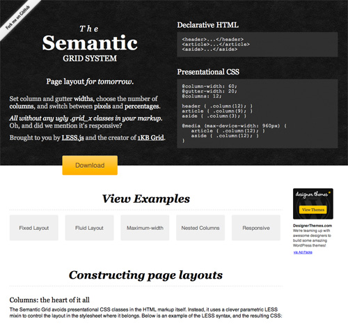
This page demonstrates the result. What makes this approach so different is that it does away with ugly .grid_x classes in the mark-up. Instead, column widths are set directly in the style sheet, enabling a clean separation between declarative mark-up and presentational style sheets. (It’s called the semantic grid for a reason, after all.)
So, What’s Behind The Curtain?
For the curious among you, below are the mixins at the center of it all. Fortunately, these functions are hidden away in the grid.less file and need not ever be edited.
// Utility variable — you will never need to modify this
@_gridsystem-width: (@column-width*@columns) + (@gutter-width*@columns) * 1px;

// Set @total-width to 100% for a fluid layout
@total-width: @_gridsystem-width;

// The mixins
.row(@columns:@columns) {
   display: inline-block;
   overflow: hidden;
   width: @total-width*((@gutter-width + @_gridsystem-width)/@_gridsystem-width);
   margin: 0 @total-width*(((@gutter-width*.5)/@_gridsystem-width)*-1);
}
.column(@x,@columns:@columns) {
   display: inline;
   float: left;
   width: @total-width*((((@gutter-width+@column-width)*@x)-@gutter-width) / @_gridsystem-width);
   margin: 0 @total-width*((@gutter-width*.5)/@_gridsystem-width);
}
Fluid Layouts
The example above demonstrates a fixed pixel-based layout. But fluid percentage-based layouts are just as easy. To switch from pixels to percentages, simply add one variable:
// LESS
@total-width: 100%;
With no other changes, the compiled CSS then becomes this:
/* Compiled CSS */
article {
    display: inline;
    float: left;
    margin: 0px 1.04167%;
    width: 72.9167%;
}
section {
    display: inline;
    float: left;
    margin: 0px 1.04167%;
    width: 22.9167%;
}
This example shows how the percentages are dynamically calculated using LESS operations, which also applies to nested columns.
Responsive Layouts
No modern grid system would be complete unless we had the ability to adapt the layout of the page to the size of the user’s screen or device. With Semantic.gs, manipulating the grid using media queries couldn’t be any easier:
article { .column(9); }
section { .column(3); }

@media screen and (max-width: 720px) {
    article { .column(12); }
    section { .column(12); }
}
Try It For Yourself
Just a couple of days ago Twitter released a project called Bootstrap which provides similar (but more limited) grid system built using LESS variable and mixins. The future of the CSS grid seems to be taking shape before us.
The Semantic Grid System delivers the best of both worlds: the power and convenience of a CSS grid and the ideal separation of mark-up and presentation. Download the grid for yourself, fork it on GitHub, and let us know what you think!

Other Resources
- Semantic.gs Download the grid system.
- LESS Find out more about LESS.
- “Responsive Web Design,” Ethan Marcotte
- 1140 CSS Grid and Adapt.js Two other approaches to responsive layouts.
- “Rethinking CSS Grids,” Mark Boulton
- “Best Practices Are Killing Us” Nicole Sullivan’s contrarian views on semantics, as described by Luke Wroblewski.
- 1KB CSS Grid Play with Tyler Tate’s original CSS grid.
Further Reading
- Grid-Based Web Design, Simplified
- Designing With Grid-Based Approach
- Semantic CSS With Intelligent Selectors


 Flexible CMS. Headless & API 1st


