Dear Clients, The Web Has Changed. It’s Time To Use CSS3 and HTML5 Now.
Since hearing about HTML5 and CSS3, then later reading Hardboiled Web design by Andy Clarke, I have been working on a presentation to help introduce these development methods to my clients. If all i said to them was “these are the latest development methods, but there will be visual differences”, I’m sure you can imagine the response I would receive.
Most of my clients these days tell me they want the following:
- HTML to validate as Strict or Transitional,
- CSS to validate,
- Website that meets Accessibility Level 2+,
- Design that looks the same across all browsers.
They have learned this information from us, developers and agencies, who have educated the world over the last 10 years on best practices. Now we need to re-educate them, and it won’t be easy! Most people steer away from things they don’t understand out of fear of the unknown.
Re-Educating Your Client
Generally speaking, you would start by discussing what the client currently knows, and telling them why these methods are out of date and need to be changed. Following this, you would talk about how we do things now, explaining why these ways are better. Let’s begin.
How We Used To Develop

Around 40% of our time is dedicated to making our websites look pixel-perfect across all browsers. We used to make sure that a website rendered exactly the same across all browsers (or as close to it as possible). But this didn’t guarantee that the website would work on all devices and phones.
The old way of developing websites was longwinded and is out of date. The notion of delivering an identical visual experience to users on every browser (to the closest pixel) originated in the print world.
We need to remember that the Web as we know it has changed. We are no longer in 2004, developing for Internet Explorer 6 on a PC. In this day and age, the Web stretches across a broad range of devices, including mobile phones, TVs, handheld PCs and Macs, even fridges. So, our websites could be rendered in any number of ways.
By aiming for uniformity across browsers, not only are you not future-proofing your project, but you are making it less accessible.
W3C Validation

Validation is a tool to guide us, not a religion to blindly follow. For more information on this, Jeffery Way has written a great article titled “But It Doesn’t Validate.”
A website that validates is not necessarily accessible to users and does not necessarily function well across browsers. We must not mistake validation for accessibility (as defined by the WAI) or usability (as defined by the UK’s Disability Discrimination Act).
Google states that validation has no effect on its ranking system. It does partly rank websites based on how accessible and usable they are across a variety of browsers and devices. See Matt Cutt’s response to a user’s question about why their website doesn’t validate.
How We Develop Today

- We use HTML5 and CSS3 to make our websites more device-friendly, accessible and usable. These standards enable our websites to be accessed on browsers that extend far beyond just PCs and Macs.
- The development process has accelerated, which helps us complete projects faster and to a higher standard.
- Minor changes are not as time-consuming, which reduces development time and saves the client money.
- By designing and developing to the capabilities of the best browsers, our websites become more future-proof.
- This method speeds up development time and decreases costs.
Content Is The Priority

The most important principles to follow are:
- Accessibility Every website should be developed with clean HTML that can be read by any device. This enables the content to be available to all browsers and devices.
- Usability Usable information is also a high priority. If a website has been accessed but is not useable on the browser or device, then it serves no purpose (and this might even affect its ranking on Google).
The Differences Between Browsers

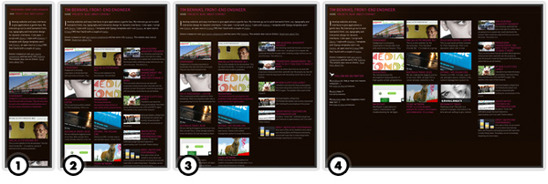
The above screenshots show how the user experience can differ between advanced and less capable browsers and devices. The four screenshots break down as follows:
- Internet Explorer 6, screen readers, browsers and devices with no CSS support.
- Older versions of browsers, such as Internet Explorer 7-8, Firefox 2, Chrome, Opera and Safari.
- All current modern browsers, such as Firefox 3.6, Chrome, Opera and Safari.
- CSS 3-D animation is supported only in Safari at the moment, but will be in upcoming versions of Firefox and Chrome due for release in 2011.
Adaptive Design

Adaptive design entails building your website slightly differently and increasing the development time. You would build the website with fluid widths so that the experience is different depending on the screen size of the user’s device. This kind of development is specialized and tailors the design to particular screen sizes, from smartphones and tablets to widescreen PCs and Macs. Some of the main size categories out there are:
- Smartphones;
- iPad in portrait orientation, other tablets and small-screen computers;
- iPad in landscape orientation, and PC and Macs with an average display width of 1024 pixels;
- Widescreen displays.
Summing Up
To put it simply, we work this way in order to make our content available to everyone and to future-proof our websites. You can find some statistics that show browser usage and tendencies across the board.
Mobile usage for June 2010:
| Opera | iPhone | Nokia | iPod Touch | Blackberry | Android |
|---|---|---|---|---|---|
| 26.35% | 18.05% | 15.84% | 8.69% | 14.41% | 6.69% |
We see a steady decline in IE users and a growing market for other browsers and devices.
Introducing HTML5 And CSS3 To Your Clients
The point of all this is to help our ordinary clients understand why we are changing the way we do things, so that they are not afraid of the changes. I am already working in this way, and I’ve found that as long as you are open and honest with clients from the start, they’ll respond positively to these new ways of working.
Download This Presentation
- PDF format
- InDesign format
Credits
I’d like to thank the following people for letting me use their work for my visuals:
- Black and white illustrations by Trent Walton;
- Visuals for “The Differences Between Browsers” section are from Hardboiled Web Design by Andy Clarke;
- Visuals for the “Adaptive Design” section are from Tim Benniks’ website.
Further Resources
- “Start Using CSS3 Today: Techniques and Tutorials”
- “Responsive Web Design Techniques, Tools and Design Strategies”
Further Reading
- Coding An HTML 5 Layout From Scratch
- You Can Use CSS3 Right Now
- How To Successfully Educate Your Clients On Web Development
- Designing With Your Clients


 Get a Free Trial
 Register For Free
 JavaScript Form Builder — Create JSON-driven forms without coding.


 Devs love Storyblok - Learn why!

