Technical Web Typography: Guidelines and Techniques

Email Newsletter
Weekly tips on front-end & UX.
Trusted by 200,000+ folks.


 Flexible CMS. Headless & API 1st
Editor’s Note: This article is a bit out of date — please proceed reading with caution.
The Web is 95% typography, or so they say. I think this is a pretty accurate statement: we visit websites largely with the intention of reading. That’s what you’re doing now — reading. With this in mind, does it not stand to reason that your typography should be one of the most considered aspects of your designs?
Unfortunately, for every person who is obsessed with even the tiniest details of typography, a dozen or so people seem to be indifferent. It’s a shame; if you’re going to spend time writing something, don’t you want it to look great and be easy to read?
Further Reading on SmashingMag:
- Mind Your En And Em Dashes: Typographic Etiquette
- Macrotypography For A More Readable Web Page
- How To Choose A Typeface — A Step-By-Step Guide!
- Respect Thy Typography
Creative and Technical Typography
I’m not sure these two categories are recognized in the industry but, in my mind, the two main types of typography are creative and technical.
Creative typography involves making design decisions such as which face to use, what mood the type should create, how it should be set, what tone it should have — for example, should it be airy, spacious and open (light) or condensed, bold and tight, with less white space (dark)? These decisions must be made on a per-project basis. You probably wouldn’t use the same font on a girl’s party invitation and an obituary. For me, this is creative typography: it is design-related and changes according to its application.
Technical typography is like type theory; certain rules and practices apply to party invitations just as well as they do to obituaries. These are little rules that always hold, are proven to work and are independent of design. The good news is that, because they are rules, even the most design-challenged people can make use of them and instantly raise the quality of their text from bog-standard to bang-tidy.
We’ll focus on technical type in this article. We’ll discuss the intricacies and nuances of a small set of rules while learning the code to create them.
We’ll learn about:
- How to choose a font face
- How to choose a font size
- Using a grid
- Working out the measure
- Vertical rhythm and baseline grids
- Choosing a typographic scale
- How to use proper quotes
- How to use proper dashes
- How to use proper ellipses
- How to hang punctuation
- Dealing with images in grids
Fair warning: this is an in-depth article. It requires some basic CSS knowledge. If you’d rather learn a little at a time, use the links above to jump from section to section.
If any of the code examples seem out of context or confusing, then here is the final piece that we’re going to create (merely for your reference).
Setting Things Up
To begin, copy and paste this into an index.html file, and save it to your desktop:
<!DOCTYPE html>
<html lang="en">
<head>
  <meta charset="utf-8" />
  <title>Your Name</title>
  <link rel="stylesheet" type="text/css" href="css/style.css" />
</head>
<body>

  <h1>Your Name</h1>

</body>
</html>
Next, copy and paste this (slightly modified) CSS reset into your style.css sheet, and save that to your machine, too:
/*------------------------------------*
  RESET
*------------------------------------*/
body, div, dl, dt, dd, ul, ol, li,
h1, h2, h3, h4, h5, h6,
pre, form, fieldset, input, textarea,
p, blockquote, th, td {
  margin: 0;
  padding: 0;
}
table {
  border-collapse: collapse;
  border-spacing: 0;
}
fieldset, img {
  border: 0;
}
address, caption, cite, dfn, th, var {
  font-style: normal;
  font-weight: normal;
}
caption, th {
  text-align: left;
}
h1, h2, h3, h4, h5, h6 {
  font-size: 100%;
  font-weight: normal;
}
q:before, q:after {
  content: '';
}
abbr, acronym {
  border: 0;
}

/*------------------------------------*
  MAIN
*------------------------------------*/
html {
  background: #fff;
  color: #333;
}
Choosing A Font Face
First, let’s choose a face in which to set our project. There is, as you know, a solid base of Web-safe fonts to choose from. There are also amazing services like Fontdeck and Typekit that leverage @font-face to add non-standard fonts in a fairly robust way.
We’re not going to use any of those, though. To prove that technical type can make anything look better, let’s restrict ourselves to a typical font stack.
Let’s use a serif stack for this project, because technical type works wonders on serif faces:
html {
  font-family: Cambria, Georgia, "Times New Roman", Times, serif;
  background: #fff;
  color: #333;
}
Cambria is a beautiful font, specifically designed for on-screen reading and to be aesthetically pleasing when printed at small sizes. If you want to alter this or use a sans-serif stack, be my guest.
On Using Helvetica
If you’d like to use Helvetica in your stack, remember that Helvetica looks awful as body copy on a PC. To alleviate this, use the following trick to serve Helvetica to Macs and Arial to PCs (you can find more details about this trick in Chris Coyier’s recent article Sans-Serif):
html {
  font-family: sans-serif; /* Serve the machine’s default sans face. */
  background: #fff;
  color: #333;
}
Beware! This is a hack. It works by using a system’s default sans font as the font for the page. By default, a Mac will use Helvetica and a PC will use Arial. However, if a user has changed their system preferences, this will not be the case, so use with caution.
Choosing A Font Size
Oliver Reichenstein authored an inspiring article, way back in 2006, stating that the ideal size for type on the Web is 16 pixels: the user agents’ standard [2018 Update: it’s now being considered to be 22px_]. This insightful article changed the way I work with type; it’s well worth a read. We’ll use 16 pixels as a base size, then. If you want to use another font size, feel free, but if you stick with 16 pixels, your CSS should look something like this:
html {
  font-family: Cambria, Georgia, "Times New Roman", Times, serif;
  background: #fff;
  color: #333;
}
If you want to use, say, 12 pixels, it will look like this:
html {
  font-family: Cambria, Georgia, "Times New Roman", Times, serif;
  font-size: 0.75em; /* 16 * 0.75 = 12 */
  background: #fff;
  color: #333;
}
You’ll be left with a basic layout (demo).
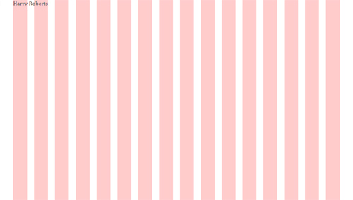
Choosing A Grid System
The grid is an amazing tool, and it’s not just for typographical ventures. It ensures order and harmony in your designs.
Some grid systems out there, in my opinion, go a little overboard and offer 30 or more columns, all awkwardly sized. For this tutorial, we’ll use Nathan Smith’s 16-column 960 Grid System (demo). 960.gs is amazing; its beauty lies in its simplicity. It is an ideal size for designs narrower than 1020 pixels, it has a good number of columns, and the numbers are easy to work with. You might also notice that the 960 Grid System only has 940 pixels of usable space. “960” comes from the 10 pixels of gutter space on either side.
Update your CSS to use a guide background image:
html {
  font-family: Cambria, Georgia, "Times New Roman", Times, serif;
  background: url(…/img/css/grid-01.png) center top repeat-y #fff;
  color: #333;
  width: 940px;
  padding: 0 10px;
  margin: 0 auto;
}
You should now have something like this:
Choosing A Measure
We have our font size, so now we need to work out our ideal line length, or “measure.” Robert Bringhurst writes in The Elements of Typographic Style that, “anything from 45 to 75 characters is widely regarded as a satisfactory length of line….”
A measure that is too short causes the eye to jump awkwardly from the end of line x to the start of line x + 1, and a measure that’s too long can cause the reader’s eye to double back. You can circumvent this somewhat by following these rules of thumb:
- for a longer measure, use slightly greater leading;
- for a shorter measure, use slightly smaller leading.
So, a measure of 45 to 75 characters is the optimum for readability in columns of text. I can pretty much guarantee that after you learn this, every massively, overly long measure you see on the Web will annoy you spectacularly.
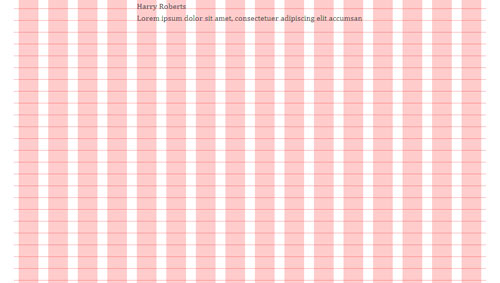
Here are 69 characters, a nice middle ground between the recommended 45 and 75:
Lorem ipsum dolor sit amet, consectetuer adipiscing elit accumsanPaste that into your page, and count how many red columns it covers. This is how wide your measure will be:
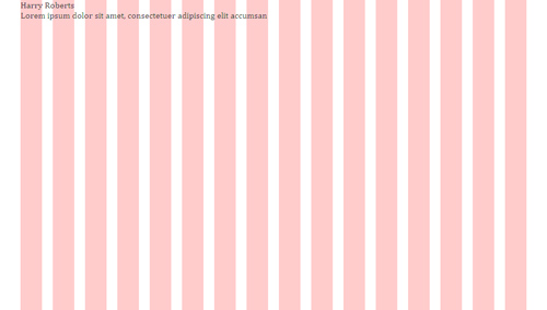
Here we have text spanning eight columns, which is 460 pixels of 960.gs. Update your CSS to read as follows:
/*------------------------------------*
  MAIN
*------------------------------------*/

html {
  font-family: Cambria, Georgia, "Times New Roman", Times, serif;
  background: url(…/img/css/grid-01.png) center top repeat-y #fff;
  color: #333;
}

body {
  width: 460px;
  margin: 0 auto;
}
If you picked a font size other than 16 pixels, make sure your measurements reflect this!
Vertical Rhythm: Setting A Baseline
Leading (which rhymes with “wedding”) is a typographical term from way back when typographers manually set type in letterpress machines and the like. The term refers to the act of placing lead between lines of type in order to add vertical space. In CSS, we call this line-height.
Line height should be around 140%. This isn’t a great number to work with, and it’s only a general rule, so we’ll use 150% (or 1.5 em). This way, we simply need to multiply the font size by one and a half to determine our leading.
Some general rules for leading:
- with continuous copy, use large leading;
- with light text on dark background, use large leading;
- with long line lengths, use large leading;
- with large x-height, use large leading;
- with short burst of information, use small leading.
If you used a 16-pixel font size, then your line height will be 24 pixels (16 pixels × 1.5 em = 24 pixels). If you used a 12-pixel font size, then your line height will be 18 pixels (12 pixels × 1.5 em = 18 pixels).
The Magic Number
For math-based tips on typography, check out this video on Web type by Tim Brown. The fun starts at 13:35.
The pixel value for your line height (24 pixels) will now be your magic number. This number means everything to your design. All line heights and margins will be this number or multiples thereof. I find it useful to always keep it in mind and stick to it.
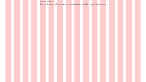
Now that we know our general line height, we can define a baseline grid. The grid we currently have aligns only the elements in the y axis (up and down). A baseline grid aligns in the x axis, too. We need to update our background image now to be 24 pixels high and have a solid 1-pixel line at the bottom, like this.
Again, if you chose a font size of 12 pixels and your line height became 18 pixels, then your background image needs to be 18 pixels high with a solid horizontal line on the 18th row of pixels.
Your CSS should now look something like this:
html {
  …
}

body {
  width: 460px;
  margin: 0 auto;
  line-height: 1.5em;
}
Your page should now look something like this:
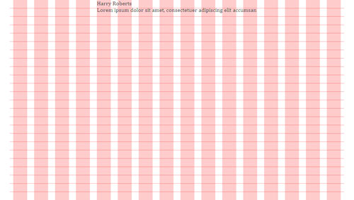
As you can see, the text hovers slightly above the horizontal guideline. This doesn’t mean that anything is set incorrectly; it is merely the offset. This could hinder the process, so either tweak the padding on the body to move the page or alter the position of the background image to move it around a little. Some tinkering in Firebug tells me that the CSS needs to be as follows:
html {
  …
  background: url(…/img/css/grid.png) center -6px repeat-y #fff;
  …
}
That gives me the following — and everything lines up perfectly:
Now, let’s get back to the magic number. Maybe you think the text is sitting too close to the top of the screen? Well, to remedy that, we’ll move the text down the page by a multiple of that magic number — let’s say 72 (3 × 24 = 72 pixels). Now adjust your CSS to read:
body {
  width: 460px;
  margin: 0 auto;
  line-height: 1.5em;
  padding-top: 72px;
}
Substitute your own magic number if you used a different font size.
We should get this:
It took some doing, but our canvas is ready at last!
Setting A Scale
Okay, our reset has made our h1 and p the same size. We need to get some basic font styles in there. Add this block of code to the end of your CSS:
/*------------------------------------*
  TYPE
*------------------------------------*/
/*--- HEADINGS ---*/

h1, h2, h3, h4, h5, h6 {
  margin-bottom: 24px;
  font-weight: bold;
}

/*--- PARAGRAPHS ---*/

p {
  margin-bottom: 24px;
}
Recognize your magic number? Let’s refresh the page and take a look:
Your magic number will now be the default margin-bottom value for all of your elements. This, combined with the line height, will keep everything on the baseline grid.
What we now need, though, are some different font sizes for the headings. We need a typographic scale. I suggest this:
- h1 = 24 pixels,
- h2 = 22 pixels,
- h3 = 20 pixels,
- h4 = 18 pixels,
- h5 = 16 pixels,
- h6 = 16 pixels.
Many people work in pixels, but I much prefer working in ems. An em is proportional to the current size of the font: 1 em in 72-point Georgia is 72 points, and 1 em in 8-point Garamond is 8 points.
So, if our base font size is 16 pixels (1 em), then 24 pixels would be 1.5 ems (24 ÷ 16 = 1.5). If we continue, we end up with:
- h1 = 24 pixels → 24 ÷ 16 = 1.5 ems
- h2 = 22 pixels → 22 ÷ 16 = 1.375 ems
- h3 = 20 pixels → 20 ÷ 16 = 1.25 ems
- h4 = 18 pixels → 18 ÷ 16 = 1.125 ems
- h5 = 16 pixels → 16 ÷ 16 = 1 ems
- h6 = 16 pixels → 16 ÷ 16 = 1 ems
Next, we need to make sure the line height of each is 24 pixels. This means that the h1 at a 24-point font size will have a line height of 1 em. Here’s the math:
(magic number) ÷ (font size) = (line height)
Using our scale, the full CSS for the headings (including the math) is:
/*--- HEADINGS ---*/
h1, h2, h3, h4, h5, h6 {
  margin-bottom: 24px;
  font-weight: bold;
}

h1 {
  font-size: 1.5em; /* 24px --> 24 ÷ 16 = 1.5 */
  line-height: 1em; /* 24px --> 24 ÷ 24 = 1 */
}

h2 {
  font-size: 1.375em; /* 22px --> 22 ÷ 16 = 1.375 */
  line-height: 1.0909em; /* 24px --> 24 ÷ 22 = 1.090909(09) */
}

h3 {
  font-size: 1.25em; /* 20px --> 20 ÷ 16 = 1.25 */
  line-height: 1.2em; /* 24px --> 24 ÷ 20 = 1.2 */
}

h4 {
  font-size: 1.125em; /* 18px --> 18 ÷ 16 = 1.125 */
  line-height: 1.333em; /* 24px --> 24 ÷ 18 = 1.3333333(3) */
}

h5, h6 {
  font-size: 1em; /* 16px --> 16 ÷ 16 = 1 */
  line-height: 1.5em; /* 24px --> 24 ÷ 16 = 1.5 */
}
There’s our typographic scale.
Now, to test it, let’s try the following markup:
<body>

  <h1>Your Name</h1>

  <h2>Your Name</h2>

  <h3>Your Name</h3>

  <h4>Your Name</h4>

  <h5>Your Name</h5>

  <h6>Your Name</h6>

  <p>Lorem ipsum dolor sit amet, consectetuer adipiscing elit accumsan</p>

</body>
You might notice that not all of the lines of text sit perfectly on a gridline, but that’s okay because they all honor the baseline! This is what I get:
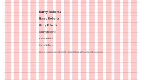
You might think that something has gone wrong. But if you look, the paragraph lies just fine once you get back to the normal font size. To be honest, I’m not entirely sure about what causes this effect; the numbers we used are all correct, and the vertical rhythm as a whole remains intact, but individual lines of larger text appear to be offset from the baseline. I think this could be due, in part, to the glyphs’ setting in their em box.
What Next?
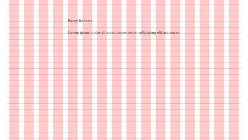
Head back into your markup and remove everything except the h1. Now we’re ready to do something useful. Let’s make a little “About you”-page.
The h1 is the name. And the markup can simply be:
<!DOCTYPE html>
<html lang="en">
<head>
<meta charset="utf-8" />
<title>Harry Roberts</title>
<link rel="stylesheet" type="text/css" href="css/style.css" />
</head>
<body>
<h1>Harry Roberts</h1>
</body>
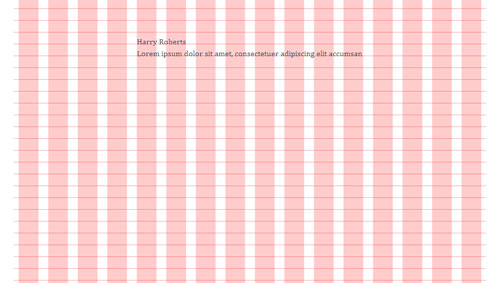
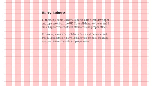
</html>Now let’s add a little introductory paragraph about yourself. Mine reads:
<p>Hi there. My name is Harry Roberts.
I am a Web developer and type geek from the UK.
I love all things Web dev, and I am a huge advocate
of Web standards and proper ethics.</p>
Let’s experiment with altering the font size arbitrarily. Add this to your CSS:
*--- PARAGRAPHS ---*/
p {
  margin-bottom: 24px;
}

body > p:first-of-type {
  font-size: 1.125em;
    /* 18px → 18 ÷ 16 = 1.125 */

  line-height: 1.333em;
    /* 24px → 24 ÷ 18 = 1.3333(3) */
}
Here we’re giving the first paragraph — a direct descendant of the body element — a font size of 18 pixels and a line height of 24 pixels. See, there’s your magic number again!
You might again see slight oddities with the paragraph sitting on the baseline. To make sure the vertical rhythm is still intact, duplicate the paragraph once more. You should get this:
Now for the best bits.
Tips on Technical Typography
There’s a good chance that you won’t want the grid to always be on, so change this CSS:
/*------------------------------------*
  MAIN
*------------------------------------*/

html {
  font-family: Cambria, Georgia, "Times New Roman", Times, serif;
  background: url(…/img/css/grid.png) center -6px repeat-y #fff;
  color: #333;
}

body {
  width: 460px;
  margin: 0 auto;
  line-height: 1.5em;
  padding-top: 72px;
}
… to this:
/*------------------------------------*
  MAIN
*------------------------------------*/

html {
  font-family: Cambria, Georgia, "Times New Roman", Times, serif;
  color: #333;
}

body {
  width: 460px;
  margin: 0 auto;
  line-height: 1.5em;
  padding-top: 72px;
  background: #fff;
}

body:hover {
  background: url(…/img/css/grid.png) center -6px repeat-y #fff;
}
This will show the grid when you hover over the body, and hide it when you don’t.
Spacing And Setting Paragraphs
We’ve sorted out the magic number, and we know we should use it to space the elements, but there’s more than one way to denote the beginning of a new paragraph. One is the method we’re already using: inserting a blank space (one magic number) between the paragraphs. The second is indentation.
Typically, you would indent every paragraph except the first in a body of text; the first paragraph has no indent and the second, third, fourth and so on do have an indent (typically with a width of 1 em).
Enric Jardi writes in Twenty-Two Tips on Typography that, “… you must not use both indentation and a line break at the same time; that is redundant.”
Here’s some quick CSS for indenting only the second and subsequent paragraphs in a body of text:
p {
  margin-bottom: 24px;
}

p+p {
  text-indent: 1em;
  margin-top: -24px;
}
For an explanation of how and why this works, refer to my other article, “Mo’ Robust Paragraph Indenting.” You might also want to look at Jon Tan’s silo.
Alignment
When setting type on the Web, use a range-left, ragged-right style. This basically means left-justifying the type. If you use a sufficiently long measure, then your rags (the uneven edges on the right side of a left-aligned paragraph) will generally be clean; the raggedness of their appearance can, however, be exacerbated at short measures, where a large percentage of each line could end up as white space.
Justified typesetting can look great but lead to unsightly “rivers” in the text. To avoid this, rewrite the copy to remove them, or use something like Hyphenator.js, which is remarkably effective.
Proper Quotations Marks, Dashes And Ellipses
Quotation Marks
Many people are unaware that there are proper quotation marks and “ambidextrous” quotation marks. The single- and double-quotation keys on your keyboard are not, in fact, true quotation marks. They are catch-alls that can function as both left and right single and double quotation marks; they are, essentially, four glyphs in one key.
The reason behind this is simply space. A keyboard cannot feasibly fit proper left and right single and double quotation marks.
So, what is a proper quotation mark? A curly (or “book”) quotation mark is rounded and more angular than an ambidextrous (keyboard-style) quotation mark. Left single and left double quotation marks look like this: ‘ and “ (‘ and “, respectively). Right single and right double quotation marks look like this: ’ and ” (’ and ”, respectively).
Many people incorrectly refer to ambidextrous quotation marks as “primes,” but a prime is a different glyph. Single and double primes look like this: ′ and ″ (′ and ″, respectively). They are used to denote feet and inches (e.g. 5′10″).
I said that one key incorporates four glyphs. In fact, two keys incorporate six glyphs.
Which Quotation Marks Should You Use?
The type of quotation marks to use (double or single) varies from country to country and style guide to style guide. Double quotation marks are typically used to quote a written or spoken source, and single quotation marks are used for quotes within quotes.
However, I much prefer Jost Hochuli’s advice in Detail in Typography: “… the appearance is improved by using the more obtrusive double quotation marks for the less frequent quotations within quotations.” Which basically means, for a nicer appearance, use single quotation marks, and then double quotation marks for quotes within quotes. (If I had a penny for every time I said quotes in this section.)
For example:
‘And then he said to me, “Do you like typography?” And naturally I said that I did.’
Use a right single quotation mark where you’d normally use an apostrophe in text: “I’m a massive typography nerd!” (I’m a massive typography nerd!)
In short, stop using those horrible keyboard quotation marks, and start using lovely curly marks in your work.
Non-English Quotation Marks
The quotation marks we’ve covered are used in English, but quotes look different in other languages.
French and Spanish use guillemets, «like this» («like this»). In Danish, they are used »like this« (»like this«). In German, using a combination of bottom and regular double quotation marks is common, „like this“ („like this“).
For a great overview of other non-English quotation marks, see the Wikipedia entry on “Non-English Usage of Quotation Marks.”
Dashes
We know that keyboards can’t accommodate all quotation marks; and they can’t accommodate all types of dashes either. The hyphen key (-) is another catch-all. There are three main types of dash: the em dash, en dash and hyphen.
The em dash (—) denotes a break in thought—like this. It’s called the “em” dash because, traditionally, it is one em wide. Em dashes are usually set without spaces on either side (as above).
The en dash (–) is traditionally half the width of an em dash. It is used to denote ranges, as in “please read pages 17–25” (17–25). It can also denote relational phrases, as in “father–son” or “New York–London.”
The hyphen simply ties together compound words, as in “front-end developer.”
The em dash, en dash and hyphen are different, and each has unique uses.
Ellipsis
An ellipsis is used to denote a thought trailing off. It is also used as a placeholder for omitted text in lengthy quotations.
The ellipsis has become the bane of my life. I often come across people who use a series of dots (periods) in place of a proper ellipsis, like so……
An ellipsis is not three dots. It is one glyph that looks like three dots. Its HTML entity is … (as in horizontal ellipsis).
So there were a few glyphs for you to use with quotes, primes, dashes and ellipses. Let’s recap:
| Name/Glyph | HTML entity | Example |
|---|---|---|
| Quotes and primes | ||
| Left single quote ‘ and right single quote ’ | ‘ and ’ | ‘Hey, this is a quote!’ |
| Left double quote “ and right double quote ” | “ and ” | ‘Hey, this is a quote “within another” quote!’ |
| Single prime ′ and double prime ″ | ′ and ″ | The girl is 7′10″! |
| Dashes | ||
| Em dash — | — | A break in thought—like this |
| En dash – | – | Ages 2–5 |
| Hyphen - | - key | front-end developer |
| Ellipsis | ||
| Ellipsis … | … | To be continued… |
In addition to these common glyphs, there are numerous others: from the division symbol (÷ or ÷) to the section symbol (§ or §). If you’re interested in special characters and glyphs, then Wikipedia’s article on “Punctuation” is a good place to start (just keep clicking from there).
Hanging Punctuation
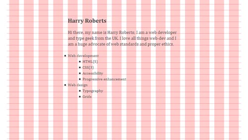
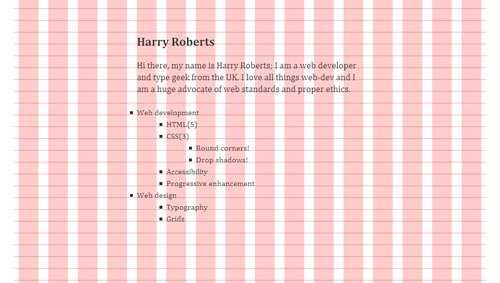
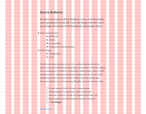
Punctuation should be hung; quotation marks and bullet points should be clear of the edges of surrounding text. If that doesn’t make sense, don’t worry! Let’s add a new section to your page. Remove that duplicated paragraph and replace it with a list of facts about yourself. Mine looks like this:
<ul>
  <li>
    Web development
    <ul>
      <li>HTML(5)</li>
      <li>CSS(3)</li>
      <li>Accessibility</li>
      <li>Progressive enhancement</li>
    </ul>
  </li>
  <li>
    Web design
    <ul>
      <li>Typography</li>
      <li>Grids</li>
    </ul>
  </li>
</ul>
Add this to the end of your CSS sheet:
/*--- LISTS ---*/
ul, ol {
  margin-bottom: 24px;
    /* Remember, if your magic number is
    different to this, use your own. */
}

ul {
  list-style: square outside;
}

ul ul,
ol ol {
  margin: 0 0 0 60px;
}
My page now looks like this:
<p>Vestibulum adipiscing lectus ut risus adipiscing
mattis sed ac lectus. Cras pharetra lorem eget diam
consectetur sit amet congue nunc consequat. Curabitur
consectetur ullamcorper varius. Nulla sit amet sem ac
velit auctor aliquet. Quisque nec arcu non nulla adipiscing
rhoncus ut nec lorem. Vestibulum non ipsum arcu. Quisque
dapibus orci vitae massa fringilla sit amet viverra nulla.</p>
<blockquote>
<p>“Lorem ipsum dolor sit amet,
consectetuer adipiscing elit. In accumsan diam
vitae velit. Aliquam vehicula, turpis sed egestas
porttitor, est ligula egestas leo, at interdum
leo ante ut risus.”
<b>—Joe Bloggs</b></p>
</blockquote>blockquote surrounding a paragraph. You might also notice the use of a b element to mark up the name. The HTML spec states that “The b element [is used for] spans of text whose typical typographic presentation is boldened.” This is a loose definition, so its use for bolding the name of a person is acceptable.
Now, add this to the end of your CSS sheet:/*--- QUOTES ---*/
blockquote {
margin: 0 60px 0 45px;
border-left: 5px solid #ccc;
padding-left: 10px;
text-indent: -0.4em;
}
blockquote b {
display: block;
text-indent: 0;
}text-indent to make the opening quote hang outside of the body of text. The number I used works perfectly for Cambria, but you can experiment with the font of your choice. (Don’t forget to remove the text-indent on the b.) Now we know how to hang bullets and quotation marks.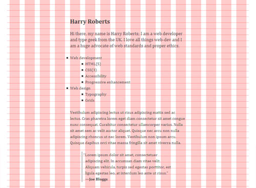
blockquote tags simply looks nicer.
## GuillemetsNow that we’ve done that, let’s add a “Read more” link to get us from this little page to, say, our portfolio’s full “About” page. We want to imply direction or movement with this link because it’s going to take us elsewhere. We could, as many people do, use a guillemet (», `»`), but — as we covered earlier — French, German and other languages use this glyph as a quotation mark. Therefore, it shouldn’t be used stylistically. Add this markup to your page:
<p><a href="https://csswizardry.com/about/"
class="read-more">Read more</a></p>/*--- LINKS ---*/
a {
color: #09f;
text-decoration: none;
}
a:hover {
text-decoration: underline;
}
a:active,
a:focus {
position: relative;
top: 1px;
}
.read-more:after {
content: "0A000BB"; /* Insert a space then right angled-quote */
}
content:""; to keep the markup clean. This means that other things, such as stylistic right-angled quotation marks and other decorative items of type, can be added with CSS to keep the markup free of non-semantic elements.
Let’s say you wanted to add tildes to either side of a heading:h1 {
text-align: center;
}
h1:before {
content: "07E0A0"; /* Insert an tilde, then a space. */
}
h1:after {
content: "0A007E"; /* Insert a space, then an tilde. */
}h1, thus:…
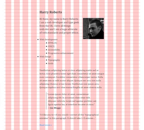
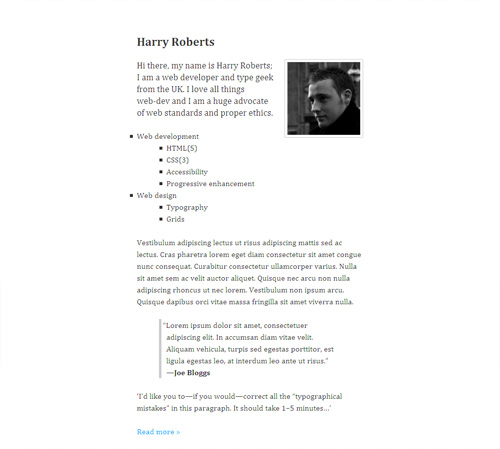
<body>
<h1>Harry Roberts</h1>
<img src="img/me.jpg" alt="A photo of me." id="me" />/*------------------------------------*
IMAGES
*------------------------------------*/
#me {
float: right;
margin: 0 0 0 20px;
display: block;
width: 148px;
height: auto;
padding: 5px;
border: 1px solid #ccc;
-moz-border-radius: 2px;
-webkit-border-radius: 2px;
-o-border-radius: 2px;
border-radius: 2px;
}
Final Words
In this admittedly long piece, we have discussed only technical typography. Everything in this article can be applied to almost any project. None of it was speculation; these are tried and tested methods and proven tips for beautiful Web type.
If you’d like to see more creative applications of Web type, then check out the work of the following creatives (each of whom has had much influence on my career so far):
- Oliver Reichenstein of Information Architects A huge inspiration to me and a very knowledgeable guy who has a passion and talent for readable, sensible and beautiful type on the Web.
- Jon Tan Jon’s website is gorgeous. He is a member of the International Society of Typographic Designers (ISTD), and his writings and “silo” (on his personal website) are a hive of typographical information.
- Jos Buivenga Not strictly a Web-type guy, but Jos is the creator of some of the most beautiful (and free!) fonts in existence. His work got me hooked on typography.
- Khoi Vinh His timelessly beautiful website spurred my love for grids. He also recently wrote a book on that very subject.
Further Reading
 (al)
(al)

