How To Use CSS3 Media Queries To Create a Mobile Version of Your Website
Editor’s Note: Please note that this article was published in 2010 and is outdated. Rachel Andrew has written another article on the current state of media queries for responsive design that includes updated and more relevant information on this topic.
CSS3 continues to both excite and frustrate web designers and developers. We are excited about the possibilities that CSS3 brings, and the problems it will solve, but also frustrated by the lack of support in Internet Explorer 8. This article will demonstrate a technique that uses part of CSS3 that is also unsupported by Internet Explorer 8. However, it doesn’t matter as one of the most useful places for this module is somewhere that does have a lot of support — small devices such as the iPhone, and Android devices.
Further Reading on SmashingMag:
- Techniques For Gracefully Degrading Media Queries
- Breakpoints And The Future Of Websites
- Looking Beyond Common Media Query Breakpoints
- Learning CSS3: A Reference Guide
In this article I'll explain how, with a few CSS rules, you can create an iPhone version of your site using CSS3, that will work now. We'll have a look at a very simple example and I'll also discuss the process of adding a small screen device stylesheet to my own site to show how easily we can add stylesheets for mobile devices to existing websites.
Media Queries
If you have ever created a print stylesheet for a website then you will be familiar with the idea of creating a specific stylesheet to come into play under certain conditions - in the case of a print stylesheet when the page is printed. This functionality was enabled in CSS2 by media types. Media Types let you specify a type of media to target, so you could target print, handheld and so on. Unfortunately these media types never gained a lot of support by devices and, other than the print media type, you will rarely see them in use.
The Media Queries in CSS3 take this idea and extend it. Rather than looking for a type of device they look at the capability of the device, and you can use them to check for all kinds of things. For example:
- width and height (of the browser window)
- device width and height
- orientation - for example is a phone in landscape or portrait mode?
- resolution
If the user has a browser that supports media queries then we can write CSS specifically for certain situations. For example, detecting that the user has a small device like a smart phone of some description and giving them a specific layout. To see an example of this in practice, the UK web conference dConstruct has just launched their website for the 2010 conference and this uses media queries to great effect.
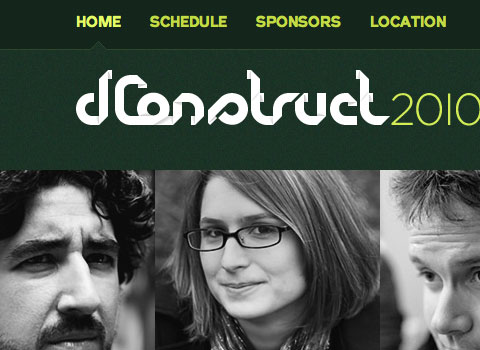
The dConstruct 2010 website in Safari on a desktop computer

The dConstruct 2010 website on an iPhone
You can see from the above example that the site hasn’t just been made smaller to fit, but that the content has actually been re-architected to be made more easy to access on the small screen of the device. In addition many people might think of this as being an iPhone layout - but it isn’t. It displays in the same way on Opera Mini on my Android based phone - so by using media queries and targeting the device capabilities the dConstruct site caters for all sorts of devices - even ones they might not have thought of!
Using Media Queries to create a stylesheet for phones
To get started we can take a look at a very simple example. The below layout is a very simple two column layout.
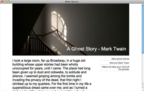
A very simple two column layout
To make it easier to read on a phone I have decided to linearize the entire design making it all one column, and also to make the header area much smaller so readers don’t need to scroll past the header before getting to any content.
The first way to use media queries is to have the alternate section of CSS right inside your single stylesheet. So to target small devices we can use the following syntax:
@media only screen and (max-device-width: 480px) {

    }
We can then add our alternate CSS for small screen and width devices inside the curly braces. By using the cascade we can simply overwrite any styles rules we set for desktop browsers earlier in our CSS. As long as this section comes last in your CSS it will overwrite the previous rules. So, to linearize our layout and use a smaller header graphic I can add the following:
@media only screen and (max-device-width: 480px) {
        div#wrapper {
            width: 400px;
        }

        div#header {
            background-image: url(media-queries-phone.jpg);
            height: 93px;
            position: relative;
        }

        div#header h1 {
            font-size: 140%;
        }

        #content {
            float: none;
            width: 100%;
        }

        #navigation {
            float:none;
            width: auto;
        }
    }
In the code above I am using an alternate background image and reducing the height of the header, then setting the content and navigation to float none and overwriting the width set earlier in the stylesheet. These rules only come into play on a small screen device.
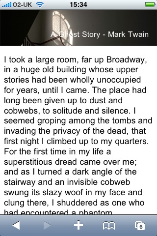
My simple example as displayed on an iPhone
Linking a separate stylesheet using media queries
Adding the specific code for devices inline might be a good way to use media queries if you only need to make a few changes, however if your stylesheet contains a lot of overwriting or you want to completely separate the styles shown to desktop browsers and those used for small screen devices, then linking in a different stylesheet will enable you to keep the CSS separate.
To add a separate stylesheet after your main stylesheet and use the cascade to overwrite the rules, use the following.
<link rel="stylesheet" type="text/css" media="only screen and (max-device-width: 480px)" href="small-device.css" />Testing media queries
If you are the owner of an iPhone, Android device or other device that has a browser which supports media queries you can test your CSS yourself. However you will need to upload the code somewhere in order to view it. What about testing devices you don’t own and testing locally?
An excellent site that can help you during the development process is ProtoFluid. This application gives you a form to enter your URL - which can be a local URL - and view the design as if in the browser on an iPhone, iPad or a range of other devices. The screenshot below is the dConstruct site we looked at earlier as seen through the iPhone view on ProtoFluid.
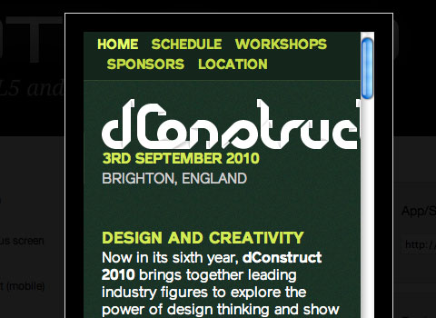
The dConstruct 2010 website in ProtoFluid
You can also enter in your own window size if you have a specific device you want to test for and know the dimensions of it’s screen.
To use ProtoFluid you need to slightly modify the media query shown earlier to include max-width as well as max-device-width. This means that the media query also comes into play if the user has a normal desktop browser but using a very tiny window.
@media only screen and (max-width: 480px), only screen and (max-device-width: 480px) {

    }
After updating your code to the above, just refresh your page in the browser and then drag the window in and you should see the layout change as it hits 480 pixels. The media queries are now reacting when the viewport width hits the value you entered.
You are now all ready to test using ProtoFluid. The real beauty of ProtoFluid is that you can still use tools such as FireBug to tweak your design, something you won’t have once on the iPhone. Obviously you should still try and get a look at your layout in as many devices as possible, but ProtoFluid makes development and testing much simpler.
Note that if you don’t want your site to switch layout when someone drags their window narrow you can always remove the max-width part of the query before going live, so the effect only happens for people with a small device and not just a small browser window.
Retrofitting an existing site
I have kept the example above very simple in order to demonstrate the technique. However this technique could very easily be used to retrofit an existing site with a version for small screen devices. One of the big selling points of using CSS for layout was this ability to provide alternate versions of our design. As an experiment I decided to take my own business website and apply these techniques to the layout.
The desktop layout
The website for my business currently has a multi-column layout. The homepage is a little different but in general we have a fixed width 3 column layout. This design is a couple of years old so we didn’t consider media queries when building it.
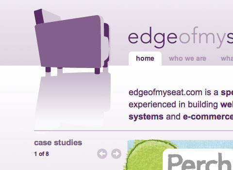
My site in a desktop browser
Adding the new stylesheet
There will be a number of changes that I need to make to linearize this layout so I’m going to add a separate stylesheet using media queries to load this stylesheet after the current stylesheet and only if the max-width is less than 480 pixels.
<link rel="stylesheet" type="text/css" media="only screen and (max-width: 480px), only screen and (max-device-width: 480px)" href="/assets/css/small-device.css" />To create my new stylesheet I take the default stylesheet for the site and save it as small-device.css. So this starts life as a copy of my main stylesheet. What I am going to do is go through and overwrite certain rules and then delete anything I don’t need.
Shrinking the header
The first thing I want to do is make the logo fit nicely on screen for small devices. As the logo is a background image this is easy to do as I can load a different logo in this stylesheet. I also have a different background image with a shorter top area over which the logo sits.
body {
        background-image: url(/img/small-bg.png);
    }

    #wrapper {
        width: auto;
        margin: auto;
        text-align: left;
        background-image: url(/img/small-logo.png);
        background-position: left 5px;
        background-repeat: no-repeat;
        min-height: 400px;
    }
Linearizing the layout
The next main job is to linearize the layout and make it all one column. The desktop layout is created using floats so all I need to do is find the rules that float the columns, set them to float: none and width:auto. This drops all the columns one under another.
.article #aside {
        float: none;
        width: auto;
    }
Tidying up
Everything after this point is really just a case of looking at the layout in ProtoFluid and tweaking it to give sensible amounts of margin and padding to areas that now are stacked rather than in columns. Being able to use Firebug in ProtoFluid makes this job much easier as my workflow mainly involves playing around using Firebug until I am happy with the effect and then copying that CSS into the stylesheet.
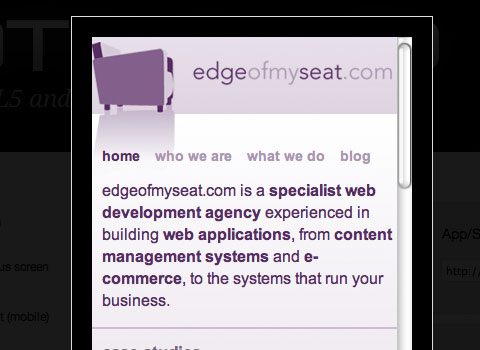
Testing the site using ProtoFluid
Testing in an iPhone
Having created my stylesheet and uploading it I wanted to check how it worked in a real target device. In the iPhone I discovered that the site still loaded zoomed out rather than zooming in on my nice readable single column. A quick search on the Safari developer website gave me my answer - to add a meta tag to the head of the website setting the width of the viewport to the device width.
<meta name="viewport" content="width=device-width" />After adding the meta tag the site now displays zoomed in one the single column.

The site as it now displays on an iPhone
This was a very simple retrofit to show that it is possible to add a mobile version of your site simply. If I was building a site from scratch that I would be using media queries on, there are definitely certain choices I would make to make the process simpler. For example considering the linearized column orders, using background images where possible as these can be switched using CSS - or perhaps using fluid images.
Our desktop layout features a case studies carousel on the homepage, this wasn’t easy to interact with on a touch screen device and so I checked using JavaScript if the browser window was very narrow and didn’t launch the carousel. The way this was already written meant that the effect of stopping the carousel loading was that one case study would appear on the screen, which seems a reasonable solution for people on a small device. With a bit more time I could rewrite that carousel with an alternate version for users of mobile devices, perhaps with interactions more suitable to a touch screen.
More resources
This is a relatively new technique but already there are some excellent tutorials on the subject of media queries. If you know of others then please post them in the comments.
- A List Apart - Responsive Web Design
- Sitepoint CSS Reference - Media Queries
- Targeting the iPhone 4 Retina Display with CSS3 Media Queries
- Aral Balkan: How to make your web content look stunning on the iPhone 4’s new Retina Display
- Stuff and Nonsense: Proportional leading with CSS3 Media Queries
- Matthew James Taylor: iPad layout with landscape and portrait modes
Providing support for Media Queries in older browsers
This article covers the use of media queries in devices that have native support. If you are only interested in supporting iPhone and commonly used mobile browsers such as Opera Mini you have the luxury of not needing to worry about non-supporting browsers. If you want to start using media queries in desktop browsers then you might be interested to discover that there are a couple of techniques available which use JavaScript to add support to browsers such as Internet Explorer 8 (and lower versions) and Firefox prior to 3.5. Internet Explorer 9 will have support for CSS3 Media Queries.
- Media Queries section on When Can I Use, showing which browsers have support
- css3-mediaqueries-js - a library that aims to add media query support to non-supporting browsers
More inspiration
To see more interesting use of Media Queries have a look at Hicksdesign where Jon Hicks has used Media Queries to not only provide a better experience for mobile device users, but also for regular web browser users with smaller windows. Also, have a look at Simon Collison’s website and Ed Merritt’s portfolio for other examples of this technique.
Try it for yourself
Using Media Queries is one place you can really start to use CSS3 in your daily work. It is worth remembering that the browsers that support media queries also support lots of other CSS3 properties so your stylesheets that target these devices can also use other CSS3 to create a slick effect when viewed on an iPhone or other mobile device. If you have implemented media queries on your site, or try this technique after reading this article, let us know in the comments.


 Flexible CMS. Headless & API 1st

