The Mystery Of The CSS Float Property
Years ago, when developers first started to make the transition to HTML layouts without tables, one CSS property that suddenly took on a very important role was the float property. The reason that the float property became so common was that, by default, block-level elements will not line up beside one another in a column-based format. Since columns are necessary in virtually every CSS layout, this property started to get used — and even overused — prolifically.
The CSS float property allows a developer to incorporate table-like columns in an HTML layout without the use of tables. If it were not for the CSS float property, CSS layouts would not be possible except using absolute and relative positioning — which would be messy and would make the layout unmaintainable.
In this article, we’ll discuss exactly what the float property is and how it affects elements in particular contexts. We’ll also take a look at some of the differences that can occur in connection with this property in the most commonly-used browsers. Finally, we’ll showcase a few practical uses for the CSS float property. This should provide a well-rounded and thorough discussion of this property and its impact on CSS development.
Definition and Syntax
The purpose of the CSS float property is, generally speaking, to push a block-level element to the left or right, taking it out of the flow in relation to other block elements. This allows naturally-flowing content to wrap around the floated element. This concept is similar to what you see every day in print literature, where photos and other graphic elements are aligned to one side while other content (usually text) flows naturally around the left- or right-aligned element.
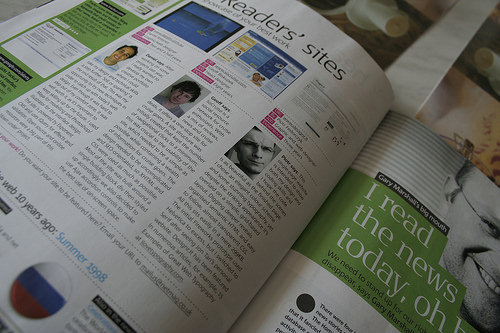
The photo above shows the “Readers’ sites” section of .net magazine, which displays 3 readers’ photos each aligned left in their respective columns with text wrapping around the aligned images. That is the basic idea behind the float property in CSS layouts, and demonstrates one of the ways it has been used in table-less design.
The effectiveness of using floats in multi-columned layouts was explained by Douglas Bowman in 2004 in his classic presentation No More Tables:
Bowman explained the principles behind table-less design, using Microsoft’s old site as a case study. Floats were used prominently in his mock overhaul of the Microsoft layout.
Syntax
The float CSS property can accept one of 4 values: left, right, none, and inherit. It is declared as shown in the code below.
#sidebar {
float: left;
}
The most commonly-used values are left and right. A value of none is the default, or initial float value for any element in an HTML page. The value inherit, which can be applied to nearly any CSS property, does not work in Internet Explorer versions up to and including 7.
The float property does not require the application of any other property on a CSS element for float to function correctly, however, float will work more effectively under specific circumstances.
Generally, a floated element should have an explicitly set width (unless it is a replaced element, like an image). This ensures that the float behaves as expected and helps to avoid issues in certain browsers.
#sidebar {
float: left;
width: 350px;
}
Specifics on Floated Elements
Following is a list of exact behaviours of floated elements according to CSS2 Specifications:
- A left-floated box will shift to the left until its leftmost margin edge (or border edge if margins are absent) touches either the edge of the containing block, or the edge of another floated box
- If the size of the floated box exceeds the available horizontal space, the floated box will be shifted down
- Non-positioned, non-floated, block-level elements act as if the floated element is not there, since the floated element is out of flow in relation to other block elements
- Margins of floated boxes do not collapse with margins of adjacent boxes
- The root element (
<html>) cannot be floated - An inline element that is floated is converted to a block-level element
Float in Practice
One of the most common uses for the float property is to float an image with text wrapping it. Here is an example:
Pellentesque habitant morbi tristique senectus et netus et malesuada fames ac turpis egestas. Vestibulum tortor quam, feugiat vitae, ultricies eget, tempor sit amet, ante. Donec eu libero sit amet quam egestas semper.
Aenean ultricies mi vitae est. Mauris placerat eleifend leo. Quisque sit amet est et sapien ullamcorper pharetra. Vestibulum erat wisi, condimentum sed, commodo vitae, ornare sit amet, wisi. Aenean fermentum, elit eget tincidunt condimentum, eros ipsum rutrum orci, sagittis tempus lacus enim ac dui.
Donec non enim in turpis pulvinar facilisis. Ut felis. Praesent dapibus, neque id cursus faucibus, tortor neque egestas augue, eu vulputate magna eros eu erat. Aliquam erat volutpat. Nam dui mi, tincidunt quis, accumsan porttitor, facilisis luctus, metus.
The CSS applied to the image in the box above is as follows:
img {
float: left;
margin: 0 15px 5px 0;
border: solid 1px #bbb;
}
The only property required to make this effect work is the float property. The other properties (margin and border) are there for aesthetic reasons. The other elements inside the box (the <p> tags with text inside them) do not need any styles applied to them.
As mentioned earlier, floated elements are taken out of flow in relation to other block elements, and so other block elements remain in flow, acting as if the floated element is not even there. This is demonstrated visually below:
In the above example, the <p> element is a block-level element, so it ignores the floated element, spanning the width of the container (minus padding). All non-floated, block-level elements will behave in like manner.
The text in the paragraph is inline, so it flows around the floated element. The floated box is also given margin settings to offset it from the paragraph, making it visually clear that the paragraph element is ignoring the floated box.
Clearing Floats
Layout issues with floats are commonly fixed using the CSS clear property, which lets you “clear” floated elements from the left or right side, or both sides, of an element.
Let’s take a look at an example that commonly occurs — a footer wrapping to the right side of a 2-column layout:
If you view this page in IE6 or IE7, you won’t see any problems. The left and right columns are in place, and the footer is nicely tucked underneath. But in Firefox, Opera, Safari, and Chrome, you’ll see the footer jump up beside the left column. This is caused by the float applied to the columns. This is the correct behaviour, even though it is a more problematic one. To resolve this issue, we use the aforementioned clear property, applied to the footer:
#footer {
clear: both;
}
The result is shown below:
The clear property will clear only floated elements, so applying clear: both to both columns would not cause the footer to drop down, because the footer is not a floated element.
So use clear on non-floated elements, and even occasionally on floated elements, to force page elements to occupy their intended space.
Fixing the Collapsed Parent
One of the most common symptoms of float-heavy layouts is the “collapsing parent”. This is demonstrated in the example below:
Pellentesque habitant morbi tristique senectus et netus et malesuada fames ac turpis egestas. Vestibulum tortor quam, feugiat vitae, ultricies eget, tempor sit amet, ante. Donec eu libero sit amet quam egestas semper.Notice that the bottom of the floated image appears outside its parent. The parent does not fully expand to hold the floated image. This is caused by what we discussed earlier: the floated element is out of the flow in relation to other block elements, so all block elements will render as if the floated element is not even there. This is not a CSS bug; it’s in line with CSS specifications. All browsers render the same in this example. It should be pointed out that, in this example, adding a width to the container prevents the issue from occurring in IE, so this would normally be something you would have to resolve in Firefox, Opera, Safari, or Chrome.
Solution 1: Float the container
The easiest way to fix this problem is to float the containing parent element:
Pellentesque habitant morbi tristique senectus et netus et malesuada fames ac turpis egestas. Vestibulum tortor quam, feugiat vitae, ultricies eget, tempor sit amet, ante. Donec eu libero sit amet quam egestas semper.Now the container expands to fit all the child elements. But unfortunately this fix will only work in a limited number of circumstances, since floating the parent may have undesirable effects on your layout.
Solution 2: Adding Extra Markup
This is an outdated method, but is an easy option. Simply add an extra element at the bottom of the container and “clear” it. Here’s how the HTML would look after this method is implemented:
<div id="container"> <img src="http://media.smashingmagazine.com/wp-content/uploads/2009/10/lifesaver.jpg" width="200" height="222" alt="" /> <p>Pellentesque habitant morbi tristique senectus et netus et malesuada fames ac turpis egestas. Vestibulum tortor quam, feugiat vitae, ultricies eget, tempor sit amet, ante. Donec eu libero sit amet quam egestas semper.</p> <div class="clearfix"></div> </div>
And the resulting CSS applied to the new element:
.clearfix {
clear: both;
}
You could also do this by means of a <br /> tag with an inline style. In any case, you will have the desired result: the parent container will expand to enclose all of its children. But this method is not recommended since it adds nonsemantic code to your markup.
Solution 3: The :after Pseudo-Element
The :after pseudo-element adds an element to the rendered HTML page. This method has been used quite extensively to resolve float-clearing issues. Here is how the CSS looks:
.clearfix:after {
content: ".";
display: block;
height: 0;
clear: both;
visibility: hidden;
}
The CSS class “clearfix” is applied to any container that has floating children and does not expand to enclose them.
But this method does not work in Internet Explorer up to version 7, so an IE-only style needs to be set with one of the following rules:
.clearfix {
display: inline-block;
}
.clearfix {
zoom: 1;
}
Depending on the type of issue you’re dealing with, one of the above two solutions will resolve the issue in Internet Explorer. It should be noted that the zoom property is a non-standard Microsoft proprietary property, and will cause your CSS to become invalid.
So, because the :after pseudo-element solution does not work in IE6/7, is a little bit bloated code-wise, and requires additional invalid IE-only styles, this solution is not the best method, but is probably the best we’ve considered so far.
Solution 4: The Overflow Property
By far the best, and easiest solution to resolve the collapsing parent issue is to add overflow: hidden or overflow: auto to the parent element. It’s clean, easy to maintain, works in almost all browsers, and does not add extra markup.
You’ll notice I said “almost” all browsers. This is because it does not work in IE6. But, in many cases, the parent container will have a set width, which fixes the issue in IE6. If the parent container does not have a width, you can add an IE6-only style with the following code:
// This fix is for IE6 only
.clearfix {
height: 1%;
overflow: visible;
}
In IE6, the height property is incorrectly treated as min-height, so this forces the container to enclose its children. The overflow property is then set back to “visible”, to ensure the content is not hidden or scrolled.
The only drawback to using the overflow method (in any browser) is the possibility that the containing element will have scrollbars or hide content. If there are any elements with negative margins or absolute positioning inside the parent, they will be obscured if they go beyond the parent’s borders, so this method should be used carefully. It should also be noted that if the containing element has to have a specified height, or min-height, then you would definitely not be able to use the overflow method.
So, there really is no simple, cross-browser solution to the collapsing parent issue. But almost any float clearing issue can be resolved with one of the above methods.
Float-Related Bugs in Internet Explorer
Over the years, there have been numerous articles published online that discuss common bugs in connection with floats in CSS layouts. All of these, not surprisingly, deal with problems specific to Internet Explorer. Below, you’ll find a list of links to a number of articles that discuss float-related issues in-depth:
- The Internet Explorer Guillotine Bug
- The IE5/6 Doubled Float-Margin Bug
- IE7 Bottom Margin Bug
- The IE Escaping Floats Bug
- The IE6 Peekaboo Bug
- The IE6 “Ghost Text” Bug
- The IE6 Expanding Box Problem
- The IE6 3-pixel Gap
Changing the Float Property with JavaScript
To change a CSS value in JavaScript, you would access the style object, converting the intended CSS property to “camel case”. For example, the CSS property “margin-left” becomes marginLeft; the property background-color becomes backgroundColor, and so on. But with the float property, it’s different, because float is already a reserved word in JavaScript. So, the following would be incorrect:
myDiv.style.float = "left";
Instead, you would use one of the following:
// For Internet Explorer
myDiv.style.styleFloat = "left";
// For all other browsers
myDiv.style.cssFloat = "left";
Practical Uses for Float
Floats can be used to resolve a number of design challenges in CSS layouts. Some examples are discussed here.
2-Column, Fixed-Width Layout
Roger Johansson of 456 Berea Street outlines an 8-step tutorial to create a simple, cross-browser, 2-column, horizontally centered layout. The float property is integral to the chemistry of this layout.
“The layout consists of a header, a horizontal navigation bar, a main content column, a sidebar, and a footer. It is also horizontally centered in the browser window. A pretty basic layout, and not at all difficult to create with CSS once you know how to deal with the inevitable Internet Explorer bugs.”
3-Column, Equal-Height Layout
Petr Stanicek of pixy.cz demonstrates a cross-browser 3-column layout, again using float:
“No tables, no absolute positioning (no positioning at all), no hacks(!), same height of all columns. The left and right columns have fixed width (150px), the middle one is elastic.”
Floated Image with Caption
Similar to what we discussed earlier under “Float in Practice”, Max Design describes how to float an image with a caption, allowing text to wrap around it naturally.
Horizontal Navigation with Unordered Lists
The float property is a key ingredient in coding sprite-based horizontal navigation bars. Chris Spooner of Line25 describes how to create a Menu of Awesomeness, in which the <li> elements that hold the navigation buttons are floated left:

How to Create a CSS Menu Using Image Sprites
To demonstrate the importance of the float property in this example, here is a screen shot of the same image after using firebug to remove the float: left:

Grid-Based Photo Galleries
A simple use for the float property is to left-float a series of photos contained in an unordered list, which gets the same result as what you would see in a table-based layout.
Foremost Canada’s product page (above) displays their products in grid-based format, next to a left-column sidebar. The photos are displayed in an unordered list with the float property for all <li> elements set to float: left. This works better than a table-based grid, because the number of photos in the gallery can change and the layout would not be affected.
Paragon Furniture’s futons page (above) is another example of a product page using an unordered list with floated list items.
iStockphoto’s search results page (above) is a similarly-structured grid of photos, but this time the photos are contained in left-floated <div> elements, instead of <li> elements.
Aligning an <input> Field with a Button
Default styling on form elements across different browsers can be a pain to deal with. Often times, in a single-field form like a search form, it is necessary to place the <input> element next to the submit button. Here is a simple search form, with an image used for the submit button:
In every browser, the result is the same: The button appears slightly higher than the input field. Changing margins and padding does nothing. The simple way to fix this is to float the input field left, and add a small right margin. Here is the result:
Conclusion
As was mentioned at the outset, without the CSS float property, table-less layouts would be, at worst, impossible, and, at best, unmaintainable. Floats will continue to be prominent in CSS layouts, even as CSS3 begins to gain prominence — even though there have been a few discussions about layouts without the use of floats.
Hopefully this discussion has simplified some of the mysteries related to floats, and provided some practical solutions to a number of issues faced by CSS developers today.
Further Reading
- Sitepoint CSS Reference: Float
- All About Floats on CSS-Tricks
- Float Layouts @ The Autistic Cuckoo
- Simple Clearing of Floats
- Visual Formatting Model: Floats
- Floating and Clearing
About the Author
Louis Lazaris is a writer and freelance Web Developer based in Toronto, Canada. He has 9 years of experience in the web development industry and posts web design articles and tutorials on his blog, Impressive Webs. You can follow Louis on Twitter or contact him using this form.


radeksonic
October 19th, 2009 5:45 amNice article. Sometimes floats are a bit weird.
Helen
October 19th, 2009 5:49 amWould be nice though when – if! – the day comes when all this works crossbr w no fixes and glitches ;)
Gerd Wippich
October 19th, 2009 5:52 am«Float» is indeed one of the difficult to understand concepts, when designing with CSS for the web. Thank you for this detailed article, Louis.
Juul Coolen
October 19th, 2009 5:55 amNice, to-the-point introduction to the use of floats. I would say they were the hardest thing to understand when I switched from tables for layout to CSS. The box model in general can be troublesome at times because of its quirks. Though, as soon as you start grasping its inner working you will never look back.
Bleyder
October 19th, 2009 6:01 amGreat article!! It’s full of advices, even for experienced designers
Michel H
October 19th, 2009 6:06 amI’m a marketeer with some knowledge of HTML, and float has always been a complete mystery to me. The beginning of this article clears up a lot for me, but you lost me about half way I’m afraid. Guess I will never be a web designer! :P
Eliza
October 19th, 2009 6:22 amFloat is something I still struggle with sometimes… thanks for the article!
Paul
October 19th, 2009 6:36 amGreat visual explanation on floats and their issues. Troubleshooting floats is a lot easier if you add background colors to your page elements (as shown in the article). Also using a tool like firebug can save a lot of time when troubleshooting.
I use solution #2, but’s it’s really interesting to see all the other solutions out there.
Thanks very much! :)
Garth
October 19th, 2009 6:41 amGood one – lots of ‘Aha’ moments when reading this – so that was why couldn’t get it to work. Thanks.
Emanuel
October 19th, 2009 6:45 amGreat article. You should have explained the “out of the document flow” a little bit more, I guess that’s where most of the developers get stuck.
When you master the floats, you master the web :)
Louis
April 12th, 2010 2:41 pmI’ve actually made some corrections in the article, striking out the word “document” because technically speaking floats are not taken out of “document flow” but rather are taken out of the flow in relation to other block-level elements; inline elements will still flow around floats. Absolutely positioned elements are more accurately said to be “out of document flow”, whereas floats are only out of flow with other block elements.
MaTYO
October 19th, 2009 6:46 amgood post, there really needs to be a decent post to explain how relative / asbsolute and floats work together. Many people seem to try and float “everything” when relative and sbolute positioning become very handy, and also decrease the amount of markup needed!
Carl
October 19th, 2009 6:50 amThanks for the post – Great reference material, its going in the bookmarks folder!
Josh Tummel
October 19th, 2009 6:51 amFloats + margin + IE6 = a huge pain.
It is pretty easy to completely avoid IE6 bugs without hacks a lot of times, but the markup/CSS doesn’t usually end as semantic as I’d like.
Jeff Edsell
October 19th, 2009 6:54 amGreat article. I’ve been doing this for a while, and I still learned some things about float.
One question, though it may be a topic for another article: In the iStockphoto example, how do they get the thumbnails to bottom align? I can never get vertical-align to do anything unless it’s applied to a table cell.
Ken
October 19th, 2009 7:05 amFloat is fun and very handy, but..breaking document flow can really be jedi mind tricks when it comes to debugging problems.
joel
October 19th, 2009 7:11 amexcellent article that puts it all in one place, then explains it beautifully!
@Michel H … its a ‘doing’ art not just for reading, so you have to just play with it! fire up Notepad++ and play with a little HTML page, keep playing and trying things out, and try it with different browsers too. You’ll be surprised how many rendering bugs Firefox has! – In addition, Firefox may ‘close tags’ for you -when you’ve made a mistake, causing the page to render ok in FF, but when you try in another browser, KABLOOEY!
I suggest Safari or Opera for your local testing, then FF, finally clean up for public viewing by trying a few versions of IE
Brett
October 19th, 2009 7:22 amI love floats. They make it so easy to develop just about any design. Just remember to clear your floated items and you should be fine.
Louis
October 19th, 2009 7:25 am@Jeff Edsell:
I haven’t looked, so I’m not sure how they do it, but the way I would do that is to position the images (or links that wrap the images) absolutely within the list elements. The images/links would have “bottom” property set to zero, and the list items would be “position: relative”.
FeryKloucek
October 19th, 2009 7:44 amI’m using float elements a lot, but there’s still some You can learn! Sometimes it’s good to read article like this to find some solution which is really easy, but sometimes it’s not so easy to find this one all alone.. Good job again!
brian
October 19th, 2009 7:58 amJust remember to clear and expect your margins to be a pain in the butt at times, but I don’t really have issues with floats. Once you get your brain wrapped around it they are very useful and fun.
Great article…could have used it a few years ago though! ;-)
Anne
October 19th, 2009 8:00 amLots of helpful tips. I’ll be working on integrating a few of them later today! Thanks!
Jason
October 19th, 2009 8:08 amGreat Tutorial! Floats are definitely one of the more trickier things to master in css…
iamkreative
October 19th, 2009 8:08 amNice article, I have trouble with floats now and then especially on my blog design. This article will come in very useful. thanks.
Redstage Magento
October 19th, 2009 8:12 amWow. Thanks for the tutorial. This clears a lot of issues I’ve had in the past.
al
October 19th, 2009 8:15 amI do mostly print design work but often clients ask me to design their website as well so Im slowly getting into web design. So far Ive done a few projects using tables (I know, I know, bad me) and they seem to work fine, but I know everybody who knows web design hates tables so Im trying to learn tableless layout. Floats are still a big head scratcher to me, I freak out at how many bugs there are and how the look of the layout varies from one browser to another. However, I did find this article understandable and helpful, it helped clear out some of the mystery :) Keep it up Smashing Magazine.
Mike Grace
October 19th, 2009 8:26 amAMAZING! This is the best article I have ever read on the float property. Very helpful and I will definitely be sharing this with all of my friends.
Janell
October 19th, 2009 8:31 amThis is the best explanation of “float” I have read! Thanks so much.
Tim
October 19th, 2009 8:32 amNice information about the input fields, didn`t know that. Saves me a lot of time and frustration!
Rob
October 19th, 2009 8:36 amNotice all the “does not work in IE” comments in the article. And people wonder why I have always said “IE is the worst browser on the planet.”
Now, before anyone says IE8′s CSS is much better nowadays, that doesn’t mean anything else about IE8 has improved. It has but not much or anywhere near as much as any other browser.
Tanveer
October 19th, 2009 8:43 amanother fix to collapsed parent is
make an empty div and giv it clear:both; in css styles
place the cleared div just befor the parent div (container) ending tag instead of floating the parent div, this one i found lot better solution
floating the parent div proved complicated in the html who has lot of tags in it
Pete
October 19th, 2009 8:52 amI generally prefer solution 3 to solution 4 for clearing floats, for the drawbacks you mention when using the overflow property
Kris W
October 19th, 2009 9:11 amOne of my favorite solutions for fixing the collapsed parent is applying the CSS “overflow:auto” and “width:100%” to the parent.
Onthebuzz
October 19th, 2009 9:26 amAnother, fine detailed article on floats for the rehash trail. Thanks
Schajee
October 19th, 2009 9:33 amI think I mentioned this before in some other post as well, but to clarify again… a double declaration works in all cases for clearing floats without invalid CSS. There are two ways of doing it, either by defining a class and assigning it to all needy elements, or use only within CSS. In either case,
e { display: inline-block; overflow: hidden; }
e { display: block; }
works fine for all browsers as far as I know. This declaration is for parents who have floated children and need to be wrapped around. Learned this on #css on Freenode.
Silence
October 19th, 2009 10:10 amGreat! I didn’t know the trick of the input field float!
By the way, there is a google js code that fixes the most css bugs of internet explorer, the code is here: http://code.google.com/p/ie7-js/
Briefly, you only have to code your css for firefox, etc and using the code above the page should look fine in ie6…
Henrique
October 19th, 2009 1:15 pmOn the last point: “Aligning an input Field with a Button”
No, floating input elements and adding margin is not the cross-browser to fix the issue. It also won’t align correctly button elements with images inside.
The solution is working with vertical-align values, because input elements are baseline aligned, while inputs/buttons are bottom aligned. Try setting “middle” for all to get them aligned correctly with labels and input text.
Greg Johnson
October 19th, 2009 1:48 pmI had no idea the float property had such a large misunderstanding that it needed an entire article to clear up…
Well informed and written article though. Cheers.
Roy Ho
October 19th, 2009 2:51 pmGreat write up, definitely a refresher…
Allen
October 19th, 2009 4:27 pmIts interesting how much flack M$ catches for ie6 when contemporary browsers NS4, etc. were no better. The issue with ie6 is not its primitive/incompatible support for css, the problem is the number of idiot IT managers and ignorant consumers that have not upgraded.
~ Thecvit ~
October 19th, 2009 6:05 pmGreat! Thanks for the tutorial.
chrissy
October 19th, 2009 6:26 pmi work at a firm where 90% of the rest of the front-end developers absolutely or relatively position almost every element on their sites. Later, when i have to fix something of theirs or add stuff in, it gets VERY frustrating.
For instance, if I add an image to a div that is absolutely positioned to the top right (which could just as easily be floated right), I ALWAYS have to reposition it to get it to look right. If they’d just floated it, I could add my new image to the div without even touching the css.
Another problem is when they try to use some jquery effects or plugins which sometimes rely heavily on position: relative or position: absolute. Since their elements are already positioned, it just completely blows up when they try to add jquery effects like fading in or out. And then I’m usually the one that has to fix it for them.
Then when I bring it up with them and suggest they learn more about floating elements, they look at me like I’m completely whacked and I end up getting ridiculed! It sucks even more because they’re all male and I’m the only female (other than two interns), and I look even more like the odd one out.
chrissy
October 19th, 2009 6:32 pmI also don’t understand all the “doesn’t work on ie” comments… I never have problems as long as I remember to clear my floats and design in a way where I KNOW that most of the elements in my design will have equal margins on the left and right.
gr8pixel
October 19th, 2009 7:48 pmI’m floated! :D nice article indeed… thanks!
Mahima
October 19th, 2009 8:49 pmThanks for the article :) it was really helpful
Hellones
October 19th, 2009 8:55 pmI found some real-practiced solution with my current web project, and it was helped by reading your article, nice wrote.
Forgive me If I would like to ask a newbie question, and if it is not related then ignore it.
Why,nowadays ,web trend does not use the hybrid between table and the float div ?
Because before I shifted to use table-less layout, I had tried hybried one and mostly it worked with less bugs with browser compatability.
Alex
October 19th, 2009 9:00 pmFixing the Collapsed Parent
.cleared {
clear: both;
overflow: hidden;
zoom:1;
}
its work in all browsers.
Silverback
October 19th, 2009 10:46 pmKnow most of that, but it´s great summary. Thanx SM
Rasmus Seidler
October 19th, 2009 11:06 pmAnother way to easy solve the float-problem without using a clear: both, is to set the wrapping element to display: inline-block. That should work as well.
ardianzzz
October 19th, 2009 11:29 pmnice! i’ll never forget the ‘float’ property in my layout
Thomas van Diepen
October 19th, 2009 11:48 pmGood stuff!
Andrea Pernici
October 20th, 2009 1:44 amI think this is one of the most complete guide to css float. Great!
Adriaan Fenwick
October 20th, 2009 2:38 amGreat article. I always say that the float is your friend and always have to help developers when it comes to floating. The major mistake that is always made is that developers forget to clear a float when they are having layout issues.
Love float: left :D
Louis
October 20th, 2009 2:45 am@Henrique:
The button I used is an image button, so yes, it does work cross-browser. However, you’re correct, you can do it with “vertica-align: middle”. It’s about the same amount of code, so either way is fine.
M.R.
October 20th, 2009 2:49 amThank you for the article.
Joachim Norgaard
October 20th, 2009 3:45 amGreat article and it certainly deepened my understanding.
I would like to read an article about how to setup a no-table design having several labels and input controls in the same “row”. Examples of grids without use of tables never discuss the problems having several input elements in several columns and rows that you like to have aligned vertically and horisontally – which tables “unfortunately” do so great…
Artifex Design
October 20th, 2009 4:28 amTo fix your Fixing the Collapsed Parent problem, I have been using a good technique for a while now which has been working well for me. It is a very simple fix and only a little extra information needs adding to your CSS – I’ll give an example below.
In this example we want to create a box for containing feedback from clients, and in this box we want their text to be held (which will be in a simple paragraph element) and an image of their logo floated to the left – the logo will be 30px high. We will call this class .feedbackbox as it’s relevant to this example.
We simply need to add the following CSS to our style sheet:
.feedbackbox{
width: 700px;
border: 1px solid #cccccc;
margin: 20px;
padding: 10px;
min-height: 50px;
}
* html .feedbackbox{
height: 50px;
}
The important properties are the “min-height: 50px;” and “height: 50px;” ones. Everything else is for aesthetic reasons and not essential!
The first property (min-height: 50px;) applies a minimum height to all of the feedback boxes of 50px – meaning they can never shrink below this. We use 50px as the image is 30px high, and then 10px padding is also added to the feedback box, so we need to make sure this is the minimum height.
The second property (height: 50px;) is a fix for IE6, as it doesn’t understand the min-height property correctly.
I’ve been using this technique for a long time and it has worked great – I am however open to feedback (especially reasons why it may not be a great solution) so I can improve my coding.
I hope that helps at least some of you and sorry the explanation is very lengthily – I’ve tried to explain in detail for those of you who are less familiar in these territories!
Andy
Shane Jeffers | Three Styles
October 20th, 2009 4:52 amFloats are a huge part of my CSS coding… even though when I was a beginner they were relatively hard to understand, but this article did an amazing job!!!!
Brandon
October 20th, 2009 5:27 amvery good.. very very good.
Aaron
October 20th, 2009 5:38 amI’m surprised to see a large amount of people comment on how “float” has been a mystery to them and how difficult it is to understand. There isn’t anything difficult about it and it’s easy to understand. If you code properly floats work the SAME in every browser, without any hacks.
Also, to clear a container you should NEVER use “zoom” because it isn’t a supported CSS property anymore. The clear class I use is the following:
.clear { margin: 0; padding: 0; border: 0; height: 0; clear: both; }
Easy.
roni
October 20th, 2009 6:31 am@Aaron
Agreed, but I found some IE6 version that would still give some height to this “empty” clearer as IE6, does not like empty DIVs.
Thus I had a in my clearer float with a font-size:0; line-height:0 in it’s class.
Louis
October 20th, 2009 6:34 am@Andy:
From my testing, min-height does not fix the collapsed parent. All it does is make it less collapsed. It might appear to fix it in some instances, but if the floated children are given lengthier content, you’ll see the collapse partially occur again.
Joshua Sortino
October 20th, 2009 6:37 amI know some very seasoned designers who still struggle with the float property. Thanks for the tutorial!
Artifex Design
October 20th, 2009 6:45 am@Louis
Good point. I guess in an ideal world there isn’t a perfect fix (as you noted in your post).
However in a lot cases you will probably know what the minimum height of whatever you put in there will be? I know what you mean though, it’s not going to be as simple as that.
Andy
Aaron
October 20th, 2009 7:24 am@roni
Yes, you’re correct IE 6 doesn’t like empty divs. With the class I mentioned above, I also add a comment inside the div container that has the clear class.
<div class="clear"><!-- CLEAR BOX --></div>
…by placing the comment between the div tag this will fix any weird issues that IE 6 has.
Felipe
October 20th, 2009 7:58 amThanks! Exactly what I was looking for
David
October 20th, 2009 8:21 amGreat article summarizing the major points on floats. Been using CSS for a few years now and still spend time wrestling with getting floats to cooperate. Hopefully not anymore ;-)
foxy
October 20th, 2009 9:50 amHUGE thanks for this information! This has helped tremendously.
Paul
October 20th, 2009 11:28 amFloat: right/left; It’s a mysterious thing for me and it’s hard to put it really right as you wanted to do. Thanks to this article!
ArjayM
October 20th, 2009 4:03 pmYeah. You’re correct on the conclusion. For me, sometimes a table-less form/layout (without css float prop) making the page terrible during cross browsing (testing in IE and in FF). That’s why I used tables for good alignment and good cross browsing compatibility.
But thanks for this tutorials, it opens my mind to used float sometimes. ;-)
-Arjay
Asinox
October 20th, 2009 4:45 pmNice post :) thanks
Nate
October 20th, 2009 5:06 pmI use the following, which works perfect in all browsers:
.container {
/* clear contained floats */
width: 100%;
overflow: hidden;
}
.floated {
/* ie5/6 double float margin fix */
float: left;
display: inline;
}
Lance Vincent
October 20th, 2009 6:44 pmThat was a great read about floats! Float is indeed a mysterious property, but have been very useful for all the tableless site I’ve worked with. If you wouldn’t mind, I would suggest writing the same lengthy article about the property “position”. That, for me, is even more mysterious!
Prashant salat
October 20th, 2009 9:50 pmNice things!!! Thank you i like css sprite i learn new thing thanx again….
AndyB
October 21st, 2009 12:34 amThat’s the best explanation of Float that I’ve ever read. Thanks very much, it’s made everything so clear to me!
MSEFFECTS
October 21st, 2009 7:42 amGood Article.
Thanks :-)
AG
October 21st, 2009 9:05 amAnother simple way to align input fields and buttons is to apply vertical-align:middle; to both input and buttons.
Maicon Sobczak
October 21st, 2009 3:08 pm“Aligning an Field with a Button” saved some hours to me. Thanks.
Selvam
October 23rd, 2009 4:07 amworkship SM
Usman Arshad
October 25th, 2009 2:40 amThanks for the nice article aslo Thanks @Aaron and @roni for the solution.
the end code look like this and it works in all browsers…
.clear {
clear: both;
height: 0px;
line-height: 0px;
font-size: 0px;
}
for every clear div added comment for fix IE 6.
Carly
October 27th, 2009 4:21 amFantastic article, this is going to help so many people!
Dinesh
October 27th, 2009 5:26 amLoved it- loved it- loved it. What an explanation. Probably I won’t get in any book.
Tony
October 28th, 2009 11:58 pma good article. Explained a problem i was having with 1 of my company projects although would have liked to find this when I was fixing it :D used a few hours to fix all the floats and clears all around the page, would have been slightly faster with the help of this article.
Michael
October 29th, 2009 4:38 pmIt would be amazing when a program comes out and all you do is place images where you want it and it will auto-generate the code for you :) Margin, padding, position ETC :D
El Guapo
November 18th, 2009 2:20 pmIt’s interesting that in all these comments, no one has mentioned that CSS completely fails for real layout. And yet, will continually keep beating are heads against the wall, as nothing is being done to address its flaws ( CSS3 ). No, the ugly columns module isn’t the answer.
ttrusty
November 29th, 2009 12:33 pmGreat article on a subject that can be difficult to wrap your head around. The ‘Practical Uses…’ are a helpful bonus. Thanks.
Trisha
November 29th, 2009 12:40 pmthank you! thank you! thank you! Been coding layouts with CSS for over a year, and this STILL was a sore spot. (was) disappearing background color, clearing with br not working in IE, using hr for IE, not validating cuz hr color same as background or text… grrrrrr. finally decided to just sit down and go over floats again from the beginning. you saved me so much frustration. ahhh the little things. did I say thank you?
padma
December 9th, 2009 10:13 amHi,
Nice article this works when the image tag is above the tag when its below the tag its not working. I am referring to the tube image and the text wrapped around it
Roger
December 15th, 2009 8:27 pmI’m currently working on a website that is a 3 column liquid layout, which you might already understand is floated containers within floated containers. To make a long story short I have been digging deep in order to understand what I’m doing, understanding how floats work to create an aesthetically pleasing layout. Anyway, there are tons of resources out there to absorb, but this is the most clear and precise resource I’ve come across so far in giving me some understanding about how to implement floats in an effective manner. Thanks!
AJ
January 1st, 2010 8:18 pmThis are some great tips. Even after a while of using CSS I still find myself fighting with floating elements from time to time.
Lincoln
May 27th, 2010 7:30 amgreat article!
but I still have a problem with a float list items, like in http://www.submarino.com.br
- the main problem is that in all browsers – each item get the same height (in each line) – but not in IE6!
I want a way to fix it: set the same height for all itens in the same line… (float elements inside a list).
njmehta
September 7th, 2010 6:56 amExcellent explanation of the css float property
Ameya
May 2nd, 2011 3:19 amWhat an article!! Never imagined that so much can be written on simple float property. I have a doubt here. I am using float property for a div which is used to display some text and an image. However, in Chrome, it would not float left. Instead it goes to rightmost corner. Any hint how to resolve this?
Thanks for wonderful article,
Ameya
ghansham
May 24th, 2011 5:46 amvery nice article
Alex
November 29th, 2011 9:24 amThank you for the text wrap/float tutorial! Great help thanks
ravi suryawanshi
April 20th, 2012 1:48 amVery nice article
but also is any trick to view same design view in dreamweaver also.
Brian
July 12th, 2012 2:07 amOMG! Thank you! Exactly what I was looking for :)
Michael Benjamin
November 5th, 2012 10:31 amGreat article. I read it originally upon publication. Read it again today. Still very helpful. Thank you.
Eehm Waynhs
March 7th, 2013 6:06 pmHey I am getting a Javascript alert on occasion when I first come to your page but only when I use Chrome. I figured you may wish to know. Regards
nikhil
May 15th, 2013 8:09 pmthanks:its very useful.