Mastering CSS Coding: Getting Started

Email Newsletter
Weekly tips on front-end & UX.
Trusted by 200,000+ folks.


 Flexible CMS. Headless & API 1st
 Register!
If you are getting your feet wet with CSS, this is the perfect time to fire up your favorite text editor and follow along in this tutorial as we cover the most common and practical uses of CSS.
We’ll start with what you could call the fundamental properties and capabilities of CSS, ones that we commonly use to build CSS-based websites:
Once you are comfortable with the basics, we will kick it up a notch with some neat tricks to build your CSS website from scratch and make some enhancements to it.
Further Reading on SmashingMag:
- 70 Expert Ideas For Better CSS Coding
- CSS3 Flexible Box Layout Explained
- Challenging CSS Best Practices
- The Mystery Of The CSS Float Property
1. Padding vs. Margin
Most beginners get padding and margins mixed up and use them incorrectly. Practices such as using the height to create padding or margins also lead to bugs and inconsistencies. Understanding padding and margins is fundamental to using CSS.
What Is Padding And Margin?
Padding is the inner space of an element, and margin is the outer space of an element.
The difference becomes clear once you apply backgrounds and borders to an element. Unlike padding, margins are not covered by either the background or border because they are the space outside of the actual element.
Take a look at the visual below:
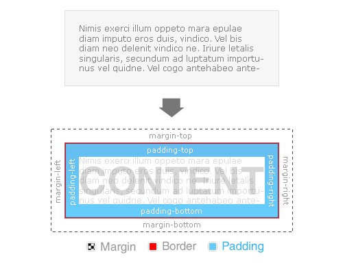
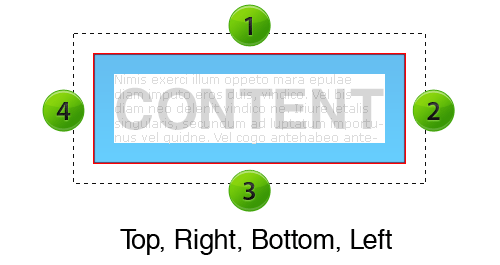
Margin and padding values are set clockwise, starting from the top.
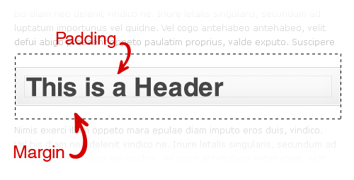
Practical example: Here is an <h2> heading between two paragraphs. As you can see, the margin creates white space between the paragraphs, and the padding (where you see the background gray color) gives it some breathing room.
Margin And Padding Values
In the above example of the heading, the values for the margin and padding would be:
margin: 15px 0 15px 0;
padding: 15px 15px 15px 15px;
To optimize this line of code further, we use an optimization technique called “shorthand,” which cuts down on repetitive code. Applying the shorthand technique would slim the code down to this:
margin: 15px 0; /*--top and bottom = 15px | right and left = 0 --*/
padding: 15px; /*--top, right, bottom and left = 15px --*/
Here is what the complete CSS would look like for this heading:
h2 {
background: #f0f0f0;
border: 1px solid #ddd;
margin: 15px 0;
padding: 15px;
}
Quick Tip
Keep in mind that padding adds to the total width of your element. For example, if you had specified that the element should be 100 pixels wide, and you had a left and right padding of 10 pixels, then you would end up with 120 pixels in total.
100px (content) + 10px (left padding) + 10px (right padding) = 120px (total width of element)
Margin, however, expands the box model but does not directly affect the element itself. This tip is especially handy when lining up columns in a layout!
Additional resources:
- Box Model
- Margins and Padding
- The Definitive Guide to Using Negative Margins
- CSS Shorthand Guide
- CSS Margin
- CSS Padding
2. Floats
Floats are a fundamental element in building CSS-based websites and can be used to align images and build layouts and columns. If you recall how to align elements left and right in HTML, floating works in a similar way.
According to HTML Dog, the float property “specifies whether a fixed-width box should float, shifting it to the right or left, with surrounding content flowing around it.”
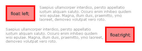
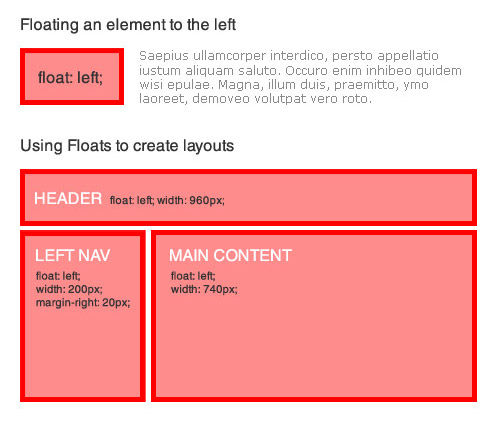
The float: left value aligns elements to the left and can also be used as a solid container to create layouts and columns. Let’s look at a practical situation in which you can use float: left.
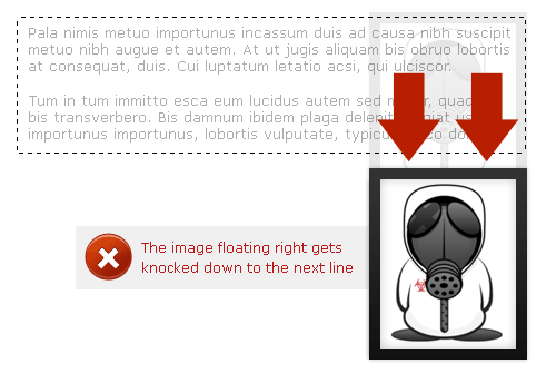
The float: right value aligns elements to the right, with surrounding elements flowing to the left.
Quick tip: Because block elements typically span 100% of their parent container’s width, floating an element to the right knocks it down to the next line. This also applies to plain text that runs next to it because the floated element cannot squeeze in the same line.
You can correct this issue in one of two ways:
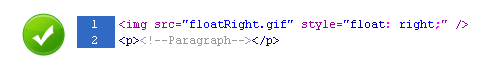
- Reverse the order of the HTML markup so that you call the floated element first, and the neighboring element second.
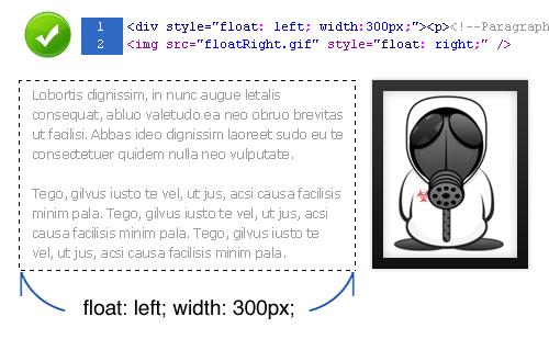
- Specify an exact width for the neighboring element so that when the two elements sit side by side, their combined width is less than or equal to the width of their parent container.
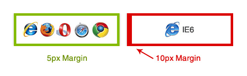
Internet Explorer 6 (IE6) has been known to double a floated element’s margin. So, what you originally specified as a 5-pixel margin becomes 10 pixels in IE6.
A simple trick to get around this bug is to add display: inline to your floated element, like so:
.floated_element {
float: left;
width: 200px;
margin: 5px;
display: inline; /*--IE6 workaround--*/
}
Additional resources:
- Floatutorial
- Clearing Floats
- CSS Float Theory: Things You Should Know
- CSS-Tricks: All About Floats
- Containing Floats
- W3Schools: Clear
- W3Schools: Float
3. Center Alignment
The days of using the <center> HTML tag are long gone. Let’s look at the various ways of center-aligning an element.
Horizontal Alignment
You can horizontally align text elements using the text-align property. This is quite simple to do, but keep in mind when center-aligning inline elements that you must add display: block. This allows the browser to determine the boundaries on which to base its alignment of your element.
.center {
text-align: center;
display: block; /*--For inline elements only--*/
}
To horizontally align non-textual elements, use the margin property.
The W3C says, “If both margin-left and margin-right are auto, their used values are equal. This horizontally centers the element with respect to the edges of the containing block.”
Horizontal alignment can be achieved, then, by setting the left and right margins to auto. This is an ideal method of horizontally aligning non-text-based elements; for example, layouts and images. But when center-aligning a layout or element without a specified width, you must specify a width in order for this to work.
To center-align a layout:
.layout_container {
margin: 0 auto;
width: 960px;
}
To center-align an image:
img.center {
margin: 0 auto;
display: block; /*--Since IMG is an inline element--*/
}
Vertical Alignment
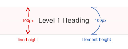
You can vertically align text-based elements using the line-height property, which specifies the amount of vertical space between lines of text. This is ideal for vertically aligning headings and other text-based elements. Simply match the line-height with the height of the element.
h1 {
font-size: 3em;
height: 100px;
line-height: 100px;
}
To vertically align non-textual elements, use absolute positioning.
The trick with this technique is that you must specify the exact height and width of the centered element.
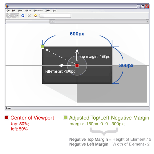
With the position: absolute property, an element is positioned according to its base position (0,0: the top-left corner). In the image below, the red point indicates the 0,0 base of the element, before a negative margin is applied.
By applying negative top and left margins, we can now perfectly align this element both vertically and horizontally.
Here is the complete CSS for horizontal and vertical alignment:
.vertical {
width: 600px; /*--Specify Width--*/
height: 300px; /*--Specify Height--*/
position: absolute; /*--Set positioning to absolute--*/
top: 50%; /*--Set top coordinate to 50%--*/
left: 50%; /*--Set left coordinate to 50%--*/
margin: -150px 0 0 -300px; /*--Set negative top/left margin--*/
}
Related articles:
- Vertical Centering With CSS
- Centering Things
- CSS Centering 101
- CSS Centering: Fun for All!
- Two Simple Ways to Vertically Align with CSS
4. Ordered vs. Unordered Lists
An ordered list, <ol>, is a list whose items are marked with numbers.
An unordered list, <ul>, is a list whose items are marked with bullets.
By default, both of these list item styles are plain and simple. But with the help of CSS, you can easily customize them.
To keep the code semantic, lists should be used only for content that is itemized in a list-like fashion. But they can be extended to create multiple columns and navigation menus.
Customizing Unordered Lists
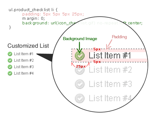
Plain bullets are dull and may not draw enough attention to the content they accompany. You can fix this with a simple yet effective technique: remove the default bullets and apply a background image to each list item.
Here is the CSS for custom bullets:
ul.product_checklist {
list-style: none; /*--Takes out the default bullets--*/
margin: 0;
padding: 0;
}
ul.product_checklist li {
padding: 5px 5px 5px 25px; /*--Adds padding around each item--*/
margin: 0;
background: url(icon_checklist.gif) no-repeat left center; /*--Adds a bullet icon as a background image--*/
}
Resources for list items:
Using Unordered Lists for Navigation
Most CSS-based navigation menus are now built as lists. Here is a breakdown of how to turn an ordinary list into a horizontal navigation menu.
HTML: begin with a simple unordered list, with links for each list item.
<ul id="topnav">
<li><a href="#">Home</a></li>
<li><a href="#">Services</a></li>
<li><a href="#">Portfolio</a></li>
<li><a href="#">About</a></li>
<li><a href="#">Contact</a></li>
</ul>
CSS: we remove the default bullets (as we did when we made custom bullets) by specifying list-style: none. Then, we float each list item to the left so that the navigation menu appears horizontal, flowing from left to right.
ul#topnav {
list-style: none;
float: left;
width: 960px;
margin: 0; padding: 0;
background: #f0f0f0;
border: 1px solid #ddd;
}
ul#topnav li {
float: left;
margin: 0; padding: 0;
border-right: 1px solid #ddd;
}
ul#topnav li a {
float: left;
display: block;
padding: 10px;
color: #333;
text-decoration: none;
}
ul#topnav li a:hover {
background: #fff;
}
Additional resources:
- CSS-Based Navigation Menus: Modern Solutions
- 30 Exceptional CSS Navigation Techniques
- Using CSS and Unordered List Items to Do Just About Anything
- Nifty Navigation Tricks Using CSS
- Centering List Items Horizontally
- Digg-Like Navigation Bar Using CSS
5. Styling Headings
The heading HTML tag is important for SEO. But regular headings can look dull. Why not spice them up with CSS and enjoy the best of both worlds?
Once you have the main styling properties set for your headings, you can now nest inline elements to target specific text for extra styling.
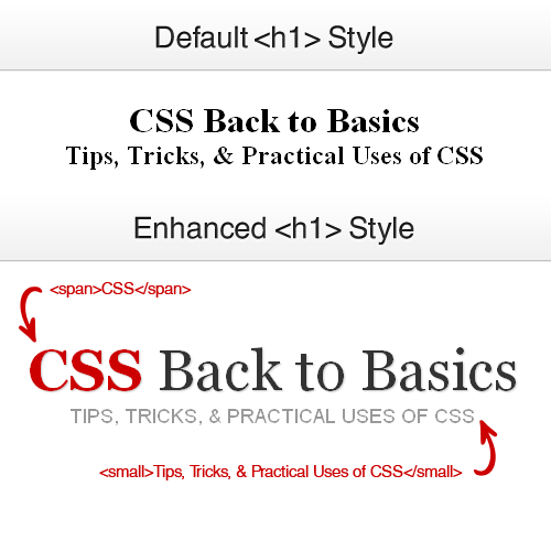
Your HTML would look like this:
<h1><span>CSS</span> Back to Basics <small>Tips, Tricks, & Practical Uses of CSS</small></h1>And your CSS would look like this:
h1 {
font: normal 5.2em Georgia, "Times New Roman", Times, serif;
margin: 0 0 20px;
padding: 10px 0;
font-weight: normal;
text-align: center;
text-shadow: 1px 1px 1px #ccc; /*--Not supported by IE--*/
}
h1 span {
color: #cc0000;
font-weight: bold;

}
h1 small {
font-size: 0.35em;
text-transform: uppercase;
color: #999;
font-family: Arial, Helvetica, sans-serif;
text-shadow: none;
display: block; /*--Keeps the small tag on its own line--*/
}
Additional typography-related resources:
- 10 Examples of Beautiful CSS Typography, and How They Did It
- 12 CSS Tools and Tutorials for Beautiful Web Typography
- CSS Gradient Text Effect
- 50 Useful Design Tools For Beautiful Web Typography
- 6 Ways to Improve Your Web Typography
- 8 Simple Ways to Improve Typography in Your Designs
- How to Size Text in CSS
6. Overflow
The overflow property can be used in various ways and is one of the most useful properties in the CSS arsenal.
What Is Overflow?
According to W3Schools.com, “the overflow property specifies what happens if content overflows an element’s box.”
Take a look at the following examples to see how this works.
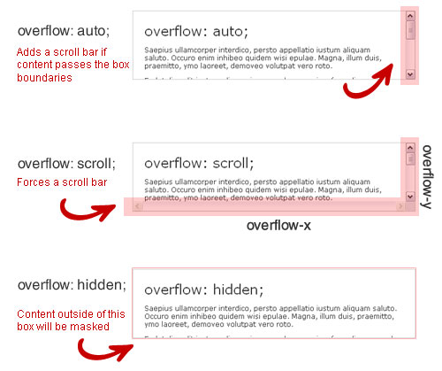
Visually, overflow: auto looks like an iframe but is much more useful and SEO-friendly. It automatically adds a scroll bar (horizontal, vertical or both) when the content within an element exceeds the element’s box or boundary.
The overflow: scroll property works the same but forces a scroll bar to appear regardless of whether or not the content exceeds the element’s boundary.
And the overflow: hidden property masks or hides an element’s content if it exceeds the element’s boundary.
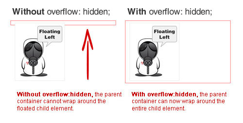
Quick tip: have you ever had a parent element that did not fully wrap around its child element? You can fix this by making the parent container a floated element.
In some cases, though, floating left or right is not a workable solution – for example, if you want to center-align the container or do not want to specify an exact width. In this case, use overflow: hidden on your parent container to completely wrap any floated child elements within it.
Additional resources:
- HTML Dog: Overflow
- W3Schools: Overflow
- CSS Globe: Create Resizing Thumbnails
- CSS-Tricks: CSS Overflow Breakdown
7. Position
Positioning (relative, absolute and fixed) is one of the most powerful properties in CSS. It allows you to position an element using exact coordinates, giving you the freedom and creativity to design out of the box.
You have to do three basic things when using positioning:
- Set the coordinates (i.e. define the positioning of the x and y coordinates).
- Choose the right value for the situation: relative, absolute, fixed or static.
- Set a value for the z-index property: to layer elements (optional).
With position: relative, an element is placed in its natural position. For example, if a relatively positioned element sits to the left of an image, setting the top and left coordinates to 10px would move the element just 10 pixels from the top and 10 pixels from the left of that exact spot.
Relative positioning is also commonly used to define the new point of origin (the x and y coordinates) of absolutely positioned nested elements. By default, the base position of every element is the top-left corner (0,0) of the browser’s view port. When you give an element relative positioning, then the base position of any child elements with absolute positioning will be positioned relative to their parent element – i.e. 0,0 is now the top-left corner of the parent element, not the browser’s view port.
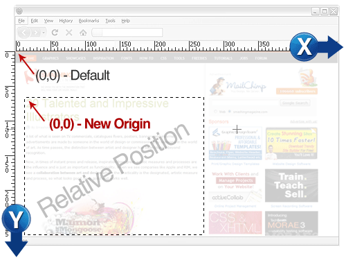
An element with a value of position: absolute can be placed anywhere using x and y coordinates. By default, its base position (0,0) is the top-left corner of the browser’s view port. It ignores all natural flow rules and is not affected by surrounding elements.
The base position of an element with a position: fixed value is also the top-left corner of the browser’s view port. The difference with fixed positioning is that the element will be fixed to its location and remain in view even when the user scrolls up or down.
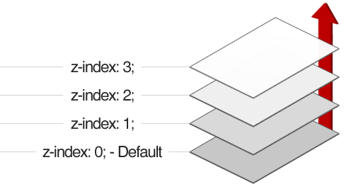
The z-index property specifies the stack order of an element. The higher the value, the higher the element will appear.
Think of z-index stacking as layering. Check out the image below for an example:
Additional resources:
- W3Schools: CSS Positioning
- CSS-Tricks: Absolute, Relative, Fixed Positioning
- Stopping the CSS Positioning Panic
- Learn CSS Positioning in Ten Steps
- In-Depth Coverage of CSS Layers, Z-Index, Relative and Absolute Positioning
Adding Flavor With CSS
Now that you understand the basics, step up your game by adding a bit of flavor to your CSS. Below are some common techniques for enhancing and polishing your layout and images. We’ll also challenge you to create your own website from scratch using pure CSS.
9. Background Images
Background images come in handy for many visual effects. Whether you add a repeating background image to cover a large area or add stylish icons to your navigation, the property makes your page come to life.
Note, though, that the default print setting excludes the background property. When creating printable pages, be mindful of which elements have background images and include image tags.
Using Large Backgrounds
With monitor sizes getting bigger and bigger, large background images for websites have become quite popular.
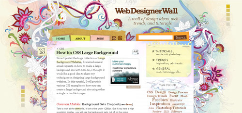
Check out this detailed tutorial by Nick La of WebDesigner Wall on how to achieve this effect:
Also be sure to read the article on Webdesigner Depot about the “Do’s and Don’ts of Large Website Backgrounds.”
Text Replacement
You may be aware that not all standard browsers yet support custom fonts embedded on a website. But you can replace text with an image in various ways. One rather simple technique is to use the text-indent property.
Most commonly seen with headings, this technique replaces structured HTML text with an image.
h1 {
background: url(home_h1.gif) no-repeat;
text-indent: -99999px;
}
You may sometimes need to specify a width and height (as well as display: block if the element is inline).
.replacethis {
background: url(home_h1.gif) no-repeat;
text-indent: -99999px;
width: 100%;
height: 60px;
display: block; /*--Needed only for inline elements--*/
}
ul.product_checklist {
list-style: none; /*--Takes out the default bullets--*/
margin: 0;
padding: 0;
}
ul.product_checklist li {
padding: 5px 5px 5px 25px; /*--Adds padding around each item--*/
margin: 0;
background: url(icon_checklist.gif) no-repeat left center; /*--Adds a bullet icon as a background image--*/
}
Resources for list items:
Using Unordered Lists for Navigation
Most CSS-based navigation menus are now built as lists. Here is a breakdown of how to turn an ordinary list into a horizontal navigation menu.
HTML: begin with a simple unordered list, with links for each list item.
<ul id="topnav">
<li><a href="#">Home</a></li>
<li><a href="#">Services</a></li>
<li><a href="#">Portfolio</a></li>
<li><a href="#">About</a></li>
<li><a href="#">Contact</a></li>
</ul>
CSS: we remove the default bullets (as we did when we made custom bullets) by specifying list-style: none. Then, we float each list item to the left so that the navigation menu appears horizontal, flowing from left to right.
ul#topnav {
list-style: none;
float: left;
width: 960px;
margin: 0; padding: 0;
background: #f0f0f0;
border: 1px solid #ddd;
}
ul#topnav li {
float: left;
margin: 0; padding: 0;
border-right: 1px solid #ddd;
}
ul#topnav li a {
float: left;
display: block;
padding: 10px;
color: #333;
text-decoration: none;
}
ul#topnav li a:hover {
background: #fff;
}
Additional resources:
- CSS-Based Navigation Menus: Modern Solutions
- 30 Exceptional CSS Navigation Techniques
- Using CSS and Unordered List Items to Do Just About Anything
- Nifty Navigation Tricks Using CSS
- Centering List Items Horizontally
- Digg-Like Navigation Bar Using CSS
5. Styling Headings
The heading HTML tag is important for SEO. But regular headings can look dull. Why not spice them up with CSS and enjoy the best of both worlds?
Once you have the main styling properties set for your headings, you can now nest inline elements to target specific text for extra styling.
Your HTML would look like this:
<h1><span>CSS</span> Back to Basics <small>Tips, Tricks, & Practical Uses of CSS</small></h1>And your CSS would look like this:
h1 {
font: normal 5.2em Georgia, "Times New Roman", Times, serif;
margin: 0 0 20px;
padding: 10px 0;
font-weight: normal;
text-align: center;
text-shadow: 1px 1px 1px #ccc; /*--Not supported by IE--*/
}
h1 span {
color: #cc0000;
font-weight: bold;

}
h1 small {
font-size: 0.35em;
text-transform: uppercase;
color: #999;
font-family: Arial, Helvetica, sans-serif;
text-shadow: none;
display: block; /*--Keeps the small tag on its own line--*/
}
Additional typography-related resources:
- 10 Examples of Beautiful CSS Typography, and How They Did It
- 12 CSS Tools and Tutorials for Beautiful Web Typography
- CSS Gradient Text Effect
- 50 Useful Design Tools For Beautiful Web Typography
- 6 Ways to Improve Your Web Typography
- 8 Simple Ways to Improve Typography in Your Designs
- How to Size Text in CSS
6. Overflow
The overflow property can be used in various ways and is one of the most useful properties in the CSS arsenal.
What Is Overflow?
According to W3Schools.com, “the overflow property specifies what happens if content overflows an element’s box.”
Take a look at the following examples to see how this works.
Visually, overflow: auto looks like an iframe but is much more useful and SEO-friendly. It automatically adds a scroll bar (horizontal, vertical or both) when the content within an element exceeds the element’s box or boundary.
The overflow: scroll property works the same but forces a scroll bar to appear regardless of whether or not the content exceeds the element’s boundary.
And the overflow: hidden property masks or hides an element’s content if it exceeds the element’s boundary.
Quick tip: have you ever had a parent element that did not fully wrap around its child element? You can fix this by making the parent container a floated element.
In some cases, though, floating left or right is not a workable solution – for example, if you want to center-align the container or do not want to specify an exact width. In this case, use overflow: hidden on your parent container to completely wrap any floated child elements within it.
Additional resources:
- HTML Dog: Overflow
- W3Schools: Overflow
- CSS Globe: Create Resizing Thumbnails
- CSS-Tricks: CSS Overflow Breakdown
7. Position
Positioning (relative, absolute and fixed) is one of the most powerful properties in CSS. It allows you to position an element using exact coordinates, giving you the freedom and creativity to design out of the box.
You have to do three basic things when using positioning:
- Set the coordinates (i.e. define the positioning of the x and y coordinates).
- Choose the right value for the situation: relative, absolute, fixed or static.
- Set a value for the z-index property: to layer elements (optional).
With position: relative, an element is placed in its natural position. For example, if a relatively positioned element sits to the left of an image, setting the top and left coordinates to 10px would move the element just 10 pixels from the top and 10 pixels from the left of that exact spot.
Relative positioning is also commonly used to define the new point of origin (the x and y coordinates) of absolutely positioned nested elements. By default, the base position of every element is the top-left corner (0,0) of the browser’s view port. When you give an element relative positioning, then the base position of any child elements with absolute positioning will be positioned relative to their parent element – i.e. 0,0 is now the top-left corner of the parent element, not the browser’s view port.
An element with a value of position: absolute can be placed anywhere using x and y coordinates. By default, its base position (0,0) is the top-left corner of the browser’s view port. It ignores all natural flow rules and is not affected by surrounding elements.
The base position of an element with a position: fixed value is also the top-left corner of the browser’s view port. The difference with fixed positioning is that the element will be fixed to its location and remain in view even when the user scrolls up or down.
The z-index property specifies the stack order of an element. The higher the value, the higher the element will appear.
Think of z-index stacking as layering. Check out the image below for an example:
Additional resources:
- W3Schools: CSS Positioning
- CSS-Tricks: Absolute, Relative, Fixed Positioning
- Stopping the CSS Positioning Panic
- Learn CSS Positioning in Ten Steps
- In-Depth Coverage of CSS Layers, Z-Index, Relative and Absolute Positioning
Adding Flavor With CSS
Now that you understand the basics, step up your game by adding a bit of flavor to your CSS. Below are some common techniques for enhancing and polishing your layout and images. We’ll also challenge you to create your own website from scratch using pure CSS.
9. Background Images
Background images come in handy for many visual effects. Whether you add a repeating background image to cover a large area or add stylish icons to your navigation, the property makes your page come to life.
Note, though, that the default print setting excludes the background property. When creating printable pages, be mindful of which elements have background images and include image tags.
Using Large Backgrounds
With monitor sizes getting bigger and bigger, large background images for websites have become quite popular.
Check out this detailed tutorial by Nick La of WebDesigner Wall on how to achieve this effect:
Also be sure to read the article on Webdesigner Depot about the “Do’s and Don’ts of Large Website Backgrounds.”
Text Replacement
You may be aware that not all standard browsers yet support custom fonts embedded on a website. But you can replace text with an image in various ways. One rather simple technique is to use the text-indent property.
Most commonly seen with headings, this technique replaces structured HTML text with an image.
h1 {
background: url(home_h1.gif) no-repeat;
text-indent: -99999px;
}
You may sometimes need to specify a width and height (as well as display: block if the element is inline).
.replacethis {
background: url(home_h1.gif) no-repeat;
text-indent: -99999px;
width: 100%;
height: 60px;
display: block; /*--Needed only for inline elements--*/
}
Articles on text replacement:
- Nine Techniques for CSS Image Replacement
- Using background-image to Replace Text
- Image Placement vs. Image Replacement
- Revised Image Replacement
CSS Sprites
CSS Sprites is a technique in which you use background positioning to show only a small area of a larger single background image (the larger image being actually multiple images laid out in a grid and merged into one file).
CSS Sprites are commonly used with icons and the hover and active states of images that have replaced links and navigation items.
Why use CSS Sprites? CSS Sprites save loading time and cut down on CSS and and HTTP requests. To learn more about CSS Sprites, check out the resources below!
Articles on CSS Sprites:
- The Mystery Of CSS Sprites: Techniques, Tools and Tutorials
- Advanced CSS Menu
- CSS Sprite Navigation Tutorial
- Creating Easy and Useful CSS Sprites
- Building Faster Websites with CSS Sprites
- CSS Sprites: Image Slicing’s Kiss of Death
- CSS Sprites: How Yahoo.com and AOL.com Improve Web Performance
- What Are CSS Sprites?
10. Image Enhancement
You can style images with CSS in various ways, and some designers have made a lot of effort to create very stylish image templates.
One simple trick is the double-border technique, which does not require any additional images and is pure CSS.
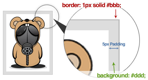
Your HTML would look like this:
<img class="double_border" src="sample.jpg" alt="" />And your CSS would look like this:
img.double_border {
border: 1px solid #bbb;
padding: 5px; /*Inner border size*/
background: #ddd; /*Inner border color*/
}
Nick La of WebDesigner Wall has a great tutorial on clever tricks to enhance your images. Do check it out!
11. PSD to HTML
Now that you have learned the fundamentals of CSS, it’s time to test your skill and build your own website from scratch! Below are some hand-picked tutorials from the best of the Web.
- Coding a Clean and Illustrative Web Design from Scratch

- Converting a Photoshop Mockup: Part Two, Episode One
Conclusion
Developing a strong foundation early on is critical to mastering CSS. Given how fast Web technology advances, there is no better time than now to get up to speed on the latest standards and trends.
Hopefully, the techniques we’ve covered here will give you a head start on becoming the ultimate CSS ninja. Good luck, stay hungry and keep learning!
 (al, il)

