The Mystery Of CSS Sprites: Techniques, Tools And Tutorials

Email Newsletter
Weekly tips on front-end & UX.
Trusted by 200,000+ folks.
 Flexible CMS. Headless & API 1st


And if you haven’t heard of CSS sprites before, now is probably a good time to learn what they are, how they work and what tools can help you create and use the technique in your projects.
What Are CSS Sprites?
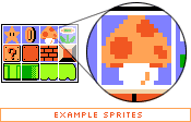
The term “sprite” (similar to “spirit,” “goblin,” or “elf”) has its origins in computer graphics, in which it described a graphic object blended with a 2-D or 3-D scene through graphics hardware. Because the complexity of video games has continually increased, there was a need for smart techniques that could deal with detailed graphic objects while keeping game-play flowing. One of the techniques developed saw sprites being plugged into a master grid (see the image below), then later pulled out as needed by code that mapped the position of each individual graphic and selectively painted it on the screen.
Sprites were displayed over a static or dynamic background image, and the positioning of the sprite was controlled simply by the hardware controllers. The term was coined because the sprites seemed to “haunt” the display and didn’t really exist in the graphic memory.
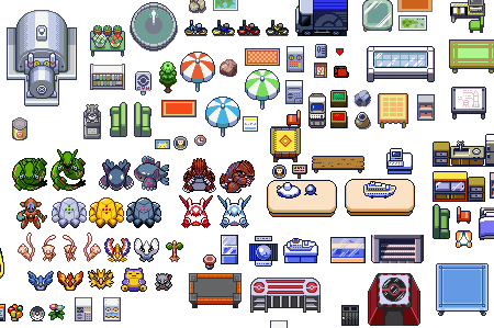
The Pokemon Sprite Sheet, consisting of over 1000 graphic objects. Found here. You can click on the image for the larger version (thanks, Ryan!).
Time passed, and at the beginning of the 2000s, when progressive Web designers started to seek alternatives to JavaScript-based rollover menus (with onMouseOver and onMouseOut effects), sprites saw a renaissance in Web development. With CSS, the simple implementation of sprites was possible, and it was much easier and clearer than its JavaScript-based predecessor.
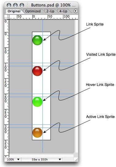
In 2004, Dave Shea suggested a simple CSS-based approach to CSS sprites based on the practice established by those legendary video games. In this case, multiple images used throughout a website would be combined into the so-called “master image.” To display a single image from the master image, one would use the background-position property in CSS, defining the exact position of the image to be displayed. Any hover, active or focus effects would be implemented using the simple definition of the background-position property for the displayed element.
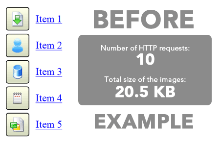
When the page is loaded, it would not load single images one by one (nor hover-state images per request), but would rather load the whole master image at once. It may not sound like a significant improvement, but it actually was: the main disadvantage of the onMouse effects is that JavaScript-based hover effects require two HTTP requests for each image, which takes time and creates that unpleasant “flickering” of images. Because the master image is loaded with the whole page only once with CSS sprites, no additional HTTP requests are needed for hover, active or focus effects (because the image is already loaded), and no “flickering” effect occurs.
Consequence: CSS sprites reduce HTTP requests and the loading time of pages. This is the main reason why CSS sprites are often used on websites with heavy traffic, where millions of page impressions would need “only” a tiny fraction of what could otherwise be 30,000,000. Hence, CSS sprites are commonly used, particularly for navigation (such as for hover effects), icons and buttons.
Where Are CSS Sprites Used?
CSS sprites can be used in various settings. Large websites can combine multiple single images in a meaningful manner, creating clearly separated “chunks” of the master images – the purpose being to keep the design maintainable and easy to update. The large empty space between the images is often used to make sure that the text resizing in browser doesn’t cause side effects such the display of multiple images in the background. In fact, sprites usually work well in a pixel-based design, but they are hard to use in elastic (em-based) designs due to the restricted background-position-property. Essentially, the structure that sprites take depends on the trade-off between maintainability and reduced server load; thus, it varies depending on the project you are working on.
Here are some inspiring (and not so inspiring) examples:
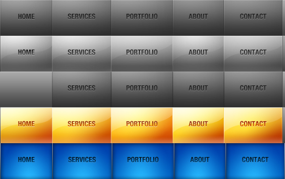
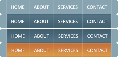
Xing Xing uses various icons and buttons, as well as its logo, in the sprite.

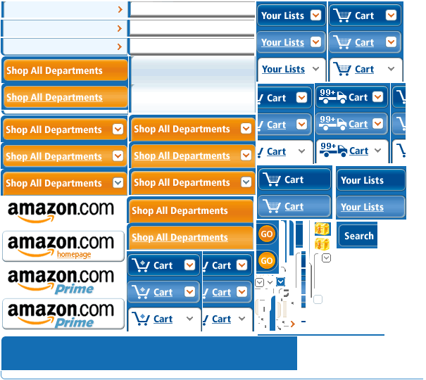
Amazon Large, shiny and compact CSS sprites on Amazon.
Apple Apple uses CSS sprites for various states of its main navigation menu.

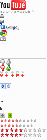
YouTube YouTube takes a vertical approach to its buttons and icons. The whole sprite is 2800 pixels in height!
CNN CNN uses a modest CSS sprite with its social icons.
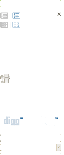
Digg Digg has quite an esoteric sprite, with small arrows and brackets. The large empty space between the images is used to make sure that text resizing doesn’t display multiple images as the background image. You can explicitely define width and height in pixels, so that this problem does not occur – however, in this case the resized text will never break out of the defined box, thus possibly making the text unreadable. Consequently, you must be cautious when using spriting for buttons with variable text labels. For those buttons, you should define font size in pixels also. Or just use the large empty space in the sprite (thanks, daftie!).
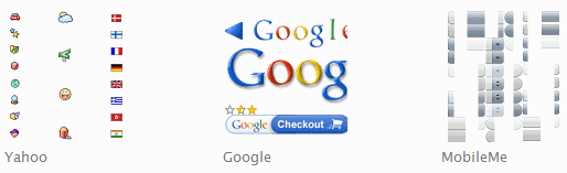
Yahoo Yahoo has nice icons in its sprite, spread out equidistant from each other.
Google Google sticks to its minimalist design principle with its minimalist CSS sprite.
Dragon Interactive A design agency with a colorful, vivid CSS sprite for the navigation menu.
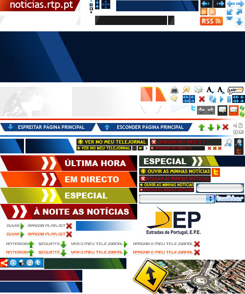
TV1.rtp.pt
A huge colorful and qute chaotic CSS sprite on a site of a Portugiese TV-channel (thank you, António Manuel Cardoso!).
CSS Sprites are used to combine many frequently used graphic elements, such as navigation elements, logos, lines, RSS icons, buttons, etc. Conversely, they are not used for any kind content that is likely to change frequently upon release.
Articles About CSS Sprites
CSS Sprites: Image Slicing’s Kiss of Death The legendary introductory article about CSS sprites on A List Apart.
CSS Sprites: What They Are, Why They’re Cool And How To Use Them An illustrated article about CSS sprites by Smashing Magazine author Chris Coyier and a blogger from Turkey, Volkan Görgülü.
How Yahoo.com and AOL.com Improve Web Performance With CSS Sprites Some of the busiest websites on the Web use CSS sprites to save on HTTP requests. This article shows how Yahoo! and AOL use sprites to improve performance. Note: some devices (the iPhone being the most notable) apply sprites in a memory-intensive way, which slows the device to a crawl.
What Are CSS Sprites? An introduction by Jason Cranford Teague.
Sprite Optimization
Dave Shea ponders whether it actually makes sense to create large CSS sprites, combining all elements into a single image and then displaying them with the background-position property in CSS. Answer: No, do not over-complicate things. Instead, find a good compromise between quick loading time and maintainability.
Creating Easy and Useful CSS Sprites A detailed introduction to CSS Sprites by Ignacio Ricci. All files can be downloaded as well.
Fast Rollovers Without Preload A practical example of implementing fast rollovers.
CSS Sprites + Rounded corners Another example from practice, this one explaining how to display rounded corners using CSS Sprites.
CSS Image Sprites An extensive tutorial with examples, tips, suggestions and best practices.
Optimize Your Website Using CSS Image Sprites This very detailed tutorial by Andrew Johnson explains what CSS sprites are, why they are important, how they work and how to implement them.
Animated GIF For CSS Sprites This article discusses one of the more bizarre uses of CSS sprites: as an animated GIF.
Image Sprite Navigation With CSS Learn how to create a simple menu with the hover effect.

Advanced CSS Menu Implement the hover effect with CSS sprites.
Creating and Using CSS Sprites A very basic tutorial about CSS sprites by David Walsh.

Screencasts about CSS Sprites
How to Use CSS Sprites David Perel explains the basics of CSS sprites and how to use them in your website design. 10 minutes.
Creating Rounded Buttons With CSS Sprites Continuing the above sprites tutorial, David shows how to create dynamic rounded-corner buttons with CSS.
Exactly How to Use CSS Sprites In this screencast, Andres Fernandez shows how to use CSS sprites to improve loading time and decrease HTTP requests.
How To Use CSS Sprites This screencast, Smashing Magazine author Chris Coyier shows how to use CSS sprites in practice, by taking what would have been eight different images and combining them into one. As an added bonus, he then expands on the idea with jQuery by building a little accordion widget.
Faster Page Loads With Image Concatenation For complex web apps, the quantity and resulting latency of icons and images used can greatly affect page load times. And developers usually try to reduce, rather than increase, page load times for their sweet Web apps.
CSS Image Sprites In 10 Minutes Another screencast that explains how to use CSS sprites for a navigation menu.
CSS: Using Percentages in Background-Image
This article explains the background-position property, which is essential to implementing CSS sprites.
CSS Image Maps With CSS Sprites
With CSS Sprites, the hover effect doesn’t have to be applied to the whole element. Using a negative background-position value, you can create pure CSS-based image maps. Below, you’ll find some techniques in which CSS sprites are used for this purpose.
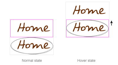
CSS Image Maps Using Sprites
A basic example of a CSS-based image map with a negative background-position value. Try hovering over the image. Compare this with the classic example without CSS sprites.
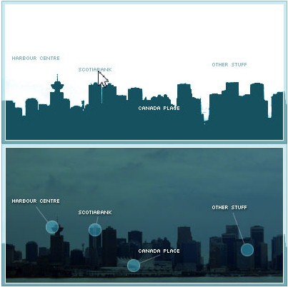
City Guide Map Using Sprites Another example, with horizontally positioned hover areas.
Advanced Map Using Sprites A more advanced technique by Frank Manno.
CSS Sprites Techniques
CSS Sprites 2 Dave Shea expands on the classic CSS sprites technique with jQuery. His technique allows for animation between link states, while still being fully degradable for visitors who do not have JavaScript enabled.
CSS Sprites2 Refactored: Building an Unobtrusive jQuery Plug-In Joel Sutherland describes his jQuery plug-in, which cleans up Dave Shea’s function and allows for more control over the animation with less initial configuration.
Background Repeat and CSS Sprites CSS sprites are a great way to improve the loading speed of your pages. One of the problems you might face with sprites is how to deal with cases where the background repeats. The rule is pretty simple: if you want the background to repeat vertically (top to bottom), place the images in the sprite horizontally (left to right) and make sure the individual images in the sprite have the same height. For the opposite case, when you want to repeat horizontally, sprite vertically.
CSS Sprite: Photoshop Script Combines Two Images for CSS Hover This article presents a simple JSX Photoshop script for creating image sprites, and you can also assign a keyboard shortcut to it.
Extending CSS Spriting Jennifer Semtner extends the classic CSS sprites technique to non-background images and discusses what to consider when using CSS Sprites for the design.
Sliding Doors Meets CSS Sprites Combining the ideas behind Dave Shea’s CSS sprites and Douglas Bowman’s sliding doors technique, this post assumes you have a good understanding of Bowman’s article “Sliding Doors of CSS.”
How to Preload Images When You Can’t Use CSS Sprites This article addresses the problem that occurs with CSS sprites when the user resizes text. The idea is to combine the images into two images, rather than one. Then you place the image being shown on hover as the background image of another element (preferably a containing element), positioned just off screen.
JavaScript Sprite Animation Using jQuery Alex Walker combines visual jQuery effects with CSS sprites to achieve the “page turn” effect.
IE6, CSS Sprites and Alpha Transparency Julien Lecomte shows how to combine CSS sprites, PNG transparency and Internet Explorer 6 compatibility using the AlphaImageLoader hack.
CSS Sprite Generators
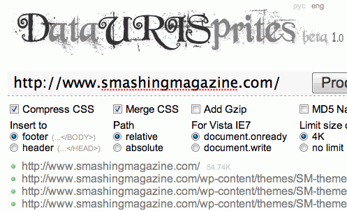
Data URI Sprites DURIS (Data URI [CSS] Sprites) is a new method to manage website’s background images. It’s aimed to replace classical CSS Sprites. The new technique allows you to apply any corrections to your make-up, allows you to minimize number of requests for design-related data that is used on the webpage and uses text (non graphic) format of image data presentation. It also solves all problems with scaling for background images and combines images of different types and axes of repetition.
Spritr This simple tool lets you upload multiple images and generates CSS code for the sprite.
Sprite Creator 1.0 This tool allows you to upload an image and create the CSS code for selected areas of the sprite.
CSS Sprite Generator A Drupal module for building CSS sprites.
CSS Sprites Generator
This tool allows you to upload multiple files and generate a sprite out of them. It also gives you the CSS code (the background-position value) for each image in the sprite.
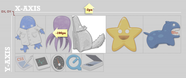
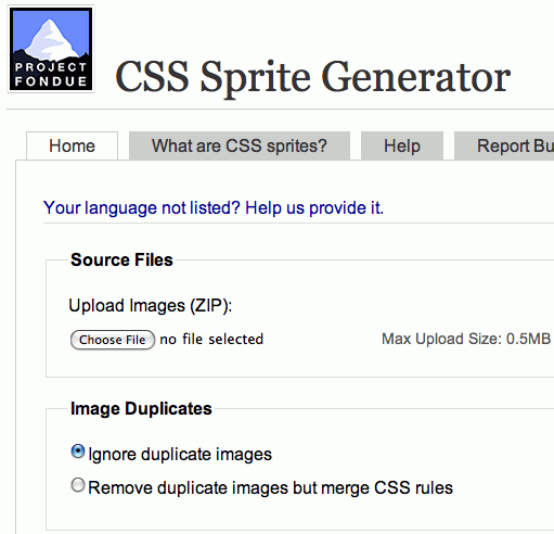
Projekt Fondue CSS Sprite Generator This generator lets you ignore duplicate images, resize source images, define horizontal and vertical offset, define background and transparency color, assign CSS class prefixes and various other things. It also supports many languages. The source code is available for downloading and is covered by a BSD license. Want to run a local copy? Well, you can do that, too.
SmartSprites A Java-based desktop application that parses special directives that you can insert into your original CSS to mark individual images to be turned into sprites. It then builds sprite images from the collected images and automatically inserts the required CSS properties into your style sheet, so that the sprites are used instead of the individual images.
You can work with your CSS and original images as usual and have SmartSprites automatically transform them to the sprite-powered version when necessary. A PHP version is available as well. Open-source. Check also Chris Brainard’s Sprite Creator 1.0.
Bonus: How Does The background-position Property Work?
The background-position property, together with CSS specificity and CSS floats, is probably one of the most confusing and counter-intuitive of CSS properties.
According to CSS specifications, the background-position takes two (optional) arguments: horizontal position and vertical position. For example:
.introduction {
    background-image: url(bg.gif);
    background-position: [horizontal position] [vertical position];
    }
Using this property, you can define the exact position of the background image for the block-level element (list item li). You can use either % or px units (or mix both) to define the starting position (i.e. the upper-left corner) of the displayed part of the master image. Alternatively, you could use the following keywords: top left, top center, top right, center left, center center, center right, bottom left, bottom center, bottom right.
Hence, in background-position: x% y%, the first value is the horizontal position, and the second value is the vertical position. The top-left corner is 0% 0%. The bottom-right corner is 100% 100%. If you specify only one value, the other value will be 50%.
For instance, if you use,
ul li {
    background-image: url(bg.gif);
    background-position: 19px 85px;
    },
… then the background-image will be positioned 19 pixels from the left and 85 pixels from the top of the list item element.
As SitePoint’s reference article explains: “a background-image with background-position values of 50% 50% will place the point of the image that’s located at 50% of the image’s width and 50% of the image’s height at a corresponding position within the element that contains the image. In the above case, this causes the image to be perfectly centered. This is an important point to grasp – using background-position isn’t the same as placing an element with absolute position using percentages where the top-left corner of the element is placed at the position specified.”
You can find a detailed explanation of the property in the article “background-position (CSS property)” on SitePoint.
Related posts
You may want to take a look at the following related posts:
- 53 CSS-Techniques You Couldn’t Live Without
- Powerful CSS-Techniques For Effective Coding
- 50 Extremely Useful and Powerful CSS Tools
- CSS Float Theory
- CSS Specificity
 (al)
(al)

