Responsive Design Frameworks: Just Because You Can, Should You?

Email Newsletter
Weekly tips on front-end & UX.
Trusted by 200,000+ folks.


 Flexible CMS. Headless & API 1st
 Register!
Responsive design is about building a website with a grid-based layout, images that resize and media queries, as described by Ethan Marcotte. After Marcotte defined the technique, responsive design frameworks began to emerge that incorporated these principles. Mostly based on CSS and JavaScript, many of these frameworks are open-source, free to download and quickly customizable.
Some of the most popular today are Bootstrap and Foundation, which we’ll focus on in this article.
As responsive design frameworks became popular, a big debate emerged: Why would a professional designer use a responsive design framework?
Internet debates rage on. Many declare that responsive design frameworks are awful, that only people who don’t know HTML and CSS would ever use such a thing. Here were the standard arguments against frameworks:
- A designer could write their own grid system, and they probably should if they know any HTML and CSS.
- Websites based on frameworks load slowly.
- All websites based on frameworks look the same.
- Bloat is common, whether due to the extra div tags, the 5000+ lines of CSS or the large JavaScript files.
While detractors complain vociferously, responsive design frameworks continue to grow in popularity. I suggest that these frameworks have positive aspects, even for the most experienced front-end Web developer, and I’ll outline these below.
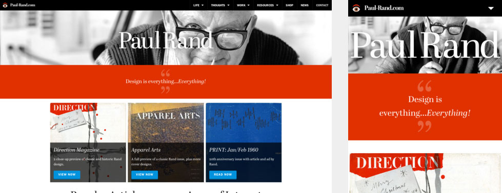
The website for American modernist Paul Rand was built with Foundation.
A Place For Responsive Design Frameworks
One morning, I was listening to Eli White’s keynote presentation at the Northeast PHP Conference. White is a PHP developer, and his talk was a retrospective of the development of the Web and PHP over the last 20 years. One point he made was that, 15 years ago, back-end developers built everything from scratch. Not much was available in the open-source world at the time, and proprietary content management systems (CMS) cost in the hundreds of thousands of dollars. If you wanted a survey for your website, for example, you had to write one from scratch.
Now in 2014, back-end developers no longer do this. Why would they, when they can use SurveyMonkey’s API to create something for their client in 10 hours, rather than 100 or 1000 hours? Is SurveyMonkey’s code the most awesome in the world, the most efficient, the most cleverly written and bloat-free? I am not a PHP developer and don’t know the answer to that. However, the API is tested and debugged, it runs well, and it is ready to be incorporated in your next project — and that has tremendous value.
Unless your client wants something very specific and has the money to fund such a project, as White explained, most PHP developers would argue that there is no good reason to write your own survey by hand in 2014.
So, what’s the equivalent technology shortcut for the front end of a website? Unfortunately, we don’t have one.
Currently, we have two choices for creating the front end of a website. The first choice is to download a template (or theme). Commonly used with CMS-based websites, a theme might come with a few color choices and a few variables to be tweaked. On the plus side, most themes are available for free or a very low cost relative to the cost of the overall website. Downloading a theme, changing some colors and dropping in a logo takes little time.
What’s more, a good theme will be updated regularly, and it will come with documentation, making it much more straightforward to modify. On the negative side, a theme might be used by many and not be unique in the slightest, and it might even make the website look like it belongs to a particular CMS.
The second choice is a fully customized solution. A graphic designer would be hired to discuss branding, and they would iterate through three designs and two rounds of revisions, perhaps prototype directly in the browser or convert the designs to HTML and CSS, integrate the design with a CMS or their back end of choice if desired, and deliver the (hopefully) perfect result to the client. On the plus side, each tag would be precisely placed, and the code would be perfectly semantic, with not an ounce of fat or an excess div to be found.
To achieve this, though, the developer must be highly trained and experienced — and whenever a developer of that caliber is involved, the price tag goes up accordingly, putting the project out of financial reach of small clients and adding significantly to the expenditures of large clients. Furthermore, unless additional dollars are spent on documentation (which is unusual in my experience), if the initial developer leaves, then the next developer would have to figure out the code in order to modify it. That’s an additional cost to the client.
Where’s the middle ground between downloading a low-end design, used all over the Internet, and creating something highly customized and expensive? Where is the equivalent of a back-end developer’s API or code library? Can we create some kind of mass customization for the front end?
We need to be able to tap into some prewritten elements, combine them with customized additions, and develop a solution that’s more customized than a canned theme but less customized than a high-end solution. By not starting from scratch, we’ll have saved hours of time in development and saved money for the client.
Am I saying we should ditch customized solutions for frameworks? No, of course not. A fully customized solution has its place in the Web development world, just as canned CMS themes have their place. If your client has the time and money to achieve perfection and a fully customized solution is a sound approach for the project, then why not?
But many clients have very limited time and money, and they might not be able to wait or pay for perfection. Can we get something that’s “pretty good” instead? Perhaps not every div would be perfectly placed, and there might be a few too many of them. Perhaps the code takes a bit longer than necessary to download. Nevertheless, the solution would be documented, in active development and customizable, and it could be built on quickly for much less than a custom website. There is value in that.
Like every other technology at our disposal in the Web development world, a responsive design framework has its own positives and negatives that we need to consider.
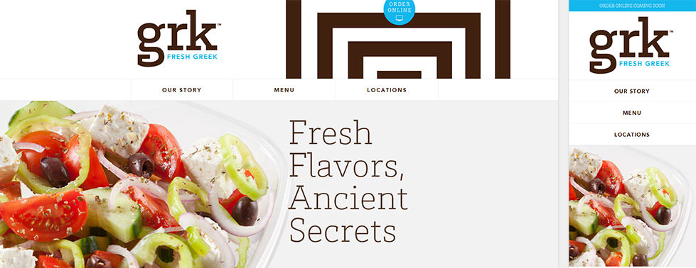
The website for Greek restaurant Grk was built with Bootstrap.
Positives And Negatives Of Responsive Design Frameworks
Focusing on Bootstrap 3 and Foundation 5, let’s explore many of the positive and negative aspects of building your next website with one of these frameworks.
Browser Compatibility
Debugging for browsers sometimes take as long as developing the website itself. If you can reduce the time spent on debugging, you could save significant costs for the client (and your own hair).
Responsive design frameworks have already been tested on a specific set of browsers and devices, which reduces the work required to launch a website. (The amount of testing you’d have to do will vary according to how much you’ve customized the framework. If you’ve changed only a few colors, then only minimal testing is required. If you’ve hacked the grid system, then testing would need to be extensive.)
The latest versions of Bootstrap and Foundation support Internet Explorer (IE) 9 and up. There are tricks to making the frameworks work in IE 8, but IE 6 and 7 are not compatible with either. In general, these frameworks also support the latest versions of other common browsers, including Firefox, Safari and Chrome, as well as different sets of mobile browsers.
Unfortunately, if you want to support a browser that hasn’t been tested, then you might discover bugs that need to be fixed in code that you aren’t familiar with.
Customizing Files
Bootstrap and Foundation have standard download packages that contain all of the required files, styles and widgets. Some files are large, and there are several files to download. In general, files come in both human-readable and minified formats.
Just because your framework of choice ships with styles and JavaScript to support dozens of components doesn’t mean you have to download and integrate them all. Bootstrap and Foundation allow you to customize your download package, so you can grab only the CSS and JavaScript that you need to run your website. This reduces bloat and, as a result, reduces downloading times, a common argument against frameworks.
Later, if you want to add a widget or style that you previously excluded, you might need to reconfigure the package. This can be avoided, though. I recommend developing the website first, without customizing the look, to determine exactly which features you need. You can then customize the download package to include code for only those features. Once the framework is in place, you can then customize the look of the website.
Note: When the next minor version of Bootstrap or Foundation is released, you’ll need to redownload the customized package. Take careful notes of what you have and have not downloaded, so that you can repeat the process when updating your files.
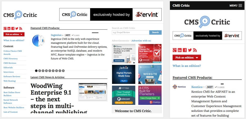
CMS Critic, a website that reviews content management systems, was built with Foundation.
Customizing Code
Some level of customization is likely required. You will probably want to change colors. If you’re more experienced, you may wish to hack the grid system.
Just because you’re using a framework doesn’t mean your website has to look like one. You can customize the CSS to give the website its own unique look, either by using LESS (for Bootstrap) or Sass (for Foundation) or simply by writing CSS from scratch.
The styles that come in Bootstrap out of the box are quite extensive, and the assumption is that you won’t be changing them extensively. You can override the CSS in a separate style sheet or by using LESS or Sass files. Unfortunately, little documentation is provided for LESS and Sass files, so you’ll need to figure out much of the code on your own. The abundant styles built into Bootstrap make it a popular choice for inexperienced front-end Web developers. (Note that Bootstrap has released Sass files within the last month. Prior to this, only LESS files were available for it.)
Foundation has fewer styles out of the box. While you can customize it with a separate style sheet, Foundation is more efficiently customized through its extensive Sass files (for which documentation is provided). With less CSS to override, you can build a fully customized look more easily. However, less experienced front-end developers might find Foundation more difficult to work with because of the greater knowledge of CSS and Sass required.
Bootstrap and Foundation can also be customized even before being downloaded, through simple changes to LESS and Sass variables. In Bootstrap, the customization options go on for pages, whereas only a handful of changes may be made to Foundation. But if you are not familiar with LESS or Sass, this is a quick and dirty way to customize the look of the framework.
Likewise, you can leverage the JavaScript provided to customize the functionality. The most recent versions of Bootstrap and Foundation require jQuery for customized widgets to work.
If you use the dedicated screens for Bootstrap and Foundation, then your download package will be customized. When the next minor version of each framework is released, you will need to customize the variables all over again for a new package.
Note that Foundation’s JavaScript includes a lot of well-placed semicolons. Bootstrap contains very few semicolons. This affects some developers’ choice of framework.
Accessibility
Accessibility is becoming increasingly important to developers. Both frameworks offer valid HTML, but let’s consider accessibility beyond valid HTML.
Bootstrap has made some advances with the help of Joomla. Joomla, an open-source CMS, incorporated Bootstrap into version 3. Joomla’s developers have a long-standing commitment to accessibility, and they did not want Bootstrap to reduce accessibility of the CMS. As a result, in Bootstrap 3 you’ll find ARIA codes and screen reader-only styles, among other accessibility improvements.
Foundation, unfortunately, has not prioritized accessibility thus far. It does not come with ARIA codes or screen reader-only styles. Zurb has stated, however, that it wants to do more.
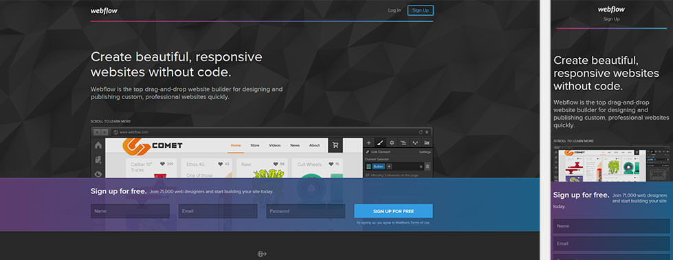
Webflow, a drag-and-drop website builder, was built with Bootstrap.
Conclusion
No responsive design framework is perfect. For a tool that performs various jobs, extra code is required to make that tool flex to your needs. Granted, completely custom code would probably be more efficient for a website than a framework.
Some front-end developers tell me that they have their own grid system, CSS and JavaScript components that they maintain for their own websites. Certainly nothing is wrong with this approach. But you have to maintain that code yourself. A popular framework minimizes the need for maintenance and testing.
I’m calling on my fellow front-end Web developers to reconsider the prospect of using a responsive design framework. Think of it as a productivity tool that you can draw on in full or in part. Download just the grid system, or take the whole package with all of the extras. Perhaps use a framework just for prototyping purpose or actually reuse the parts of the framework that you know well in your own project.
A framework is intended to get a website running quickly, with minimum debugging. Customize the heck out of it to look completely different, or change just a few colors and be done. However you use it, you’ll have standardized, documented code that can be easily passed on to another developer for maintenance and tweaking and that looks reasonable and functions well. The code is not perfect of course, but it’s pretty good. It cuts down the time required to create a website, which will make the website cost a bit less, too.
The world certainly has room for fully customized websites. I don’t mean to suggest dropping them in favor of mass customization. However, the next time a client wants a bit more in their design but is stretched for budget, perhaps it’s a good idea to consider a responsive design framework after all. You might find it to be a helpful tool in your arsenal, for quick prototyping, testing or even production code — one that expands your range of products and makes clients happy.
Further Reading
- Which Responsive Design Framework Is Best?
- Creating A Complete Web App In Foundation For Apps
- Responsive Web Design: What It Is And How To Use It
- Product Design Unification Case Study: Mobile Web Framework
Front page image credits: Zurb Foundation.
 (al, ea, mrn)

